Moodboards
There were 4 main qualifiers for the genre in this project, Hardstyle, Jumpstyle, Alternative metal and Folk metal. Folk metal was chosen for a few reasons; it is very versatile due to how many time periods, cultures, and history it covers, spanning from the viking to medieval to 12th-19th century slavic eras. Because of how much it covers it is much less limiting in terms of visuals, since there are hundreds of fantasy/historic/time appropriate inspiration and assets that could be used. Another reason is that the genre exploded in popularity during the early 2000’s but it is difficult to find merchandise and recognition for the bands within most widely accessible alternative spaces such as damaged society, hot topic or HMV, this makes it difficult to introduce new audiences to the genre and only helps it remain underground unless you already participate in very exclusive metal scenes.
Purpose
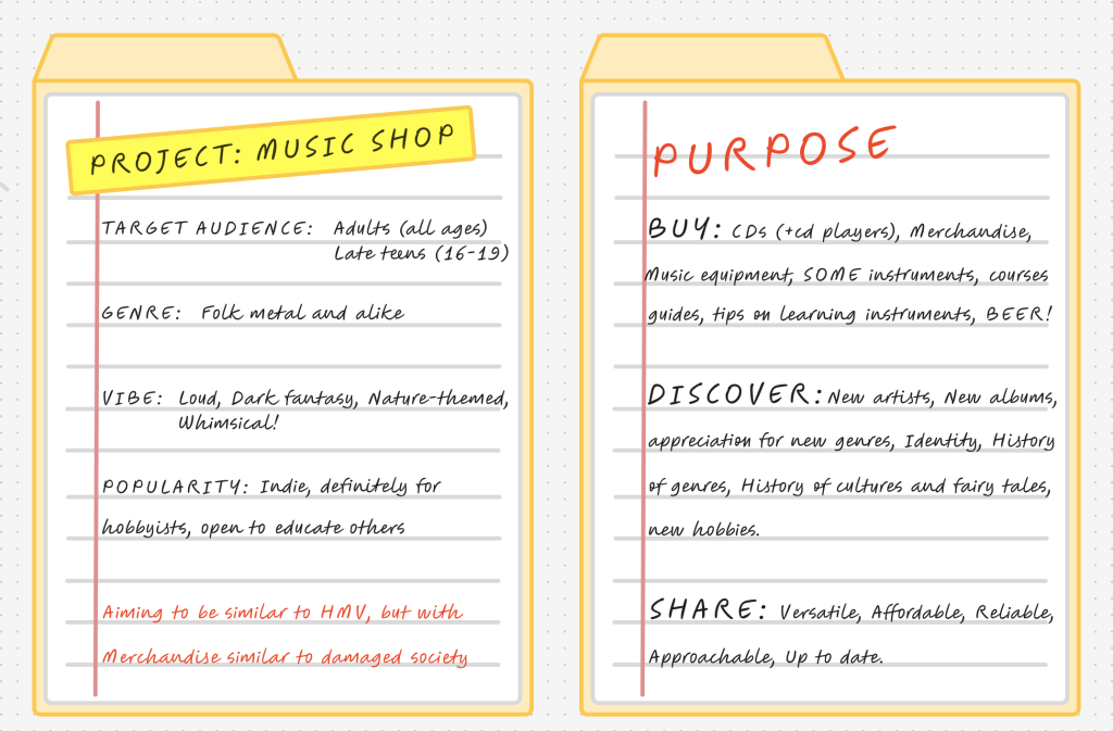
The purpose of dedicating an entire store to the folk metal genre is not just to popularise the genre, but also to honour it and spread the culture surrounding it. The goal is to create a store which cares about the music that it sells, allowing users to purchase CDs and vinyls but also to be educated on the history/folklore that is being sung about. Creating a deeper understanding of foreign cultures and history unites and fascinates people, preventing divides and hostility whilst enjoying music.
The aim is to use HMV as a foundation for inspiration but also stray away from a pre-established brand since in this scenario they become our competitors. For this reason, to improve on the brand-user interaction it would be beneficial to offer lessons and guidance on learning instruments, encouraging personal interaction between the user and the employees leading to having a casual friendly rapport with the brand instead of it feeling solely transactional. This will also encourage creativity and help users consider a new hobby which would boost their confidence as well as develop/help upkeep their cognitive abilities, demonstrating that the brand has always prioritised the wellbeing and happiness of their consumers.
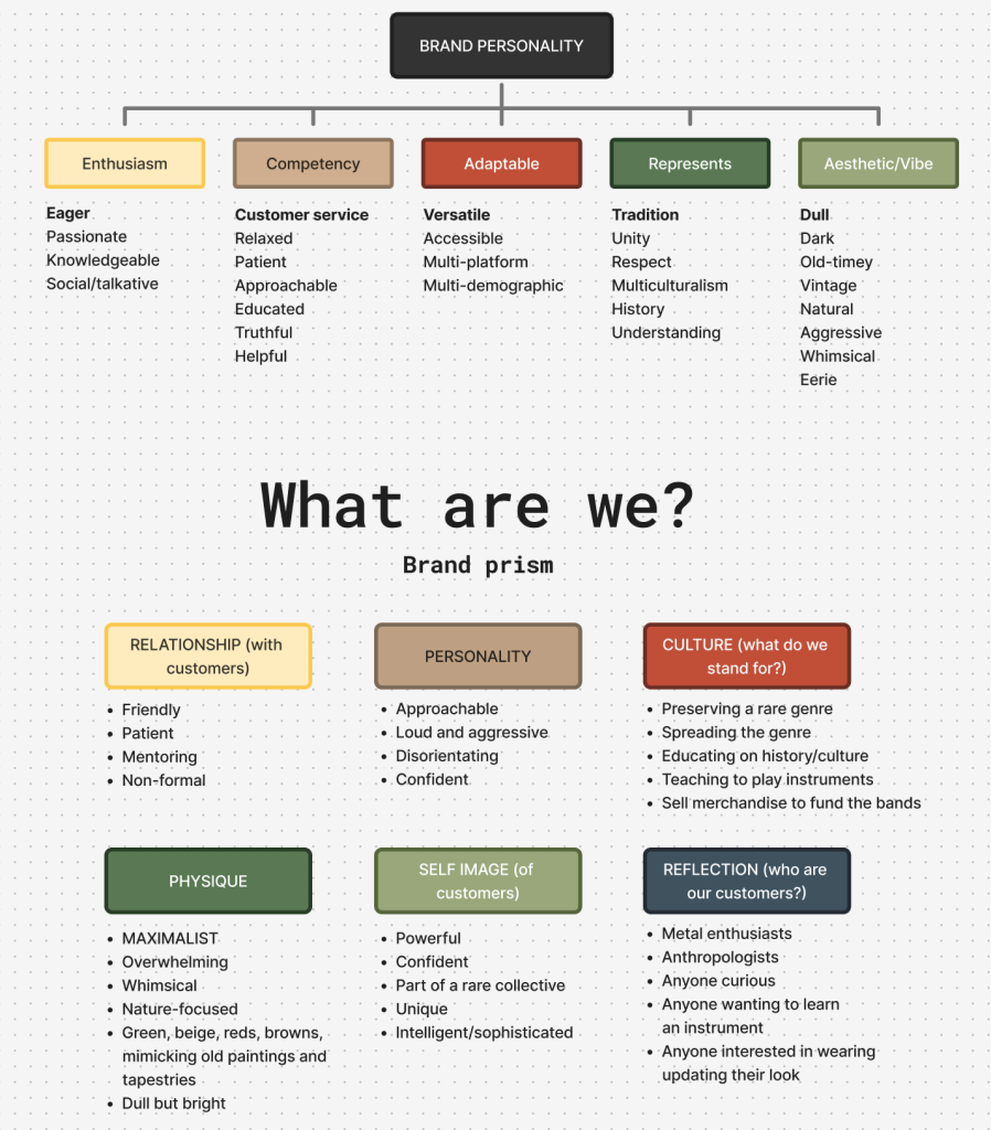
Brand matrix
After finalising my choice I needed to gather more inspiration images in order to narrow down how exactly I want my brand to look and feel. Folk metal is very inclusive, ranging from songs about vikings and legends to pirates, it is my duty to encapsulate its rich variety in one singular music store. The most widespread versions of folk metal is vikings and slavic folklore/fairytales popularised by bands such as Amon Amarth and Woodscream, and due to that the genre would typically make people associate it with old art from those eras. It is very nature centred and traditional, meaning I will probably be severely limited by what kind of visual assets I am going to be able to create.
Sketch
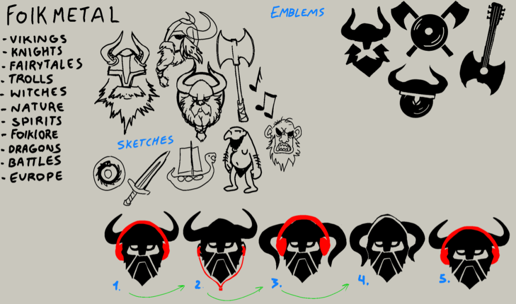
Viking metal was amongst the most popular in the folk metal genre, and because of that I was naturally swayed towards Viking and Norse visuals. I knew that I needed something simple and recognisable, something that can be applied to a variety of platforms and media such as websites, social media profile pictures, fliers and even merchandise. I made multiple attempts at emblems but they always had some flaw, for example being unclear with its intent or having too awkward of a shape which was very difficult to incorporate alongside text.
Brand guidelines
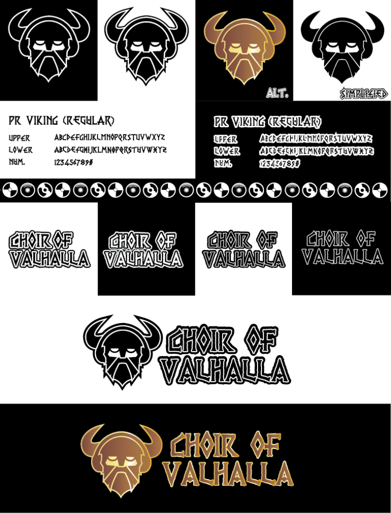
I wanted the brand to represent strength, stoicism and heritage, it needs to be prideful of its culture and confident of its history. The logo captures the essence of a Viking, powerful, masculine, stoic which is already associated with more male dominated genres like hard rock and metal, and despite the historical inaccuracy, it features cow horns on the helmet for a more distinct and recognisable silhouette. The headphones are a very subtle yet visible addition, solidifying it as a music based brand and giving the logo a more varied shape around the head area.
The alternative being golden is inspired by the old Amon Amarth game for mobile devices. The gold makes it look more powerful and the metallic shine makes it look authentic and 3 dimensional. It also helps the brand stand out amongst all the simple 1-to-2 colour logotypes. The typeface used is called PR Viking, it is both very fitting to the theme, but the jagged edges make it look old and historic, as if it was meant to be written on a papyrus, but with a modern edgy twist. This perfectly reflects the modern alternative culture as well as the old whimsical feeling of fantasy.
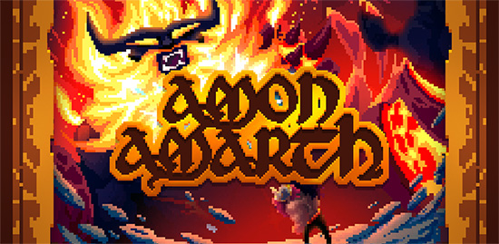
Image sourced from: Metalblade.com. (2017). Amon Amarth and Ride & Crash Games Launch New Viking Mobile Video Game In 80′s Retro Style | Metal Blade Records. [online] Available at: https://www.metalblade.com/us/news/amon-amarth-launch-new-viking-mobile-video-game/ [Accessed 15 March 2026].