Click here to view DESKTOP version.
Click here to view MOBILE version.
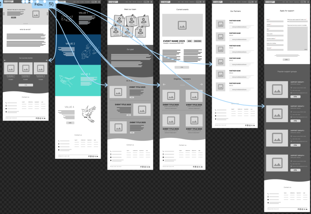
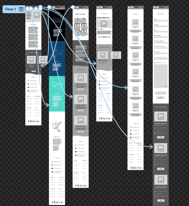
The first and most recurring calls to action are listed at the top of the website, and they are always fixed in place in order to make sure the user always has a convenient way to navigate through the entire website since they are the quickest way to get from page to page, it also helps the user to never feel lost when on the website which would be highly beneficial to those that are not accustomed to navigating the web. The logo is the biggest UI element and is specifically emphasised with its size and location in order to instil the name into the user’s memory as well as providing a quick way to get back to the home page in case they need a reminder of what the collective does. With that, the user can navigate the entirety of the website from any page and receive the information they are looking for in the most straightforward manner.
Every informational post, like news, ongoing fundraisers and support groups have a call to action assigned to them in order to show the user that this feature is an interactable element. This will eliminate a lot of mistakes and frustrations that the users would experience by clicking on a feature to learn more about it, only having to learn that it is simply decorational. The buttons stand out due to their uniquely rounded shape and a completely different colour, this helps them stand out and would accommodate users who struggle to navigate websites whether it is due to disability, old age, or simply not having used technology frequently.
Every page on the website features its own set of CTAs which makes sure that every new bit of information provided to the user is explained and elaborated upon in order to inform them as much as possible. This also makes the website very interactive and somewhat fun to explore, as well as capable of amazing the users with all the features and accommodations that they can be provided with.
Every section and CTA is using clashing tones in order to make every colour stand out, I have attempted to avoid listing all important information on a white background, in order to make it easier on those that are colour blind, people with dyslexia and/or light sensitivity.
The form on the support page uses very easy to understand language and through shape and colour varies enough so that people are capable of recognising that it deviates from the usual UI elements present on the website.