My editorial project will be a book on the benefits and identification of spiders in the UK which will aim to help desensitise readers to arachnids and prevent them from harming the ecosystem by killing them. I aim to produce a front cover, 2-4 pages of information, and a back cover. My book will be educational and focused on providing information, due to that I will aim to look at sources that use minimalism in their imagery.
Neurobiology of arachnids
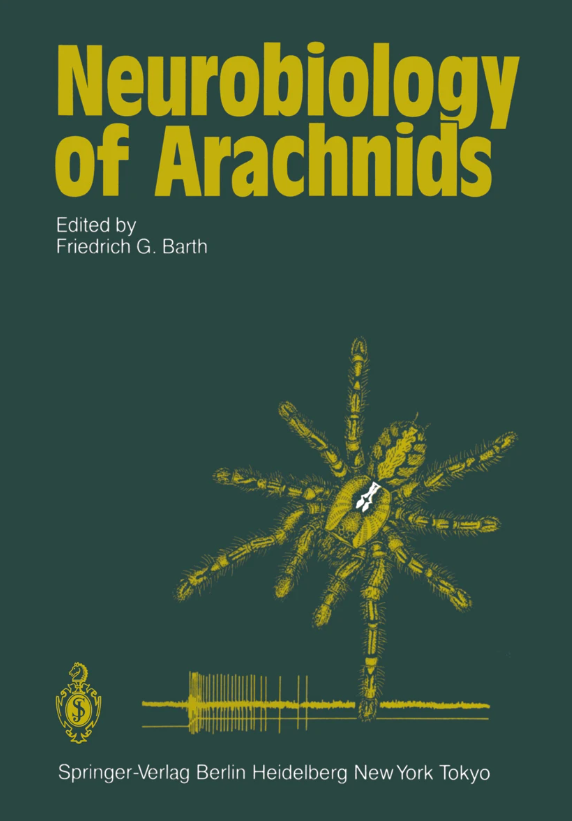
- Strictly only 3 colours used.
- Bold title at the top of the page establishing it as the most important on the hierarchy.
- Every text that does not directly relate to the subject of the book is in white in order to separate it from the information.
- Weight balance on both sides, top left and bottom right mostly reflect in their composition.
- The colours of the text, image and background are close on the colour wheel, but due to the drastically different shades are easy to read whilst still being muted.
- The image is not an illustration, but an edited photograph. The lack of focus on creativity created an overly formal tone which I will include but not to the same extreme degree.
- The only other place where the colour white is (but only in small capacity) is on the image, my assumption is that due to the scarcity of the colour it was used to draw attention to the image and make it stand out. However it might also be a reference to the fact that the subject of the book is neurobiology and it brings attention to the spider’s cephalothorax which is where the brain is located.
Arachnida
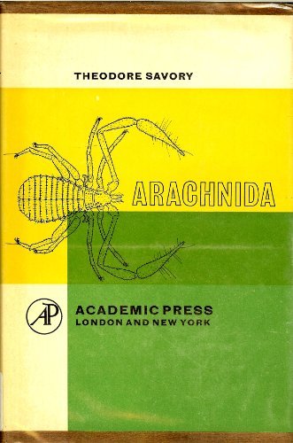
- Anatomically correct illustration of an arachnid on the cover in order to ensure that the topic of the book is unmistakable. It also sets the formal tone of the book and showcases itself to be educational.
- Writing that is unrelated to the information the book is aiming to provide is solid black and lined up.
- The imagery and text that is related to the contents of the book only consist of outlines and are larger in scale to show their importance on the hierarchy.
- The colours overlap together, but the outlines are mostly on the yellow side due to it being more difficult to see thinner lines on a darker colour.
- The cover is very minimal and plain, this ensures that the cover conveys its purpose with minimal distractions.
- The illustration features a less common variant of arachnid, using this on the front cover makes the reader realise how broad the term is.
British harvestmen
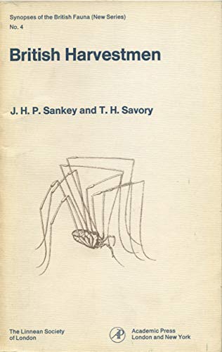
- All text on the left side is perfectly aligned, which created a very strict and professional composition and set the formal and educational tone.
- Just like the previous covers, it features a single anatomically correct outline of the subject.
- Unlike the previous covers, this one does not feature any unique colours of any kind apart from dark blue text, that gives it a more vintage textbook look.
- The texture and colour of the background make it look like it is made from the same material as old scrolls, this gives it a more educational feel since they are associated with providing information.
- The hierarchy is established via type size rather than composition.
- The muted colour of the illustration makes the book look old as if the ink has been worn out.
- The pose that the harvestman is illustrated in makes sure that most of the weight of the page remains on the left side, with the right side purposely remaining empty.
The spiders and allied orders of the British isles.
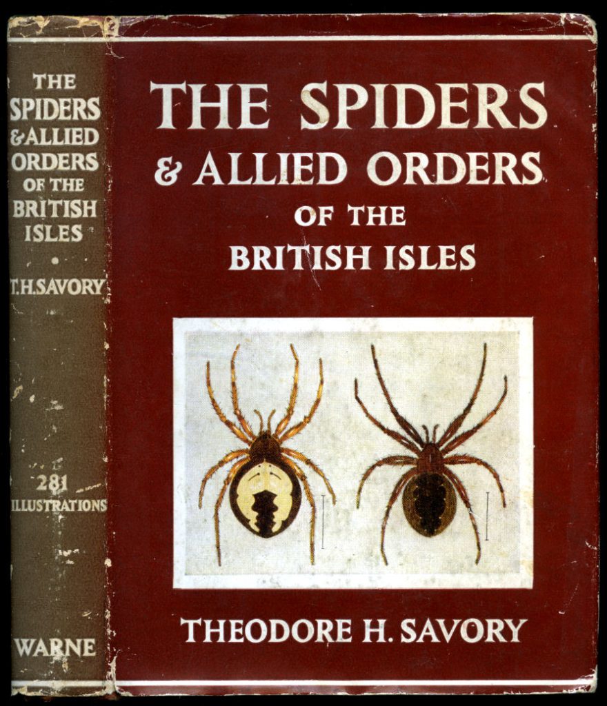
- Serif typeface will ensure a vintage look, since it was originally published in 1945.
- The colours are carefully chosen, the white photograph and text are easy to see on a deep red background, which also matches the colour of the spiders. The harmony of colours makes sure that nothing sticks out too much and therefore does not disturb the hierarchy.
- The hierarchy primarily relies on placement and size, the title of the book is placed on top and in big font size in order to make sure it is competing with the photograph below it, which was purposely made smaller in comparison to the title knowing it will overshadow it.
- The name of the author aligns similarly to the photograph in order to appear as a continuation of it so it cannot be missed, it’s placed last on the hierarchy due to the size and location.
- Unedited photographs of the spiders are used to portray them as accurately as possible.
References
https://www.goodreads.com/author/list/751540.Theodore_H_Savory
https://link.springer.com/book/10.1007/978-3-642-70348-5
https://www.abebooks.com/book-search/title/british-harvestmen
Parker, J.R. 1981. Viri digni memoria. British Arachnological Society. The Secretary’s Newsletter, 31 July 1981,https://web.archive.org/web/20180930124758/http://www.museunacional.ufrj.br/mndi/Aracnologia/pdfliteratura/Savory/BASN031.pdf
Logo and design inspiration
Whilst my magazine will focus on educating, I still need to demonstrate my creative thinking and understanding of conceptual logo designs. I have compiled logo designs that (at least partially) relate to my project and assessed them.
Logo 1)

- The spider is clearly visible in the logo.
- The spider’s fangs and legs were placed very specifically to create a heart.
- The pink/red colour of the spider helps the viewer see the hidden heart via colour association.
- The modern and sharp typeface fits the fact that the logo is meant to belong to a laboratory, making sure that the first impression is that the lab is very modern and is progressing faster into the future.
- The spider imagery and the name could signify that the lab is a spider protection foundation, which would mean the heart could signify the peoples’ love for arachnids and nature.
- The change of weight in the typeface helps to separate the 2 words without the use of a space in-between.
- The heart shape is relatively difficult to see due to the front legs of the spider distracting us from the fangs that solidify the image.
Logo 2)
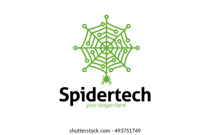
- Making use of what spiders are known for rather than the spider itself.
- Seeing the visual correlation between human technology and nature.
- The logo visually conveys the theme/purpose of the company by making the technological imagery very apparent.
- The thick weight of the typeface goes well with the thickness of the illustration and the change of colour balances out the logo and makes sure neither element is forgotten.
- Due to how close the slogan is to the company title, it was a good decision to make it a different colour so it is easier to read.
- It is however very detailed and busy, making it hard to memorise.
Logo 3)

- Spider theme visible despite the alteration done to the web.
- Visually leaning towards representing a camera shutter, indicating a photography based company.
- Green suggests an ecologically aware company, gives the first impression to the viewer of it being a caring company.
- Spiders have little to do with photography so whilst the logo is unique it does not correlate to its imagery, with the exception of it being wildlife/arachnid photography.
- The simplicity and uniqueness of the image makes it easy to memorise and recognise.
- The thickness of the logo makes it bold and visible, but it would benefit from having text next to it.