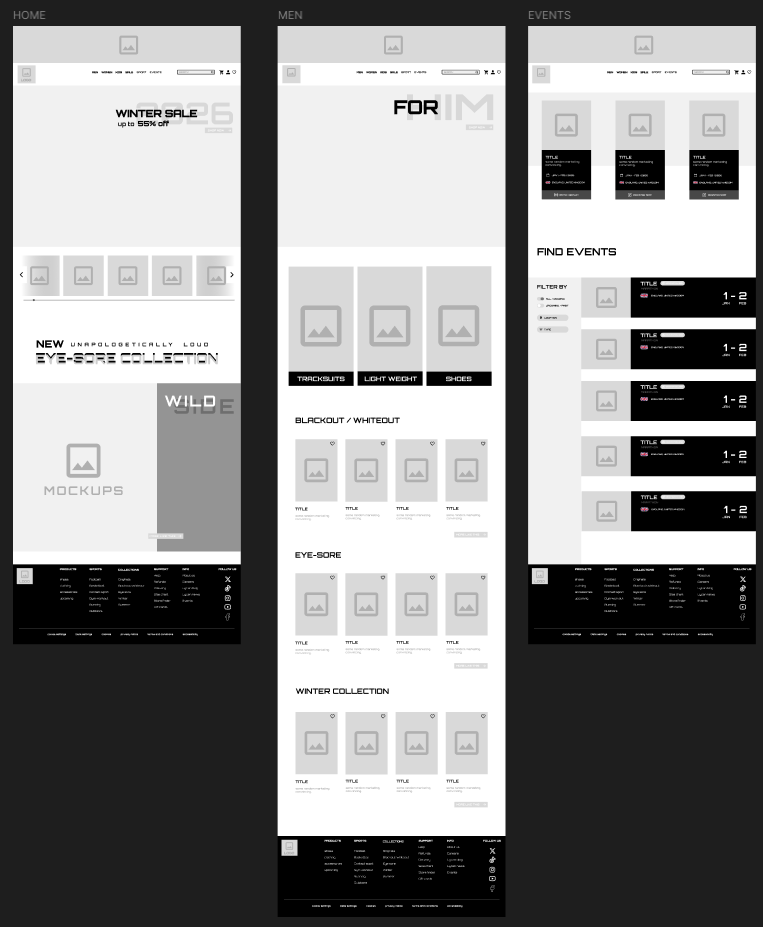
Low fidelity prototype
LOW FIDELITY PROTOTYPE PREVIEW
During the low fidelity stage I focused on the basics of the layout and any unique design choices which I couldn’t afford to forget. The focus was making the website be easy to navigate, even if it sacrifices certain features and designs, since there is no point in making it unique if only a select target demographic would be able to thoroughly appreciate it. I took a lot of inspiration from the adidas, nike, and redbull websites since they are well known established brands and they have a very similar vibe to what I am planning to go for, even being included in my brand matrix.
For starters, I organised everything into very specific categories in order to narrow down every pathway for any users that typically would have issues navigating a website (For example, Raimondas, one of my user personas who has almost no experience with technology and Olivia who can get confused with convoluted instructions). This is the most direct and easiest way to naturally guide the user through the website depending on their needs. All calls to action stand out via colour and shape, creating a high contrast between the button and the writing in order to make sure it is legible at all times.
ASDSDA
ASESDF
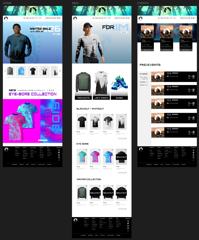
High fidelity prototype
HIGH FIDELITY PROTOTYPE PREVIEW
The logo is clearly visible at the top of the page, both on the banner and on the side and it leads to the home page of the website similar to almost every other site. This consistency makes it easier for the user to go back if they get lost or confused half way through browsing.
The banner is an editted screenshot taken from a game called “Among trees” by me. I found it to be a perfect fit due to its focus on lighting above details, making it very easy to edit and create a silhouette similar to the familiar and signature design of the trees on the clothing mockups.
All the important and new information is displayed at the start, like the current ongoing winter collection. This emphasis adds importance onto this asset, making sure that the user has no way of missing it. It adds a subtle hint of care, recommendations based on season in order to provide the user with the most suitable product that they might be in need of.