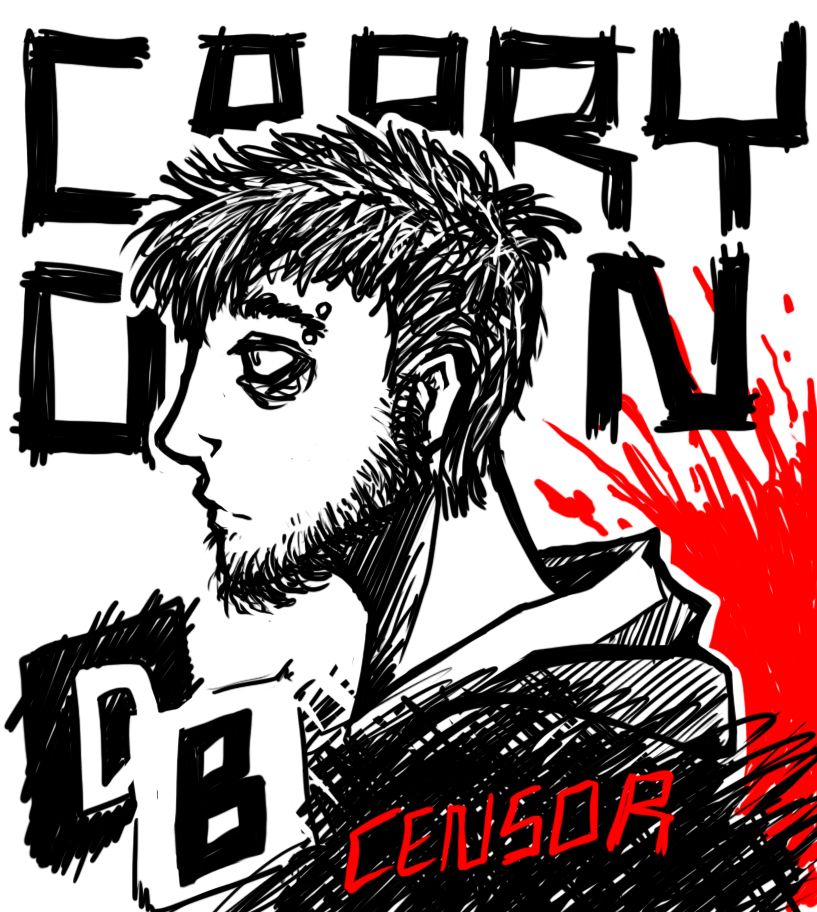
The self promotional posters have a more political undertone, I used photoshop’s brush tool to illustrate and heavily stylise my portraits. The first poster is a mini spokes piece on media and is partially linked to transgenderism similar to my first photoshop piece. The only 2 colours originally used were black and white to signify how the media portrays things only ever as right and wrong with no grey area in between. The red CENSOR is a warning and conveys the censorship of transgender individuals’ existence when there is nothing there that requires censorship, which only fuel’s fear and hate. The blood is bright red yet is behind the figure to signify how loud and dangerous the increase of violent hate crime has become but it remains ignored, with the huge words “CARRY ON” surrounding the figure encouraging the ignorance. The letters DB are my initials, I have included them to make the piece more personal to me and to work as a reminder incase I ever fall victim.
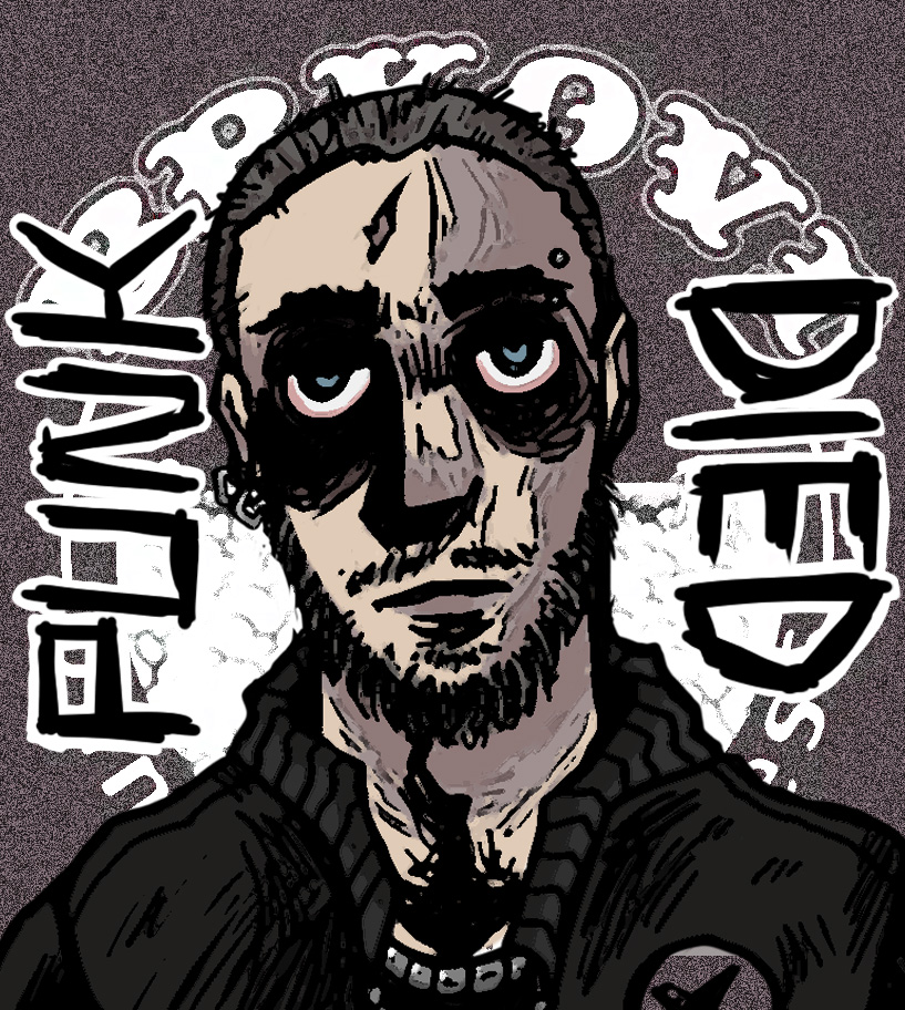
The second poster was partially inspired by the works of Tim Burton in creating an unsettling image with deep and visible outlines which make the piece look rough and detailed which fits the punk theme. This portrait has been based on old pictures of back when I was a skinhead (not to be confused with bonehead, the nazi counterpart). The piece overall signifies change, conveyed by the clear words “PUNK DIED” on the sides to state that it was a part of my life that’s in the past. The album cover in the background belongs to a Croatian punk band “Brkovi” which has a noise filter over it in order to force it into the background signifying that it is behind the figure as well as giving it a more vintage old TV look.
References.
Goran Pećanac, Roman Mirowski. 2009, Brkovi punkfolkwellness Album cover