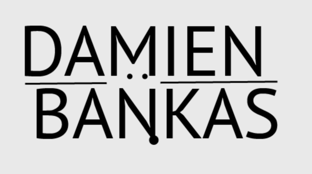
This caps lock logo was arranged in a specific way when I realised that I can see a vague shape, and decided to work on it further. The sharp angles and the positioning reminded me of a low-polygon fox so I added 3 circles to resemble eyes and a nose to solidify my vision and convey it to others. In order to make my design more clear, I have added 2 lines to separate the rest of the letters and show that the focus is purely on the M and N which made the fox stand out way more. What makes this logo effective is the fact that the shape of the fox is so recognisable it can be noticed even outside of the full logo, and can easily become a potential stand-alone logotype.
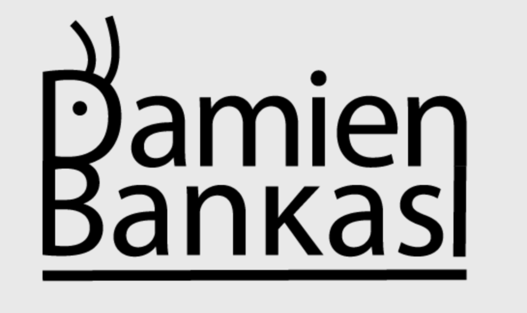
The second logo had a very similar process to the first one, involving me looking at the top and bottom letter from a different angle. This time I saw how close the two capital letters of my name were and I saw a vague shape of an ant which I have decided to expand on by making my vision more clear with the addition of an eye and antennae. Because of how perfectly the first letters aligned, it brought me discomfort to see how badly the S and N at the end didn’t align, so as an attempt to fix that I have extended the N down to the bottom of the logo in order to make the 2 sides of it appear to be equal in length. This did make it look more visually appealing, however it made my name be less recognisable, making it look like there is an additional letter at the end of my surname. This was later fixed with an addition of extra connecting lines which instead started to look like a trail that the ant has left.
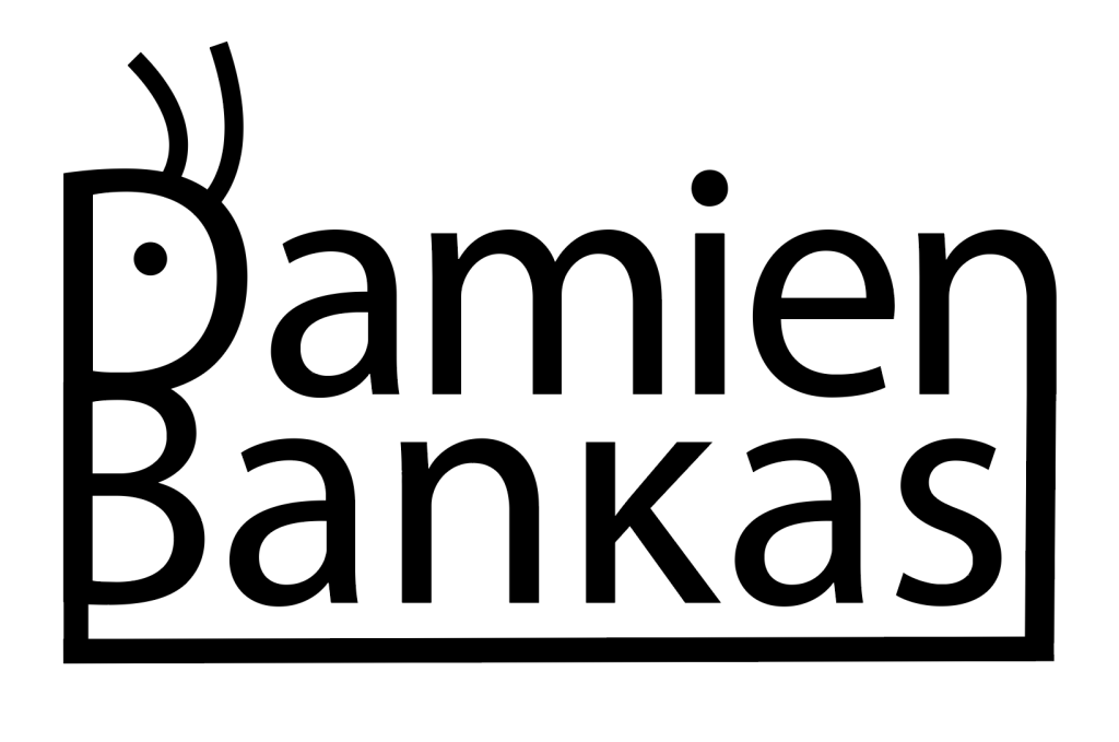
“Fixed” version of the second logo.
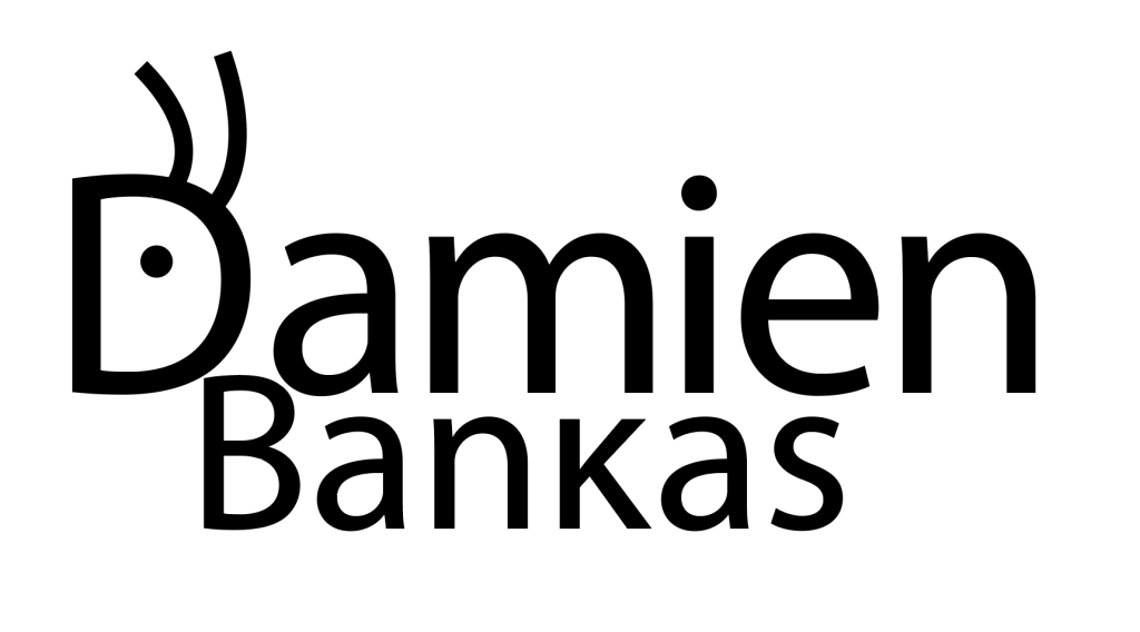
An extra attempt at making the ant into a caterpillar instead, before committing to the previous design.