Typographical Name Logo x 2
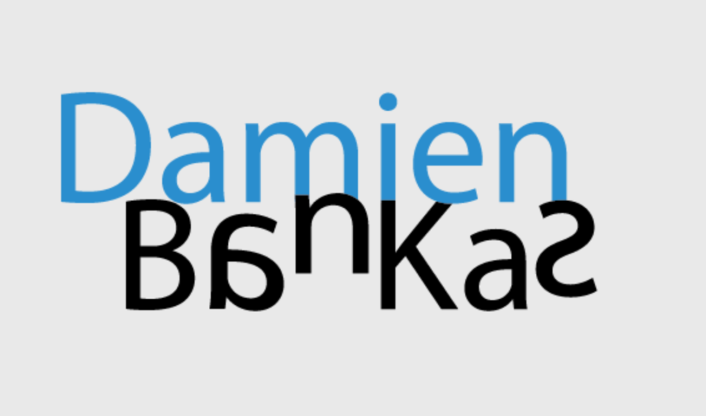
The first attempt was a refurbished version of my original idea in prescribed exercises in which I made my name be purposely hard to read by reflecting, moving, and scaling letters in order to simulate the experience of dyslexia. I decided to make my name be perfectly legible whilst being in blue to signify my frequent use of a blue overlay and convey how much it benefits me. This, however, could also be interpreted as me being difficult to understand due to various factors (including accent, background, and overall my individuality). The letters that are the most out of place are typically conjoined with the letters above them, closing gaps between letters is typically the biggest difficulty for people with dyslexia and despite the sudden shift in colour, the lack of space in-between makes it more difficult to read whilst creating pleasant and almost perfectly-aligned shapes which made the logo look both confusing and uncomfortable whilst also being very precise and appealing.
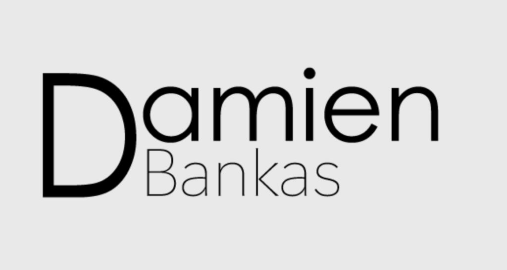
The second logo was instead an experiment of scale and weight. I emphasised the first letter of my name for better brand recognition, as well as making the transition from big font to small font less distracting for the viewer, since the size of the D takes away the attention and acts as the first letter in both the name and surname. I made the surname smaller and thinner for 2 distinct reasons, those being that having 2 words with the exact same weight close together makes them harder to differentiate and read, and to manipulate the reading order because its smaller size ensures that it will be read second. Its thin type makes the logo seem more posh and makes the viewer associate it with a high end brand due to its elegant shape.