Spread 1
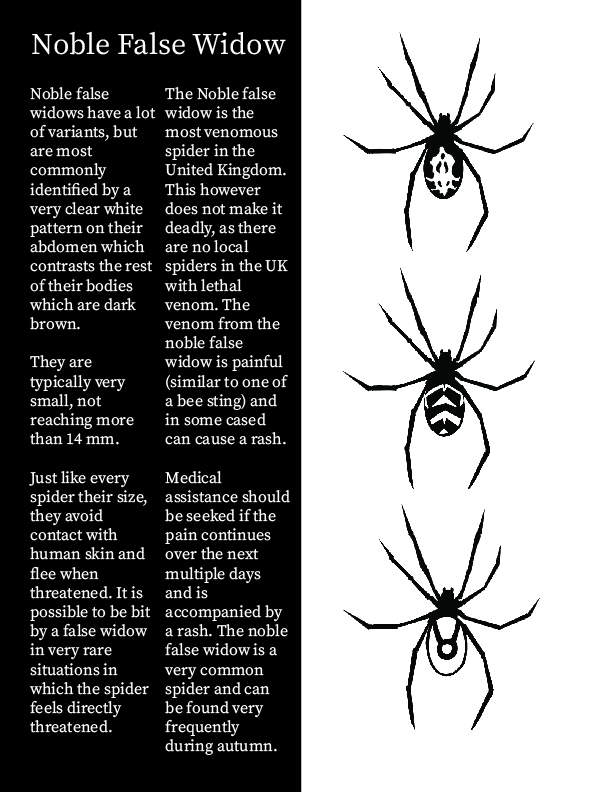
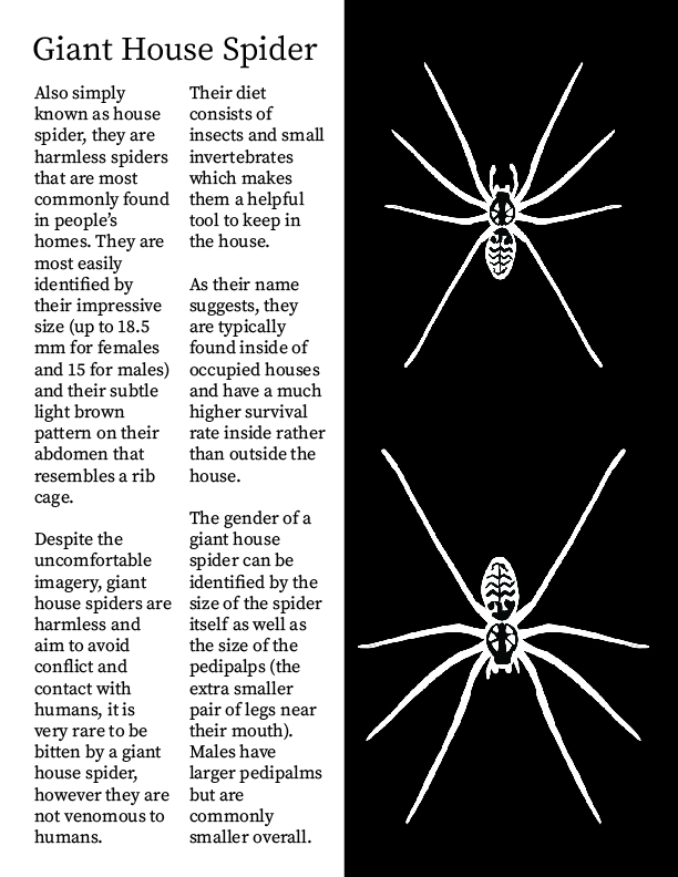
As I have mentioned, my intentions for this project are to educate people on the spiders in the UK and prevent people from unnecessarily getting rid of them, so the spreads follow the black and white theme in order to prevent distressing the readers with arachnophobia. The first 2 spreads start off by educating people on which spiders to watch out for due to them either being venomous or simply harmless despite the uncomfortable appearance. Placing these pages at the front lets me convey desired information more quickly since the first question most people will have will be about the venomous spiders, which is where I am capable of comforting the readers from the start stating that there are no lethal spiders in the UK. The black and white theme also makes it very easy for me to illustrate the patterns of the spiders I am writing about since they are very clear to see due to the high contrast of black and white and do not require any additional colours to work. The page is structured similarly to a magazine, this allowed me to separate important relevant information much easier and structure the pages in a way which makes it very convenient to read, it also follows the structure of the masthead which creates a vertical rectangular shape.
Spread 2
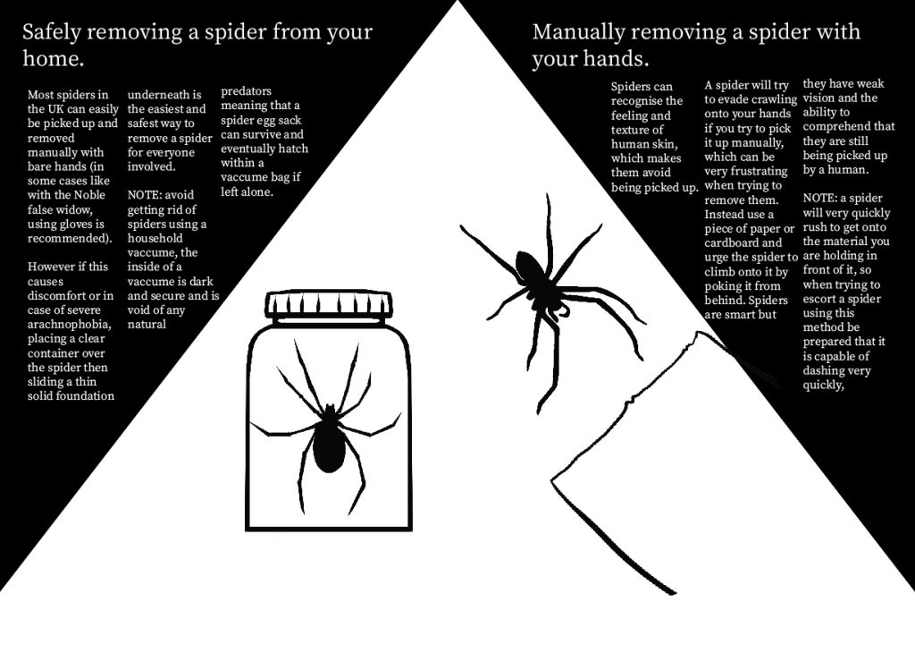
Removing spiders from your home would be the next thing that people ask about after being reassured about venomous spiders, since it is likely going to be people who are uncomfortable being around spiders and having them in their space. I have provided multiple different methods for people with different levels of tolerance towards spiders, which range from picking them up manually with your bare hands to the jar and cardboard method which does not require the person to have direct physical contact with the spider. I have used “NOTE” to convey important information quickly before the reader attempts to replicate or assume so that they will be more prepared and educated on the spiders they find. Capitalising the note draws attention to it making the reader compelled to look at it since it stands out among the normal sized text. The illustrations help convey what each page is about so that the reader can comprehend what information is about to be given to them and therefore can prioritise which pages they are most interested in based on what specific information they are seeking. The second spread also has a completely different design compared to the first one, that was done in order to create a variety since having 2 opposite colours be placed in the exact same way every page would make it harder to separate pages since after a while they will all start to blend in together.