Masthead 1
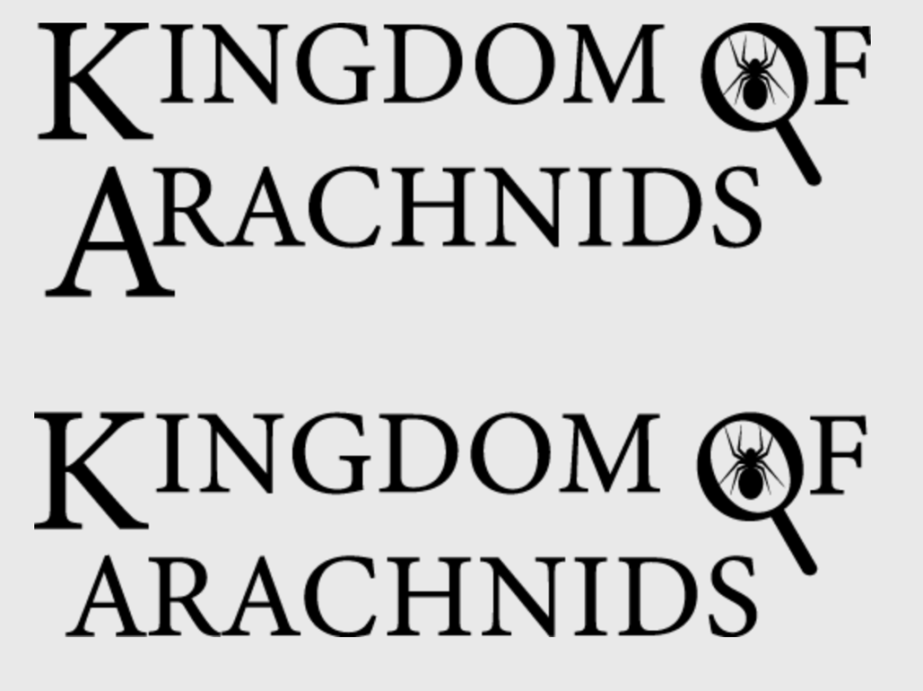
The masthead for the original cover was designed to fit the idea of making a scientific textbook, this is emphasised by the fact that I have used a serif font in order to mimic the old textbooks printed using a typewriter. At first, I have emphasised the K and the A by making them bigger, which made the shape of the words be more versatile and therefore easier to read since the original shape did not stand out at all and started to merge the 2 words together. I then realised that making the A bigger actually ruins the shape of the masthead and made it more inconvenient since now it takes up more bottom space for no practical reason, which also made it more difficult to create a more symmetrical and organised cover. The placement of the word arachnid below is not completely symmetrical but that fact is unnoticeable due to the conceptual design of the O which, using the extra line as a magnifying glass handle, expands the word and makes it appear longer. This allowed me to keep my original design choice without having to adjust the length nor size of the word.
Masthead 2
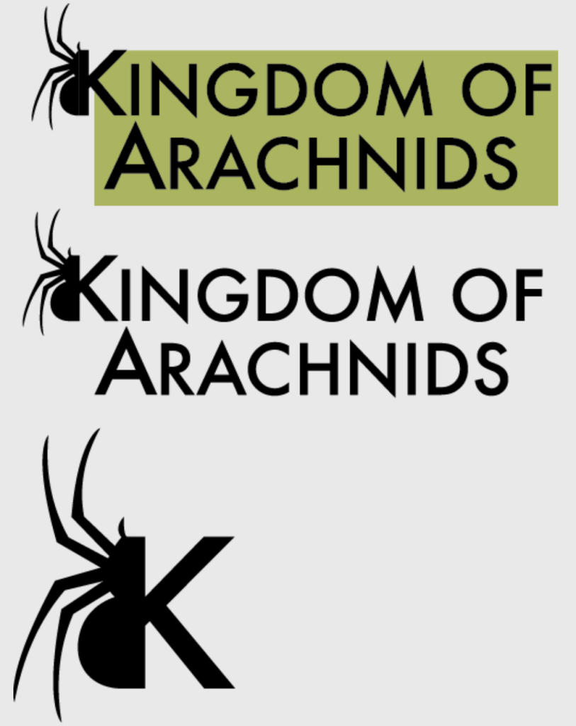
This masthead goes with the cover that has a more modern and stylised look to it, which also is aimed at a more younger target audience than the rest of the covers. This was emphasised by the sans serif font with a lot of sharp edges which makes it appear less formal and serious and therefore less “boring” for younger people. At first I thought that due to the weight imbalance because of the spider-infused logo on the left side the masthead looked too irregular, I tried to counter that by adding a green block in order to add weight onto the rest of the masthead as well as add a recognisable signature colour to it. I went back on the idea due to how out of place it started to look, and since the signature colour would barely be visible on the actual cover due to how similar it looks to the background.
Masthead 3
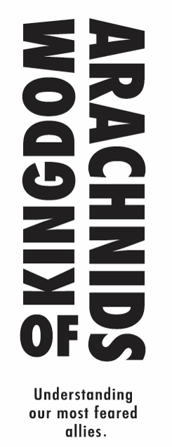
This masthead is heavily stylised similarly to the previous one, however it is almost abstract which makes it the most metaphorical since people find spiders and arachnids difficult to look at and understand. The fixed version of the masthead still follows the hierarchy, the words which are closer to the top and bigger in size are the first that catch the eye and make the reading order be more apparent despite the abstract look of it. However due to the word “of” being the only one angled horizontally, it brings attention to itself despite being the smallest due to the top and first word “kingdom” being upside down and not easily comprehendible, it makes the readers not want to start the sentence with it.
Adjusted masthead 3
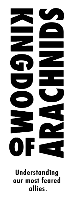
The fixed version eliminated the issue of not being able to read the masthead in its intended order. By rotating the word “kingdom” and making it start from the top, it made it easier to read and therefore encouraged the readers to start with it, following a “up to down” order. By directing the order downwards, it then had the opposite effect and made it easier to read the second half starting from the bottom side, making it a very fluid transition from reading “of” to reading “arachnids” from the bottom side towards the top. By rotating some of the words it has been made incredibly more easier to read the masthead whilst allowing it to maintain this signature abstract look.