The easiest identifiable feature of this book is its black and white colour scheme. The unique coloration makes it not only practical for those who do not wish to view photographs or illustrations of realistic arachnids but also unique in a way that it is easy to identify from each page and corelate it to the brand since every single page follows the standard.
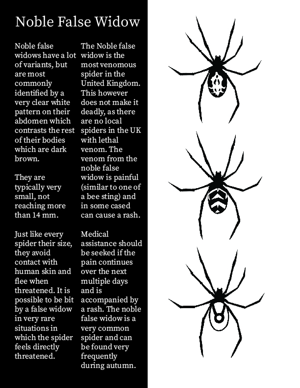
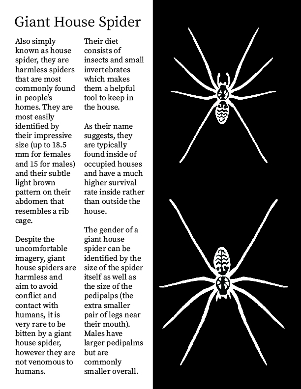
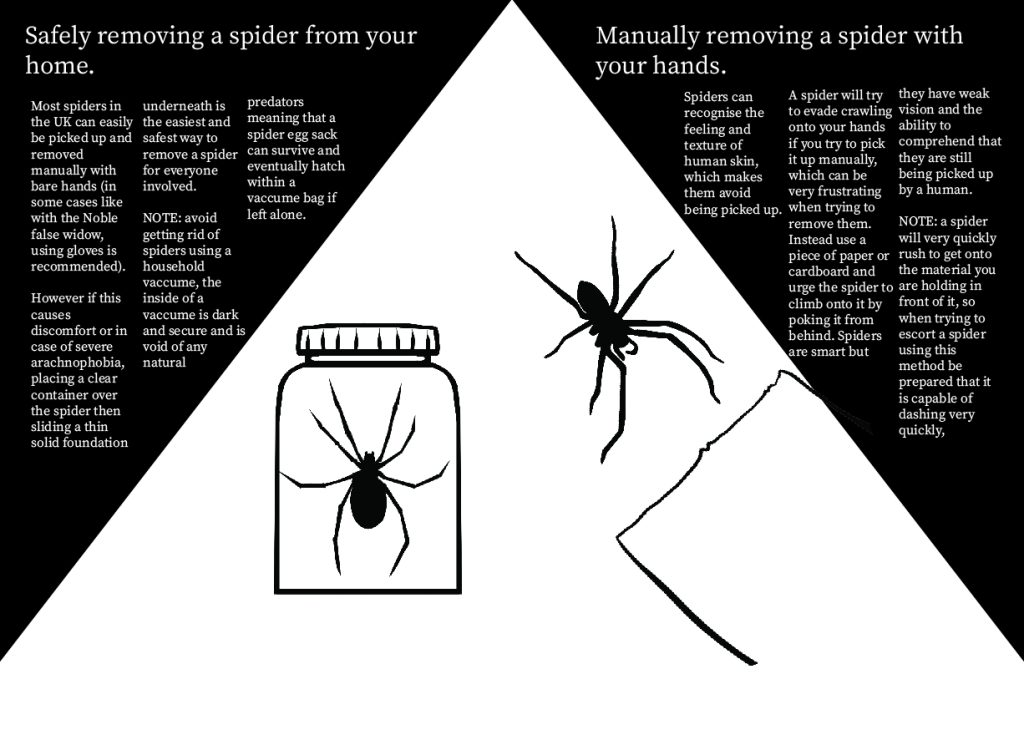
The font on the informational pages is serif, that is to make the reader associate the pages with a serious tone and therefore comprehend the information that is given as factual and educational. The reason it does not contain the same font as on the masthead is because it is far too informal for an educational piece, and it is better used to catch attention using the cover than it is for conveying information. The colour of the font is adjusted accordingly based on the colour of the background it is printed on, however the strict colour theme makes me rely on size of the font in order to emphasise its importance, like in cases where I have capitalised the word “NOTE” to bring attention to important details it provides. This method is also highly effective when used on the titles of the pages, since they are always arranged in the exact same spot at the top of the page and are scaled to a size that is visibly bigger than the rest of the text.
The text in the book is always arranged into columns instead of following the common arrangement of just going left to right like in most books, mimicking a journal or a magazine. This allows me to stay consistent with the arrangement of the book title which creates a vertical rectangular shape of text. It also makes conveying information much more effective since the gaps between the information make the text easier to follow and more convenient to read rather than if it was in 1 big block of text each time.