Bad example of use of colour in magazines.
- The focus on optical illusions made it incredibly difficult to read.
- The choice of colour for the typeface makes it difficult to read on a striped background.
- The off-centred main image only makes the negative space with the stripes more prominent and harder to concentrate on.
- The colours of the 2 spheres in the middle are not opposite and do not fit with the yellow text.
- The harsh change of typeface of the masthead compared to the cover line made it look awkwardly out of place.
- The lack of a capital letter at the start of the masthead lowers its importance.
- The “shadow” around the cover image is irregular and makes the optical illusion even harder to recognise and make sense of.
Fixed example of colour in magazines.
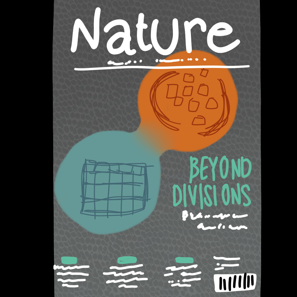
- The colours are now direct opposites of each other.
- The background has a texture which makes the negative space feel less plain without making it difficult to read or distracting from the text and main image.
- The colour of the cover line does not contrast the background nor the main image and remains easy to read and comprehend.
- The more muted colours make it seem more educational and project a formal tone which makes it appear more like a science textbook.
- The lack of optical illusion surrounding the main image made it much easier to concentrate on it which helps since it is the most prominent part of the magazine.
- The main image has been moved towards the middle to eliminate some of the negative space and make the entire magazine be equal in weight.
Good example of colour in a magazine.
- The cover lines are always on the darker parts of the image which allows the magazine to maintain the white text colour without needing to alter it to fit elsewhere.
- Despite the low opacity, the masthead stands out due to the sun imagery bringing attention towards the top of the magazine. That is because it is a rare colour in this magazine that does not appear anywhere else.
- The only other thing on the magazine featuring this unique colour is a portion of the cover line which directs the reader to the specific page which the cover line is referring to.
- Everything in the magazine is perfectly centred in the middle of the page. The cover line was scaled to be the same length as the masthead in order to fill out the empty space.
- There is an odd blue that is used above the cover lines at the bottom of the magazine, however I could infer from its size that it was not meant to stand out on the page but was meant to stand out in the cover line because the text was becoming far too condensed.
- Every cover line features a page(s) in the magazine, which intrigues the reader into wanting to open the magazine. In order to prove their legitimacy, each cover line also features the pages that are designated to the information that the coverlines provide.
References.
- Wiles, T. (2014) Volume 509 issue 7499, 8 May 2014: Systems Biology, physics and mathematics, Scientific American Magazine, Pinterest. Available at: https://uk.pinterest.com/pin/11047961560933705/ (Accessed: 28 October 2024).
- Wiles, T. (2015) 85 science cover Art ideas: Cover art, science, cover, Pinterest. Available at: https://uk.pinterest.com/bunsenb/science-cover-art/ (Accessed: 28 October 2024).
- Springer journals (no date) Springer Journals | For Librarians | Springer Nature. Available at: https://www.springernature.com/gp/librarians/products/journals/springer-journals (Accessed: 28 October 2024).