Compositionally bad example of a magazine.
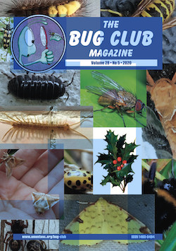
- Picture placements serve no purpose.
- Picture colours are clashing and creating an overwhelming mess on the cover.
- The blue tint that happens from the pictures overlapping is covering the masthead which distracts people from identifying the brand identity.
- The target audience is very clearly young children, I inferred that from the very heavily stylised cartoon logo.
- The random picture of a holly leaf is incredibly out of place and makes you doubt the contents of the magazine, for example if it has a certain theme around a time of year or also includes ecology of plants.
- Has absolutely no cover lines, which would not even be able to work due to the overwhelming amount of pictures crudely put together.
- The cover looks very plain despite being overcrowded.
Fixed compositional example.
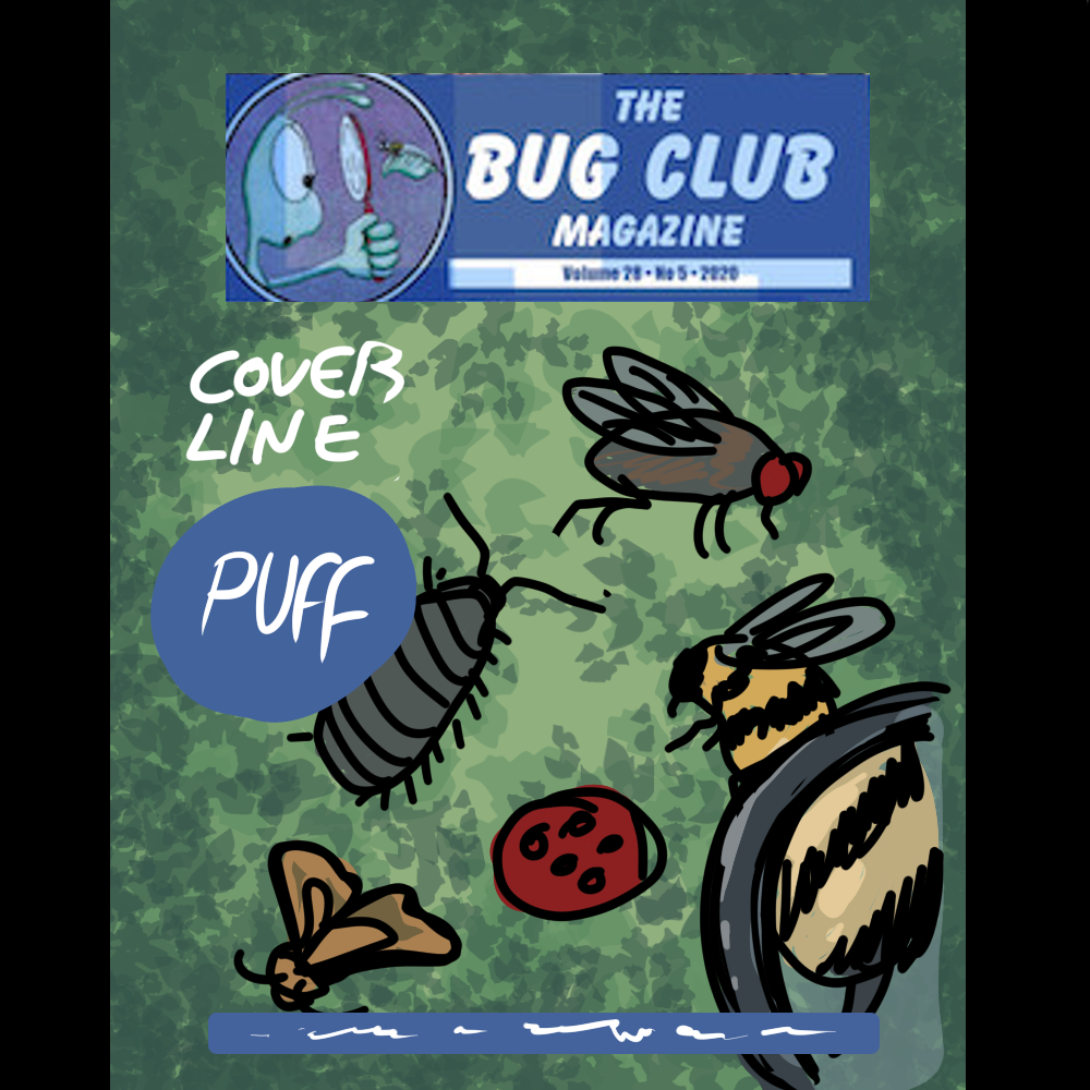
- The first thing I did is demonstrate the removal of the crude PNG images of insects in order to make sure that I can place images appropriately without unprofessional overlapping.
- In order to maintain the original young target demographic, The bugs would be realistically sketched in order to bring attention to them without having to relay incorrect information through visuals.
- I gave the magazine a proper background consisting of leaves and vegetation which compliments the signature blue colour of the magazine and makes it appear very visible and easy to read without creating a harsh contrast.
- I added a magnifying glass on the side in order to create a more “fun and childish” visual for the younger audience, which also represents childish curiosity and the attention to detail that is required in educational magazines.
- I added a cover line and a puff onto the cover since now that there is some negative space that remains free, I could afford to put more writing and advertisement on the magazine without overwhelming the canvas.
- I made sure that the text is the only thing that uses the colour white in order to keep consistent and not add unnecessary colours to the canvas which will make me revert back to the pre-changed version of the magazine which turned out to be catastrophic.
Compositionally good example.
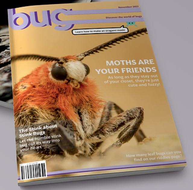
- Easily identifiable masthead that takes up the majority of the top part of the magazine.
- Cover image is big and has a lot of negative space for cover lines.
- Cover lines are in a non-contrasting colour which allows for a smooth reading experience.
- Odd colour used to emphasise the masthead.
- Barcode on the front makes it feel like an authentic magazine.
- The pug at the top makes the magazine interact with the customer directly and ensure sales by promising them something within the magazine.
- Nothing overlaps and everything has its place.
- Hierarchy is easily established through size and placement, text is bigger at the top and shrinks as you go down the page.
- Despite looking very realistic, you can still tell the primary target demographic is young children due to the small blue mascot featured at the top and a cover line persuading the reader that the magazine contains a fun activity for them.
References.
- Bug Magazine: Four cubes design (no date) FourCubesDesign. Available at: https://www.fourcubesdesign.com/bug-magazine (Accessed: 29 October 2024).
- Bug Club Magazine (no date) Bug Club Magazine – Amateur Entomologists’ Society (AES). Available at: https://www.amentsoc.org/publications/bug-club-magazine (Accessed: 29 October 2024). /