Conceptual design masthead – bad example.
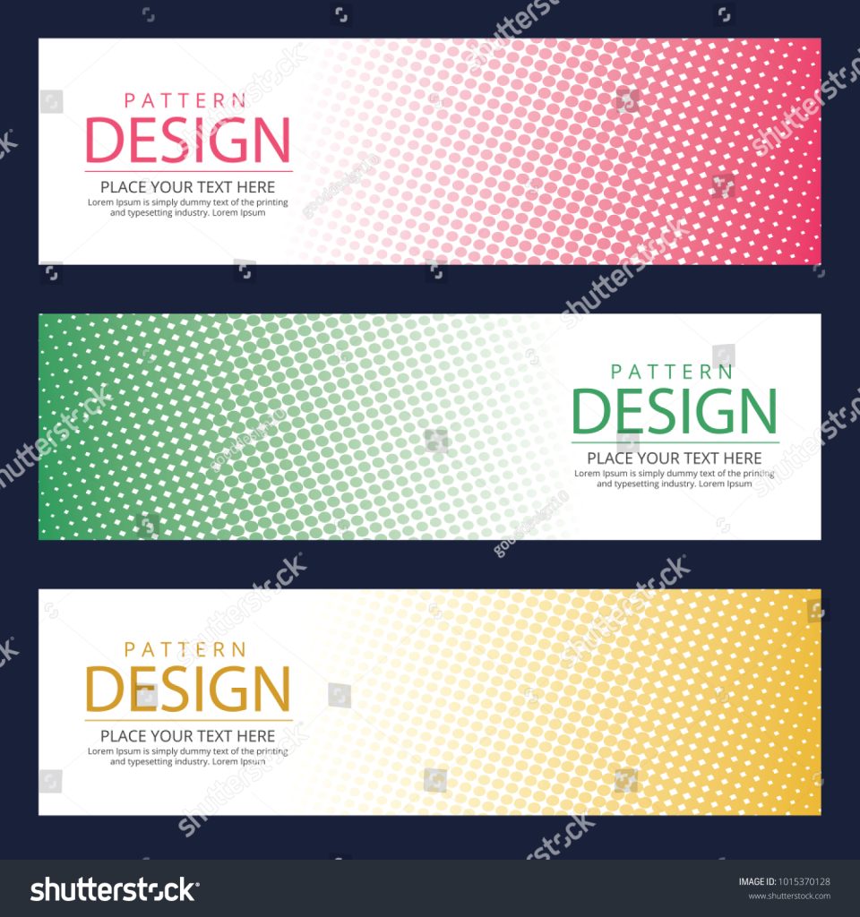
- The weight of the design is relatively equal, but leans towards the empty side which blurs the hierarchy.
- The text is too condensed, if put on a magazine cover it would be easily confused with a cover line instead of being recognised as a masthead.
- Very little colour variety, the design features black, white, and a singular colour which makes the masthead look overly formal and plain for the readers.
- The text follows the type hierarchy using size and weight, however it is very condensed together compared to the rest of the canvas.
- Too plain, does not catch the eye.
Fixed conceptual design masthead.
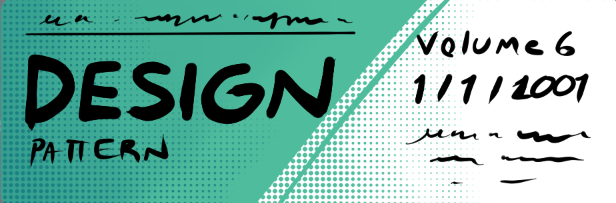
- I made the weight equal throughout the entire banner, still following type hierarchy by emphasising the “design” with its size.
- I kept the iconic 2 colour design with the comic style dot gradient, however I made sure it was a light shade so that I could be consistent with the colour of the typeface.
- I kept the design simple my only including 3 colours total, however I greatly reduced the negative space to allow.
- I separated the design into 2 portions and spread them over the canvas which helped them appear less condensed, as well as adding extras like the volume and date (as well as an extra cover line) to make it more resemble a magazine masthead.
- Whilst the design kept its iconic plain design, I have expanded it into a minimalistic design instead.
Conceptual design masthead – good example.
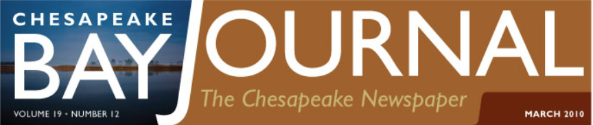
- Very clear to read.
- Makes use of the entire space provided.
- The altered length of the J helps separate the 2 words whilst eliminating any difficulties that would of occurred when trying to fit the letter J due to it’s distinguished length.
- The opposite colours help the masthead create a contrast which stands out, which is naturally merged together by hiding the transition behind the J.
- Smaller text is emphasised with white colour whilst being put on a darker background in order to maintain the hierarchy whilst making sure that they are still visible and easy to read.
- Only having an image on one side makes the masthead look more 3D and adds to the “conceptual” aspect of it since it features an actual bay behind the word bay.
- The type is bold and easy to read.
- The issue an date are typically not separated, but in this instance it was beneficial since it ensured that all negative space is covered and the date and issue didn’t have to be brutally condensed to fit into the same space.
References.
- (No date) Abstract banner – free vectors & psds to download. Available at: https://www.freepik.com/free-photos-vectors/abstract-banner (Accessed: 28 October 2024).
- Barsin, J. (2012a) Redesign of Bay Journal’s Masthead, JOE BARSIN: Creative Professional. Available at: https://www.jebdesign.com/blog/redesign-of-bay-journals-masthead.html (Accessed: 28 October 2024).