2018/2019 Lacoste x IUCN
Starting from 2018, Lacoste partnered up with IUCN and have released 10 very exclusive limited edition polo shirt designs, each design being a plain white shirt but having the iconic crocodile logo be completely erased and instead replaced by one of the 10 endangered species. What made this campaign unique and highly effective was the exclusiveness of it, the copies of each shirt made would be limited by how many individuals of that species are left on earth, and after selling out no more legitimate copies would be made. This achieved 2 goals: It put the vulnerability of said species into physical quantitative perspective for the average consumer, and it’s limited availability instilled a sense of urgency within the consumer to purchase the product out of fear of missing out.
The campaign was an enormous success, during the first launch in 2018 all 1,775 shirts were sold out within 24 hours of being made available to public and raising $325,000 (US) for the SOS (save our species) initiative. In 2019, they reran the campaign this time featuring 10 more endangered animals, releasing a total of 3,520 new limited shirts.
I acknowledge that my brand sells a non-reusable, consumable product; creating a limited quantity of product per species is not viable, especially since some considered species have less than 50 confirmed living members. Instead I can allow limited distribution of product per month, and release a new flavour each month whilst fully discontinuing the one before. This is a more achievable marketing technique catered to my specific product. After 12 months, the product line can either restart or be completely remade, replacing the old animal on each flavour with a new one. That way my brand can still spread awareness on the severity of animal extinction whilst not discontinuing any specific flavours in order to not lose consumer loyalty, it also ensures that my brand will have a much longer life span than a single year.
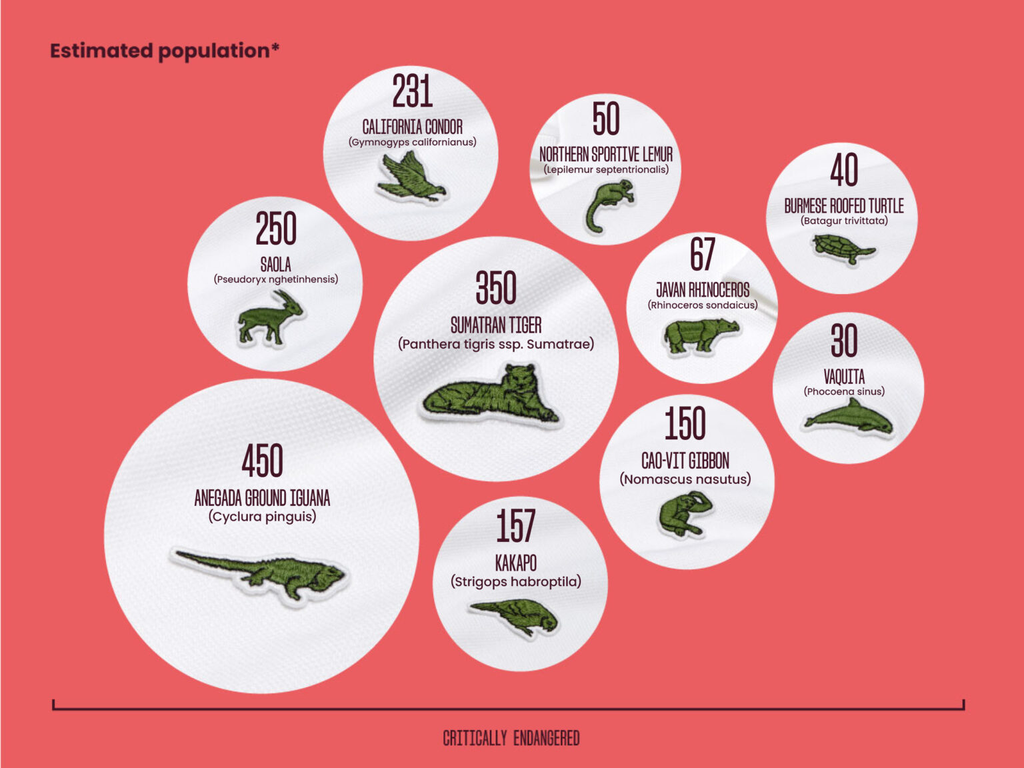
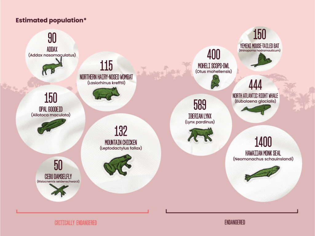
On the LEFT are the species featured in the 2018 campaign, on the RIGHT are the species listed in the 2019 campaign. Images sourced from: Anon, (n.d.). Lacoste x IUCN SOS – IUCN SOS. [online] Available at: https://iucnsos.org/initiative/lacoste-x-iucn-sos/ [Accessed 6 Oct. 2026].
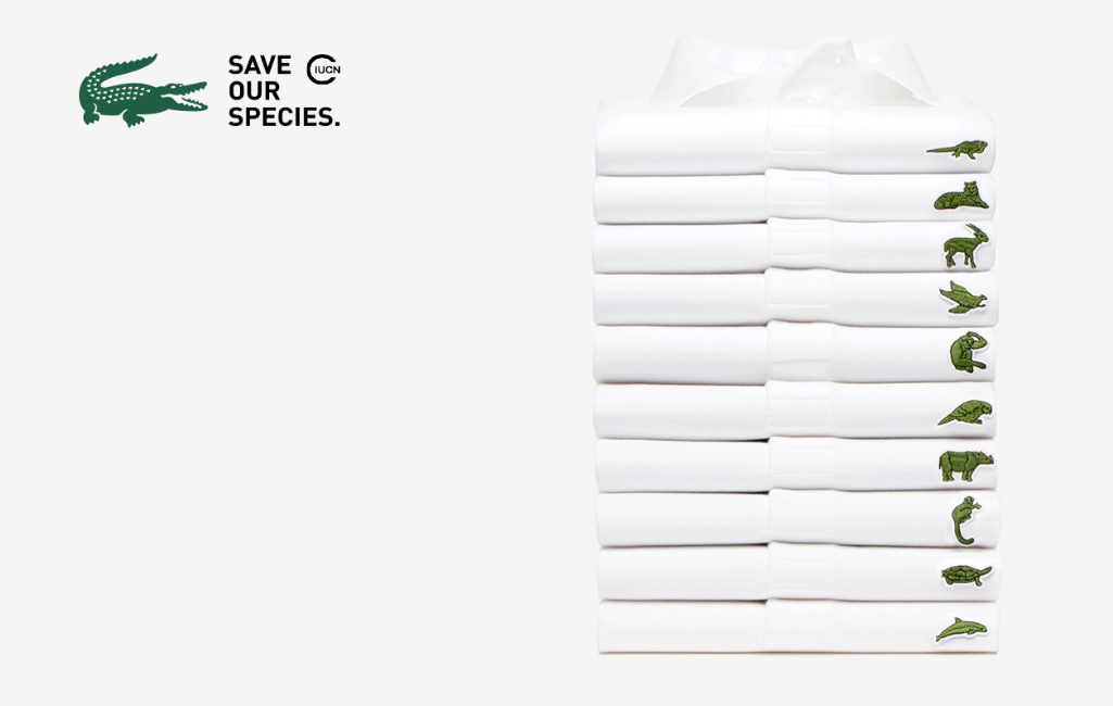
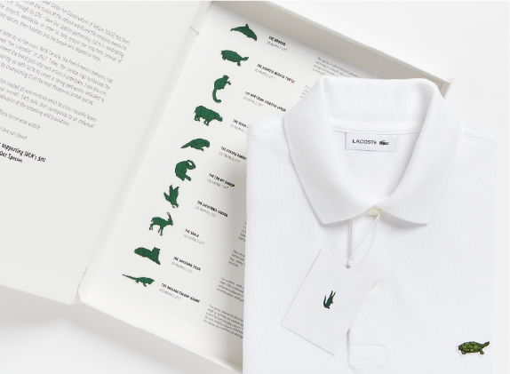
Marketing used to promote the 2018 launch of polo shirts. Sourced from: Lacoste x IUCN sos – IUCN SOS. (n.d.). Retrieved 6 October 2026, from https://iucnsos.org/initiative/lacoste-x-iucn-sos/
Design inspiration
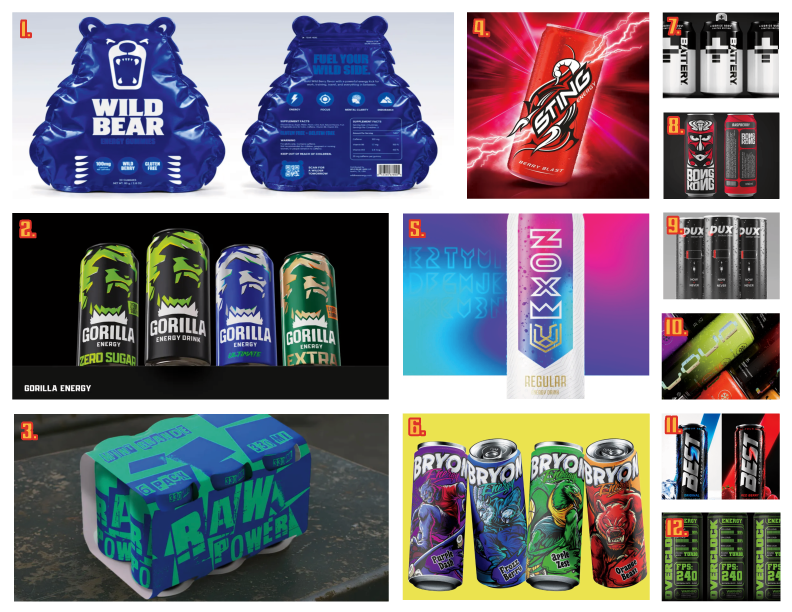
- WILD BEAR (Andmore Agency) – The unique container shape has caught my attention but would be hard to replicate with an aluminium can. The container only features 3 colours, 2 of them being blue, and yet every aspect is clearly separated and visible. I could learn from their colour composition.
- GORILLA ENERGY (DDH Branding Consultancy) – The most perfect example of what I imagine my final outcome to resemble. The masterful use of only 3 colours is admirable, it created a very high energy and aggressive visual perfect for an energy supplement. I can learn how to convey strong emotion with a minimalist design and learn the proper use of negative space to create a visually appealing composition.
- RAW POWER (Irina Burakova) – The design is very chaotic despite only using 2 colours, yet remains easy to read and comprehend. It is a good source of inspiration for colour composition, but most importantly, I would benefit from learning how to use appropriate typography to highlight the brand personality even without it being accompanied by visuals of any kind.
- STING (StormBrands energy) – It resembles a nostalgic, cheap energy drink, clearly conveying it’s high caffeine and sugar contents through its bold typography and vibrant colour. In my opinion it is a really good base but it could use with some additions that could improve it, I could learn from the thick lined art style so commonly associated with energy.
- NOX (Dezio Media Solutions) – Nox does not necessarily look like a traditional energy drink, instead more resembling vitamin water or electrolytes and clearly aimed at people interested in fitness. What separates this drink from the others on the moodboard is its use of gradients featuring a multitude of colours similar in hue. This reminded me of the fact that my designs do not necessarily need to only be solid colours, and using gradients where appropriate can vastly improve how my designs are perceived.
- BRYON (Arkana studio) – Visually, Bryon has a very appealing, loud and super bold art style that I am chasing, visually resembling an old thug/skater/rebel look. However as a product, it is very poorly done and works much better as a poster or shirt design due to its elaborate detail that does not work as effectively on a can of consumable beverage. The design struggles from being used incorrectly in the wrong medium, However I can learn from its mistakes and revive that art style with adjustments that make it fit into its designated platform.
- BATTERY (Bluemarlin agency) – A very modern minimalistic design using only 2 colours. The logo and typography end up remaining visible and comprehensive due to the designer’s confidence in utilising negative space to paint the bigger picture. Whilst it is difficult to see, the can tab also has the + logo in the gap, which is not only another example of mastering negative space and creating an immersive conceptual design, but it also reminds me of Red Bull which has a monopoly on the energy supplement market, featuring the exact same technique. From this design I can learn how to zoom out and look at the overall design rather than just printed visuals.
- BONG KONG (Varesono agency) – The drawback is that it does not appear to resemble an energy drink. I found it more resembling something alcoholic such as beer or a cider due to the semi-abstract, tribal design, as well as not featuring any a lot of imagery that people socially/culturally perceive as “energy”. However despite that, I still think there are elements I can learn from, specifically the arched typography.
- DUX (Javlon Ravshanov) – Similar to BATTERY, it is a very sleek and minimal design themed around batteries and electricity as a direct allegory for energy. Despite it not standing out a lot, I consider the typography and composition to prove useful when experimenting in my own project.
- LOUD (PROJECT SAINTE) – True to its name, LOUD is very loud with its design, using clashing colours and unlikely typography within its design. Just the visuals alone already portray the product as acidic and energetic, despite featuring no illustrations. The ability to convey the brand and product without any visuals using social preconceptions is something I consider to be only found within really skilled designers, learning this skill would be highly beneficial for my future design career.
- BEST (Hossam Farghaly) – Best appears to be going down a list of elements to use when making an energy drink can which made it end up looking very generic; however, begrudgingly it works very well. The edgy use of black and red/blue makes both colours stand out, the addition of neon accents makes it look modern and young as well as signalling that it is bursting with energy. The typography is metallic and powerful making the whole brand look confident. Despite originally not liking the design, it reminded me that the brand does not need to be revolutionary to attain the perfect identity and accurately convey their purpose, and sometimes generic and overdone elements are overdone because they have proven to work best.
- OVERCLOCK (Aleksandr Mogilev) – A very unique take on the energy drink brief. Unlike most other examples on the moodboard this one is very maximal and cluttered, yet remains organised and comprehensive. Similarly to DUX and BATTERY it uses electricity/technology as a metaphor for energy. It uses a wide variety of type sizes and patterns in order to fully fill out the canvas, this overwhelming feeling it provides by doing so is very fitting with the feeling of having a lot of caffeine in your system on an empty stomach. Whilst I find a lot of the visuals to be clutter and not actually convey anything about the drink or the brand, from this I can experiment with maximalism and learn how to utilise it appropriately.
Endangered animal candidates
In order to make the cans based on endangered animals; first, I needed to pick a variety of animals to use. When compiling animals I wanted to make sure that they aren’t all in the same classification and taxonomy to have a higher chance to appeal to a wider variety of audiences. I wanted to make sure that enough attention is brought to not only well known mammals, but also reptiles, birds, conventionally unappealing, big and small, to further reiterate that the brand protects and loves without discrimination. I used google sheets when making the table to achieve the result in the most efficient time and manner.
To gather most accurate date, I’ve been referring to the IUCN Red list of threatened species, but since some species have not been assessed in years, I always needed to look into specific conservation organisations for each animal.
Whilst the data and the chosen species are final, colours and flavours are subject to change as the project progresses. This was done so that I could get a rough idea of the final outcome.
For colour inspiration, I decided to make a very niche choice and reference Animal Jam. It is an online game created by Wildworks released in 2010 as a collaborative project with National Geographic to make a fun way for young children to learn about animals and animal conservation. It was a perfect candidate since my project has a similar premise, but the main reason I referenced it was due to how masterfully Taylor Maw (the concept artist who illustrated most of the animals) used colour in his work. Barely any of the animals resembled their natural fur colours, and yet all of them got assigned their own personality via the colours they were given. I have studied Taylor Maw’s style in the past when working on prior projects closely related to Animal Jam, however this time I will focus more on his formula for colours in order to make my products more diverse to avoid confusion and repetition.
The game also allows for custom customisation of your chosen animal, meaning I get a free template to experiment with which will make it much easier to envision how the final result will reflect on each can.
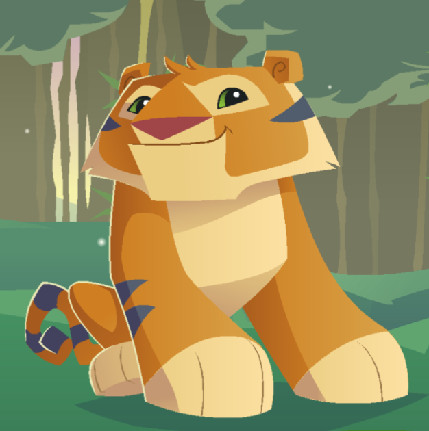
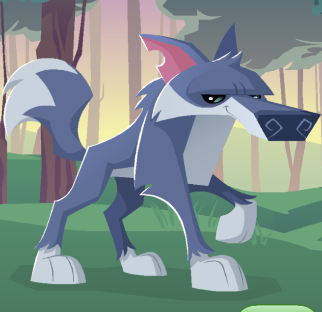
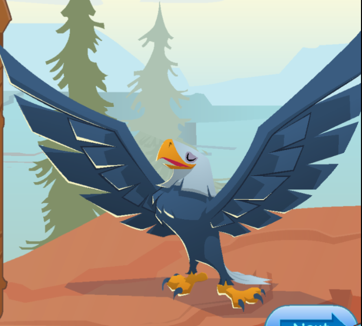
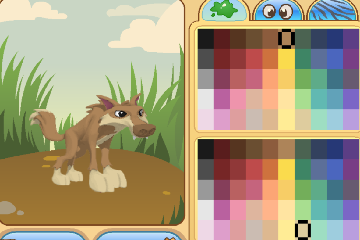
All screenshots taken by me in game (Animal Jam Classic) 2D art featured in game was drawn by Taylor Maw.
References
- Paris, B. (2019, May 22). Lacoste launches new wave of endangered animal polos for species preservation campaign. Little Black Book. Lbbonline.Com. https://lbbonline.com/news/lacoste-launches-new-wave-of-endangered-animal-polos-for-species-preservation-campaign
- Name. (2021). The IUCN red list of threatened species. IUCN Red List of Threatened Species. https://www.iucnredlist.org/search?redListCategory=cr
- and, I. (2019, May 16). IUCN and Lacoste team up again to inspire support for threatened species. IUCN. https://iucn.org/news/species/201905/iucn-and-lacoste-team-again-inspire-support-threatened-species
- IUCN save our species – your partner to protect biodiversity. (2021, March 4). HTTPS://iucnsos.org
- Lacoste x IUCN sos – IUCN SOS. (n.d.). Retrieved 24 October 2026, from https://iucnsos.org/initiative/lacoste-x-iucn-sos/
- The Brand Identity. (2025, November 13). Frontify presents: Mother design and fhirst’s fearless collaboration — The brand identity – home of the greatest in graphic & brand design. The Brand Identity. https://the-brandidentity.com/insight/frontify-presents-mother-design-and-fhirsts-fearless-collaboration
- The great gorilla count. (2024). WWF. https://www.wwf.org.uk/success-stories/great-gorilla-count
- Haugen, A. (2024, August 29). The rarest macaw on earth came back from extinction … barely. A-Z Animals. https://a-z-animals.com/animals/macaw/macaw-facts/the-rarest-macaw-on-earth-came-back-from-extinction-barely/
- Bulmer’s fruit bat: Why is it endangered? (2021, July 22). Our Endangered World. https://www.ourendangeredworld.com/bulmers-fruit-bat/
- South China tiger | species data, facts, conservation, photos – BigCatsWildCats. (2024). Bigcatswildcats.Com. https://bigcatswildcats.com/tiger/south-china-tiger/
- Communications, F. I. U.-D. (n.d.). Slender-snouted crocodiles. Tci.Fiu.Edu. Retrieved 24 October 2026, from https://tci.fiu.edu/conservation-programs/slender-snouted-crocodiles/index.html
- Sand tiger shark. (2021). AZ Animals. https://a-z-animals.com/animals/sand-tiger-shark/
- Estes, R. (2019). Addax | antelope | Britannica. In Encyclopædia Britannica. https://www.britannica.com/animal/addax-antelope
- Madagascar fish-eagle haliaeetus vociferoides species | BirdLife DataZone. (2024). BirdLife DataZone. https://datazone.birdlife.org/species/factsheet/madagascar-fish-eagle-haliaeetus-vociferoides
- Aulawi, M. R. (2026, September 22). How many komodo dragons are left in the world? 2026 Population guide – Indonesia komodo tour. Indonesia Komodo Tour. https://komodotour.com.au/how-many-komodo-dragons-are-left-in-the-world/
- La Palma giant lizard. (2026). In Wikipedia. https://en.wikipedia.org/w/index.php?title=La_Palma_giant_lizard&oldid=1347736235
- Scientists use DNA from poop to save the world’s rarest marsupial. (2026). ScienceDaily. https://www.sciencedaily.com/releases/2026/05/260519224319.htm
- admin. (2021, May 4). Roloway monkey (the rarest monkey in the world). Fantastic Wildlife. https://fantasticwildlife.com/roloway-monkey/
- Kākāpō population reaches new milestone. (2026). Govt.Nz. https://www.doc.govt.nz/news/media-releases/2026-media-releases/kakapo-population-reaches-new-milestone/
- Lacher, T., & Roach, N. (2016, September 8). IUCN red list of threatened species: Santamartamys rufodorsalis. Name. IUCN Red List of Threatened Species. https://www.iucnredlist.org/species/6664/22210948
- Wikipedia Contributors. (2019, November 6). Pygmy three-toed sloth. Wikimedia Foundation. Wikipedia. https://en.wikipedia.org/wiki/Pygmy_three-toed_sloth
- The All The Fauna Team. (2026, August 4). How many red wolves are left in the wild? Only 22-24 in 2026. All The Fauna. https://allthefauna.com/blogs/blog/how-many-red-wolves-are-left-in-the-wild
- African wild dog population 2026: Trends, stability & future outlook. (2026, February 11). Ranger Buck Safaris. https://rangerbucksafaris.com/conservation-experiences/african-wild-dog/african-wild-dog-population-2026-trends-stability-future-outlook/
- Animal jam classic. (n.d.). Animal Jam Classic Wiki. Retrieved 24 October 2026, from https://animaljam.fandom.com/wiki/Animal_Jam_Classic