To stay true to my brand, I have not used any colours and colour gradients that were not used in my brand guidelines. Despite experimenting with colours quite a bit I have realised that the vintage gold and warm brown tones do the best job at creating the cosy atmosphere, and have made the decision to not use any other colour combinations as to not distract the user and to not ruin the old-timey look with anything bright and modern.
Loyal to the guidelines, the logo is placed on the left of the typography, and nothing about it changed from the original apart from the addition of moving imagery. The proud look and the fantasy atmosphere that was carefully crafted within the branding guidelines remained.
The moving image
The logo was already golden and 3 dimensional, closely resembling a trophy or a medal, I added an extra shine animation on top to make the gold look more authentic as well as to make the transition look more interesting and retain user attention for longer. My original idea was to make the Viking logo wink at the end, but I later realised that it would be easy to miss without any sound queues, and might end up being too playful when the brand is suppose to appear stoic.
This product has used a variety of different animation methods in order to familiarise myself with the app. Adobe after effects is very different to the majority of other programs and basic features are needlessly convoluted. The biggest example of this are clipping masks. The shine going across the logo was only within the bounds of the logo due to the clipping mask, however it involved me having to duplicate the logo layer because the clipping mask would make the logo invisible instead of simply putting the shine on top of it.
Clipping mask user error, me not realising how it works at first.
The typography used a simple fade in technique, as I didn’t see the need to complicate it nor bring any special attention towards it as it would never be as recognisable by itself as the logo. The address however involved learning a brand new technique, the fade in technique. I have timed it to fade in as the vinyl record rolls past it, masking its amateur appearance behind a fun and unique visual. These are the setting used and the tutorial I watched.
The options I used for keyframe 1 (left) and keyframe 2 (right) to achieve the desired fade in effect.
The rolling vinyl utilised the rotating transform option with a LoopOut() technique which allowed the rotation to carry on forever saving me having to create a lot of unnecessary keyframes to give the illusion of a loop.
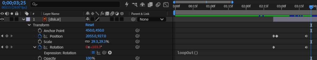
Understanding and appropriate usage of the loopOut() option.
Mobile advertisement
I have recycled a lot of assets for the social media advertisement, most notably the shine across the logo and the vinyl. I originally wanted to create the same fade in effect as the brand asset pack, but realised it would be too much for a short form video and would steal too much concentration from other features which would be more important.
I have decided to do something new, and encourage users to press the CTA by demonstrating it directly. In order to add more depth and make the click look realistic, I have used scaling to simulate depth and make the click look like it physically pushed the button. Adding depth makes it look 3d and therefore generally more interesting for the user.
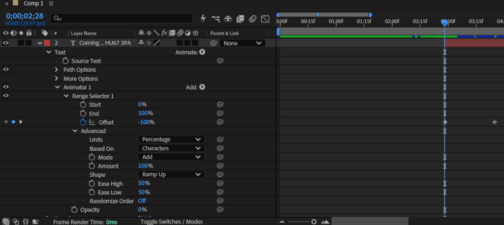
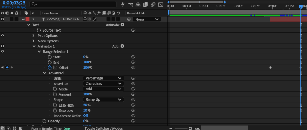
“Coming soon” is ominous and exciting, which is reiterated by how slowly it fades out, giving you a chance to process what you just read.
Pain points and reflection
The process was rather smooth and there were no notable issues. The biggest issue I encountered was the background, I have resolved to using a plain back background because due to the restrictive colour pallet of the logo it was incredibly difficult to find a background colour that complimented it.