Desktop UI
Prototype is accessible here
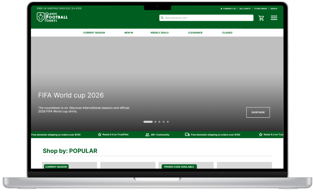
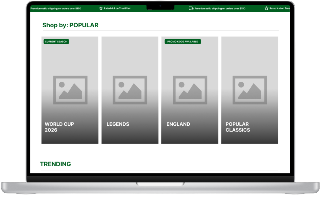
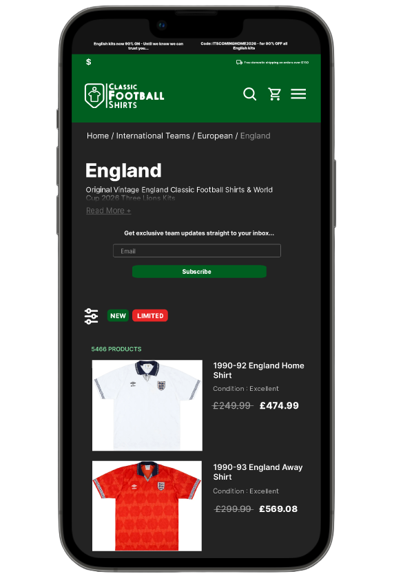
Taking peer feedback into account, I have subtly reformatted the landing page for 2 reasons, to bring attention to the world cup campaign and to make it less overwhelming by scrapping the more miscellaneous features which didn’t contribute as much. I made the popular tabs look more modern with the more upright rectangular shape mimicking other sportswear websites such as Nike whilst making sure they remain plain and in its comfort zone to retain the classic retro look.
Prototype is accessible here
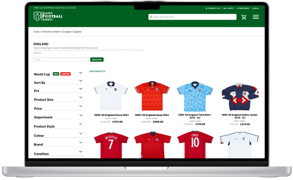
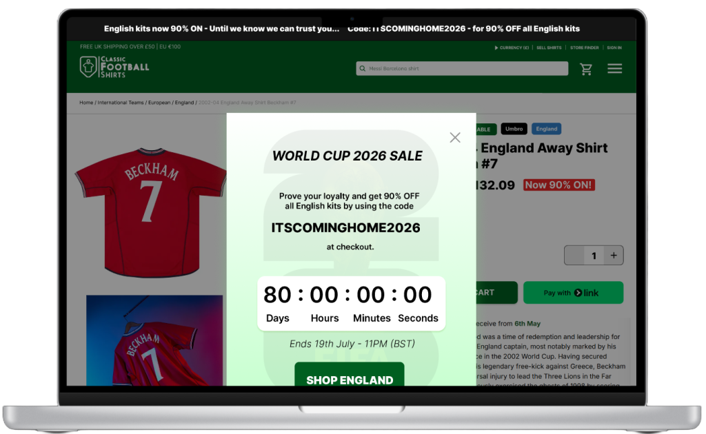
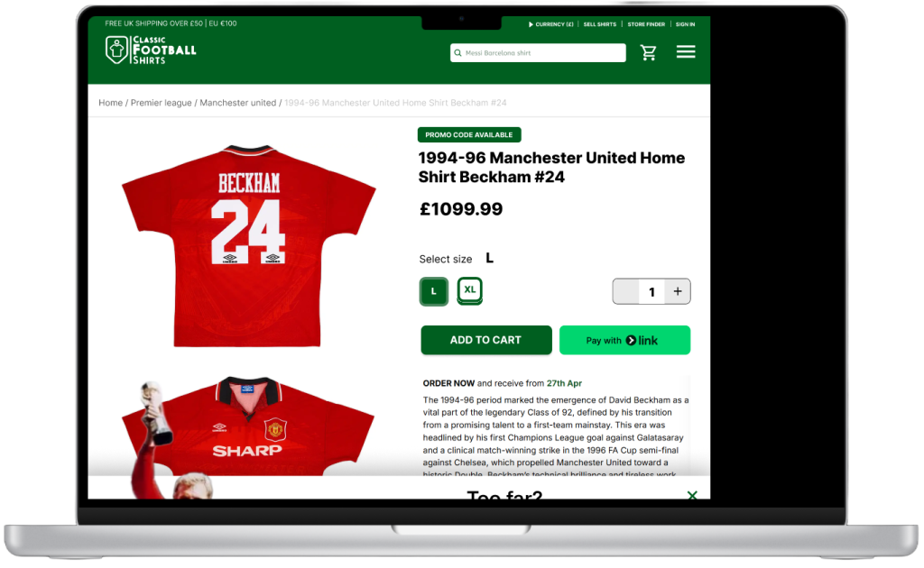
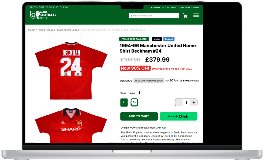
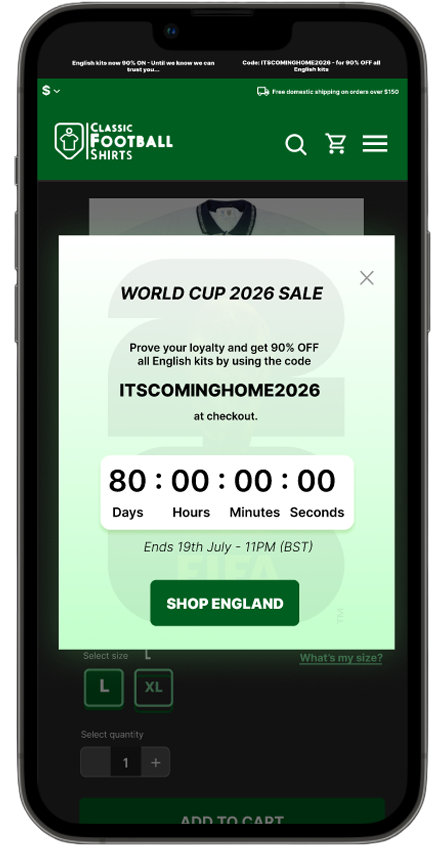
I made subtle changes to the PLP (product listing page) and the PDP (product description page) in order to make the dynamic pricing scheme more prominent throughout the entire website and help guide the user towards the promotional material. Mimicking pre-existing calls to action by surrounding them with a signature green box with dull corners worked very well due to the decision to keep white as the prominent background colour. A similar CTA was added, this time in red, to signify urgency, often used to relay time sensitivity by featuring words such as “limited” and to make the green CTA pop more.
Scrapped attempts
Prototype 1 can be viewed here Prototype 2 can be viewed here
There are a few reasons that these attempts were not finalised. The most obvious one is that I have accidentally used a “desktop” page pre-set that did not work with any of the prototype machine options, resulting in the resolution being very square-like and not properly fitted to any screen. The way I incorporated the promotional material stood out, but very unnaturally. I was clueless and tried to cram too much information into too little space. This ended up with the assets going off-grid and being severely misaligned. This has forced me to simplify my language which I infamously have trouble doing, by directly confronting me with the shortcomings that come with using overly detailed language. It has also taught me to not treat the users as idiots, and trust them to be able to comprehend simplified information (as long as it is worded appropriately).
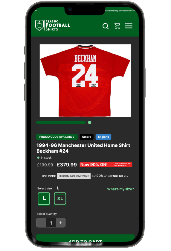
By asking for feedback from peers, I have also learnt that my research was lacking, and the shirt I used in the example has nothing to do with the world cup or even any major international event. Whilst it isn’t a dealbreaker, it felt inappropriate in this context, and it pushed me to compile more fitting candidates to be listed on the PDP and most importantly, pushed me to reconsider and design the PLP.
Mobile UI
Prototype is accessible here
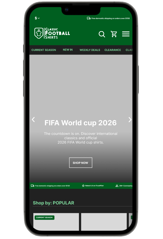
I made the decision to carry on with the mobile UI in dark mode for a few reasons. Number 1 is that a lot of users already have their phone and browser set to dark mode, and it seems that the client is aware of that too and the mobile version of the website is set to dark mode by default. Another reason I chose to do dark mode is for my own growth and to make my experimentation more interesting instead of copying and pasting the desktop UI in a more condensed format. It involved a lot of problem solving, especially when it came to gradients on the side to signify that the user can scroll sideways, it was harder to incorporate than I originally thought, and I ended up learning how to cut a lot of corners which is essential when working on time restricted projects.
Prototype is accessible here
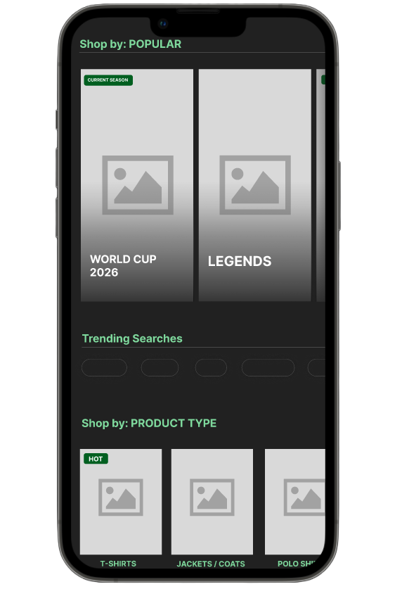
The PLP has the same small additional details, however it doesn’t translate as nicely on mobile as it does on desktop. The CTAs are incorporated naturally, however the big banner at the top has too much information, and therefore had to be severely condensed making it very difficult to see. For continuity, I decided to use the same pop-up as on desktop, because it is very versatile and can easily be adapted cross-platform.
Scrapped attempts
Similarly to the desktop attempts, I did not check the resolution prior and the UI ended up being far too big for mobile, and yet too condensed for tablet, meaning I couldn’t repurpose it. After how long and tedious the process was to change every asset to fit the resolution, proper formatting is now permanently engraved into design process.
The only successful part of the PDP attempt was the scroll setting, I changed it to make it more obvious that you can scroll sideways by implementing an extra circle (similar to the scroll settings on the front page) and rounded the corners to make it less out of place, since the sharp green rectangle does not fit and does not appear anywhere else on the website.
Social media
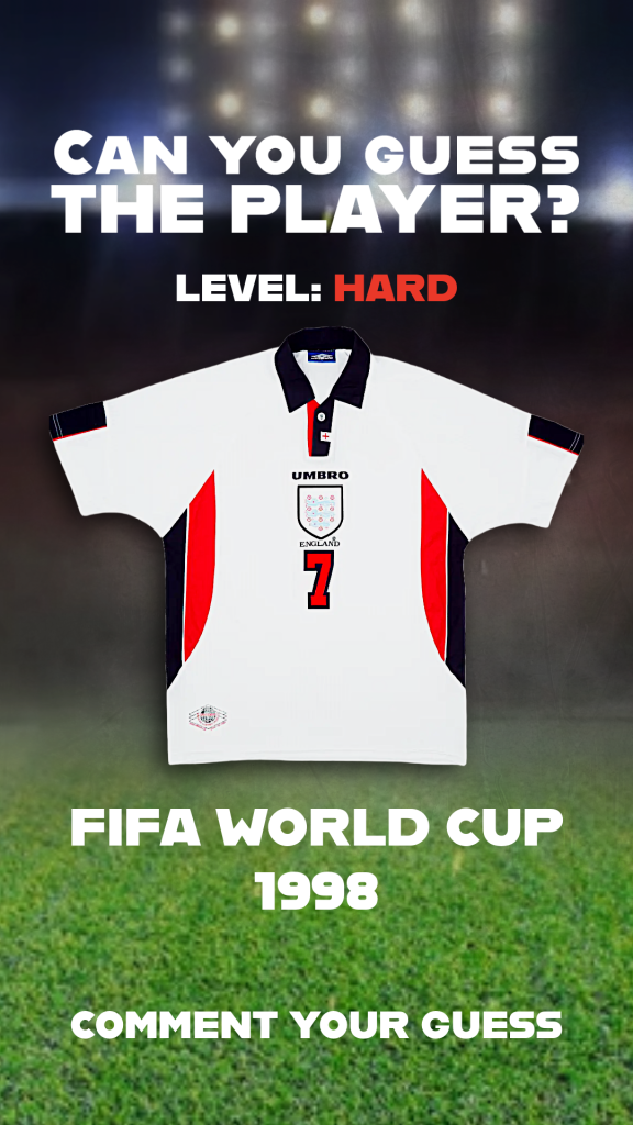
For a moving image social media post I deemed Youtube shorts to be the most appropriate platform. From the marketing team’s research, we have concluded that Youtube is the top social media for “World cup” and “Football”, and although they attempted to compile data for “Classic football shirts” specifically, it came up with very mediocre results across all social media.
The idea was to encourage interaction, either leading to friendly knowledge exchange or banter, or both. The text is bold and easy to read on a detailed background. “Hard” is in red letters to signify intensity and to artificially inflate the difficulty of the game, urging more people to participate especially when they are familiar with the clues or the shirt. It is short form and very cheap to make, and due to there being hundreds of iconic players, it is possible to make hundreds of such challenges. This simple exercise not only boosts the post’s visibility due to it being a requirement to comment, but also helps to reminisce on England’s iconic moments and reveal the theme (world cup) that the users should prepare for more of as it gets closer to the date.
Sourced from: Google trends
The moving image received very positive feedback from the client, especially about the intent of creating a discussion whether it is positive or negative, he has compared it to a different campaign that blew up in popularity due to rage baiting it’s users and creating a heated discussion which artificially boosted its popularity.
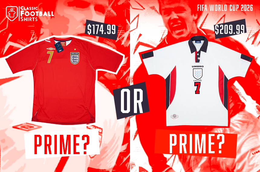
Taking that feedback into account, I realised “engagement bait” is the perfect strategy for a target audience as loyal and fierce as football fans, and therefore the direction of this project was properly born. I made a some front page images for any possible journals and online newspapers that decide to cover the brave choice of campaign. The winning design is purely red and white, which whilst being incredibly far from the typical green comfort zone of the brand, is the colours of the English flag and pas well as the colours of David Beckham’s shirts from 2 instances of him participating in the world cup.
Scrapped designs
These designs were mostly scrapped due to them having little to do with the world cup and were there as a warm up before I got back on track.