Directing a campaign myself was very insightful and helped me take a proper look at the versatile branches of graphic design. I have been tasked alongside another designer to create a campaign to encourage people to eat their 5 a day and design a campaign around that with 2 results: A poster and an animated piece.
Concepts
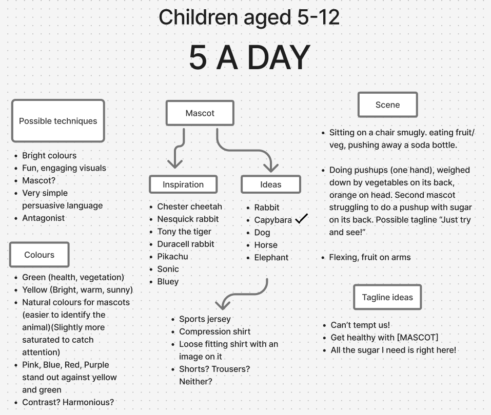
Looking at the NDNS statistics, by 2023 only 9% of children aged 11-18 managed to fulfil their 5 a day requirement, and due to this, this target demographic became our main concern. The early stages of this campaign were tough and in order to somehow turn that 0 into a 1, we had to first consider how to appeal to our demographic. We decided that due to the younger age of our target audience (as well as it being a good technique to maintain brand identity and memorability overall) a mascot would be highly beneficial, which has opened up a lot of paths for this campaign. We delegated our tasks accordingly, his style is very clean so he was tasked to create the healthy, role model mascot. My style is versatile and can get a little “gross”, so I was tasked with creating the antithesis to our healthy mascot.
Mascot creation
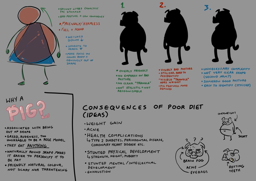
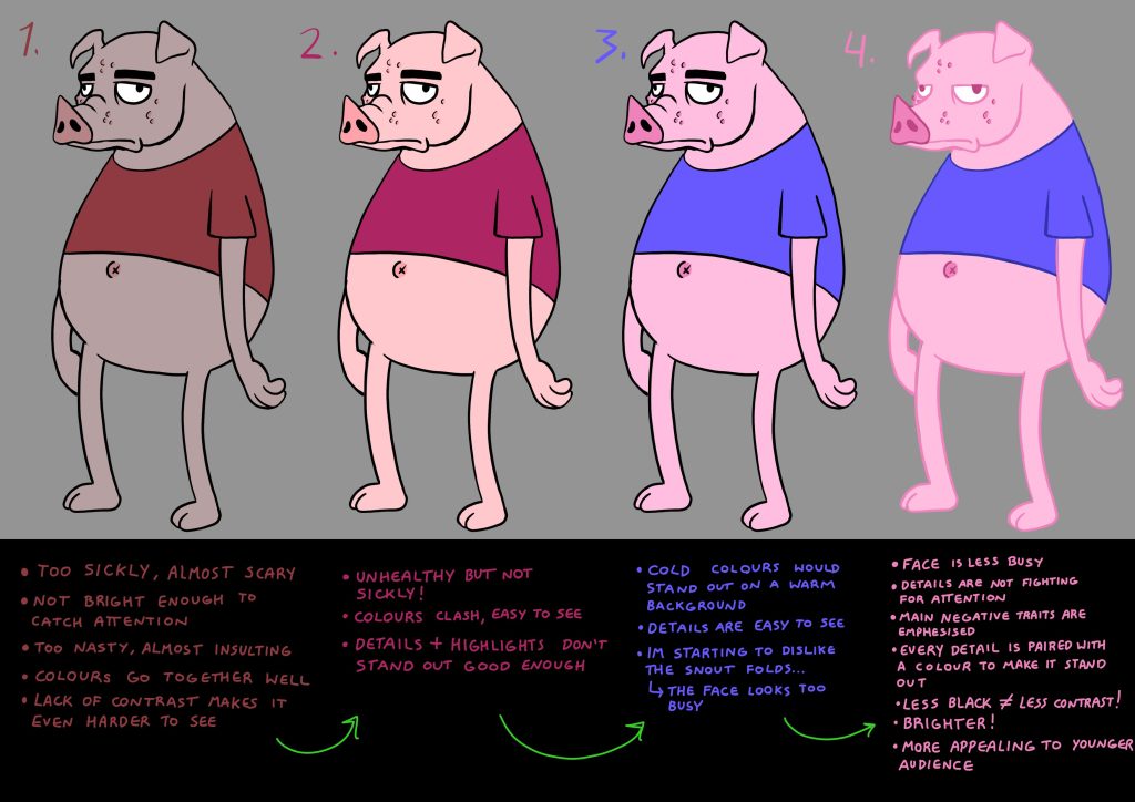
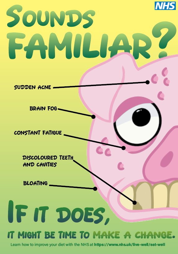
I took shape, tone, lines, and colours into account to create a character who is a personification of bad health and malnourishment. He has went through multiple designs, each being carefully constructed based on his purpose within the campaign, which is to be unlikeable and worry parents about their children exhibiting any of his traits. Whilst considering colours, I realised I have made him almost too scary for the younger side of the target audience, as well as the fact that none of his traits stand out enough. This has caused me to stray away from his original face design and the next prototypes ended up being much “cuter”, whilst still exhibiting bad health
The initial concepts and design justification.
Colour consideration and slight style experimentation in order to better fit in with what the target demographic would be most compatible with.
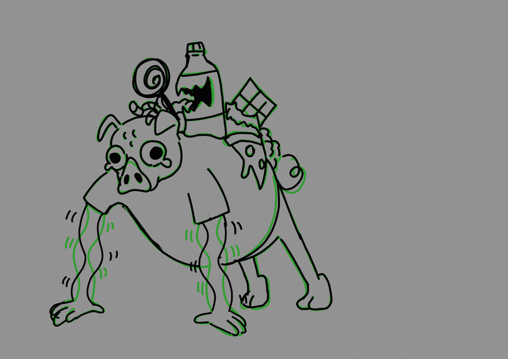
Animated concept shown through onion layers.
Constructing an outcome
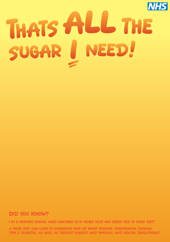
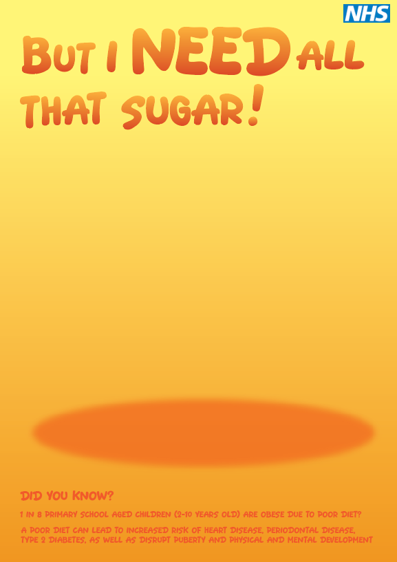
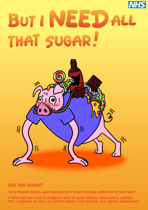
The initial idea is to create 2 very similar posters, but slightly reworded to show how a subtle change of attitude lead to completely different health outcomes. In the middle would be the 2 mascots we created. It was a good attempt but the composition and the hierarchy and most elements did not have a purpose, they seemed like an afterthought and therefore looked very unnatural and not captivating at all. This idea was later scrapped.
Instead I have slightly deviated, and created a more informational poster to gather user attention. The hierarchy makes the eye move smoothly from top to bottom, and elements such as text and visuals have a purpose that they fulfill.
Every mistake and reconsideration during this project has vastly improved my knowledge of art direction and problem solving skills. It helped me stay grounded and focused on the purpose of the campaign and how to shape my concepts into comprehensive visual elements that make my intentions clear and unmistakable.