Early development
The goal of the graphic designer in this campaign is simple: Bring attention to the client’s product and stand out amongst competitors to keep up with England’s increased interest and demand for football merchandise in honour of the 2026 World Cup.
Me and the team decided to focus on pandering to the English demographic and capitalise on their resilience and loyalty despite failure, as well as celebrating the international unity that the World Cup event makes possible. We have also however, considered some pain points that might make it difficult to accomplish. England is not guaranteed to win or even make it far, which means our campaign has to be applicable even if England gets disqualified early on.
First concept
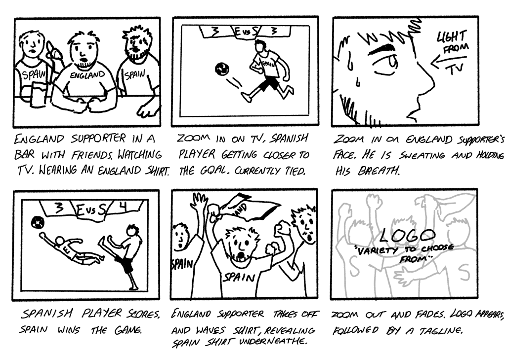
Our first concept was an advert set in a pub, a classic setting deeply integrated into British football culture. The main focus is a man wearing an English football shirt, surrounded by friends/pub-goers all dressed in support of a different team (in this example, Spain) all looking at the tv as England is playing vs Spain. England loses, and despite what would be the initial assumption, the English supporter would take off the shirt revealing a Spain shirt underneath and celebrating alongside everyone else. The end would zoom out revealing the classic football shirts logo, with a tagline suggesting having a wide choice that comes with shopping with them.
This demonstrates a few things. Firstly, despite being loyal to the England, fans can root for a wide variety of countries and teams since there will be games where England is not playing and by human nature we always subconsciously pick favourites. Demonstrating that it is perfectly acceptable to root for other countries brings football fans closer, getting rid of toxic nationalistic ideations and celebrating each other’s accomplishments. Secondly, it conveys just how strong the English resilience and loyalty are. Despite not having won a World Cup since 1966, the fan is the only one that wears the English shirt right up until the final game winning goal.
Pain points
There are however a few pain points that make me rethink the idea, or at least alter it. The same effect from the advert cannot be achieved if we show England winning, despite it being the desired outcome, but it also seems very pessimistic to assume that England will lose, and might ruin morale. Some might consider the England supporter a turn-cloak for having a “backup”, and find it insulting to insinuate that they would turn to easily, although this can be fixed by having the advert play after England gets disqualified, as to not “jinx” a bad season. Another hindrance is that it is going to be difficult to know what countries England will be playing until it is too late which leaves producers with a very tight deadline. To fix this, we can take a different approach, and instead of recreating a real-life play off we can research the country that English fans are most likely to support/switch support to after England.
Response to brief
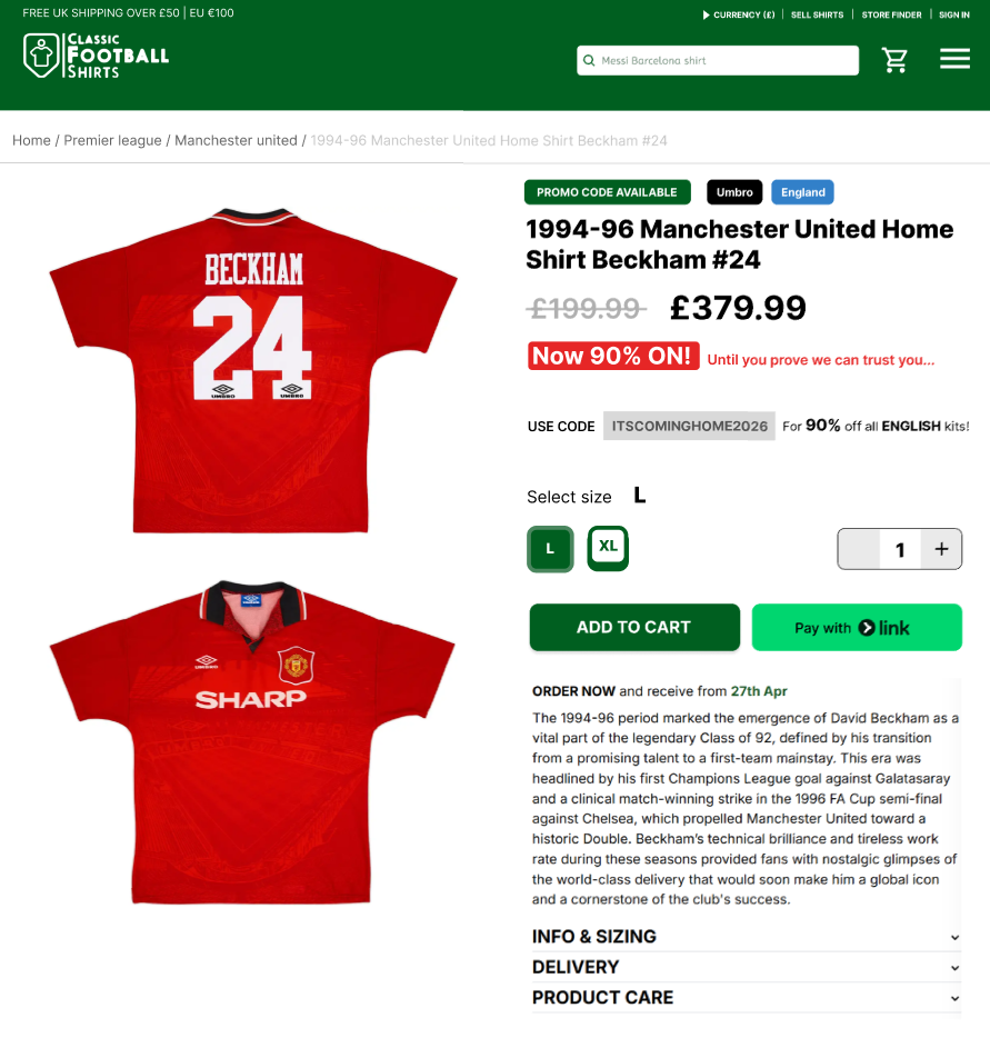
The marketers suggested a much more achievable alternative as a backup, playing around with dynamic pricing to shock and humour headlines all over England. The idea involved making the English kits be set to ludicrous prices nearing/surpassing thousands, followed by a popup offering up to 95% off English shirts using a promotional code encouraging supporting England, taking their prices down to original/discounted original value.
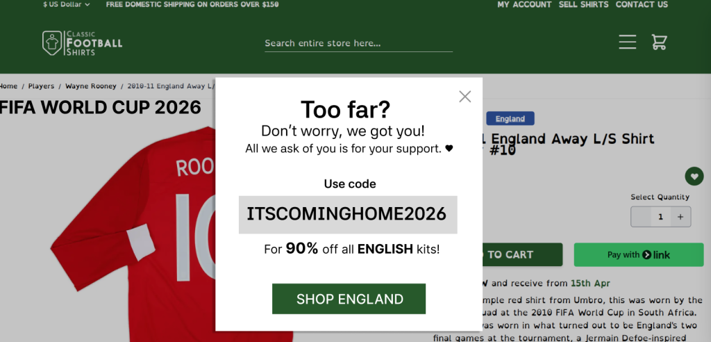
Original draft for the idea. Including the main calls to action.
The main motivator in this direction is humour, possibly using witty language such as “now 90% ON!” in order to make it obvious that the price tag was not user error but instead an intentional marketing design. “Forcing” people to use a phrase supporting England in order to get a proper discount is guaranteed to get a few laughs and solidify the fans’ resilience, perhaps even boost morale or revive lost hope for the English team. Such a direct and aggressive campaign is bound to catch media attention and lead to discussions and interaction, placing it on people’s radars when it comes to English World Cup campaigns.
Pain points
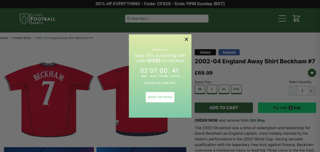
The technique itself is easy and self explanatory, but the issues started to arise when I considered how to actually make the calls to action blend in with the client’s preestablished brand identity. Before May 1st, I have developed a few prototypes that would gradually-yet-obviously lead the user towards the campaign without disturbing the core features of the website.
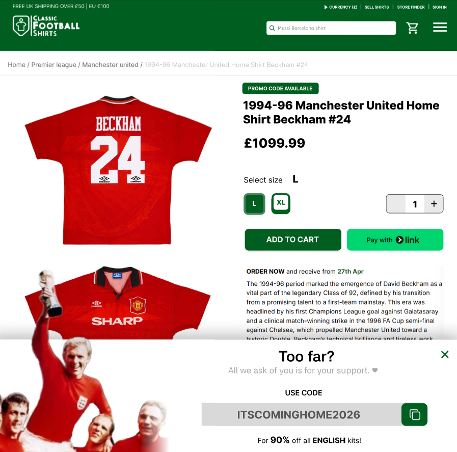
On the right is attempt 1, obstructing the screen just enough to make the user pay attention to the promotional material. On the left is attempt 2, using colour to indicate importance instead of size and therefore making the promotion a little more subtle yet persistent.
The prototypes did not make it to the final stage. Through feedback from the marketing team and peers I have realised that the specific shirt used was very unfitting for the world cup, and neither pop-up had any proper structure making it look very out of place compared to every other asset, and unpleasant to look at.
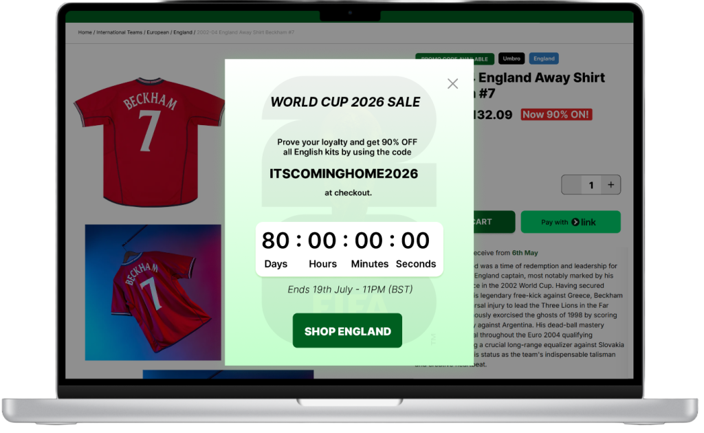
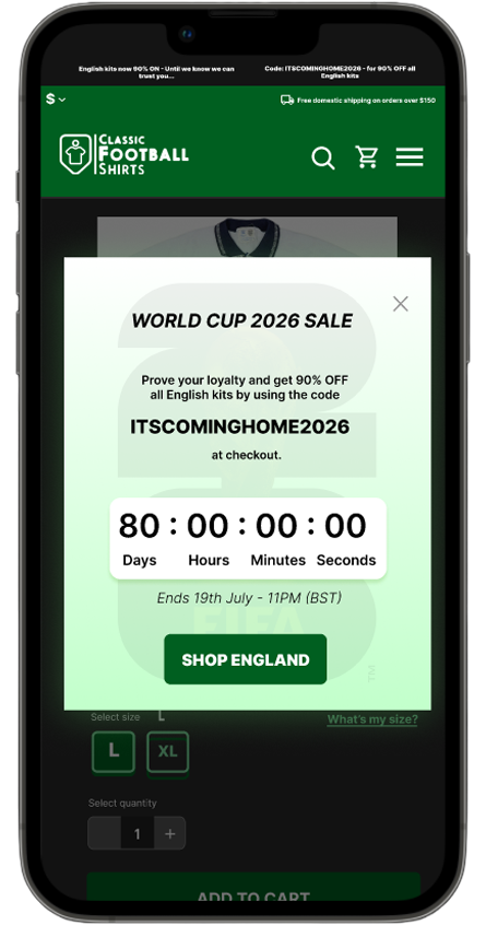
May 1st update
Starting May 1st Classic Football Shirts have released a huge summer sale which gave me perfect insight as to what sales such as these would look like to them. After studying it I realised I have strayed too far away from the original reliable pop-up-in-the-middle-of-the-screen technique which I prototyped at first. This has also given me more confidence in using more colours that don’t necessarily fit the original brand identity.
ABOVE – Original Classic Football Shirts promotional code pop up May 1st 2026. BELOW – My renditions of FIFA 2026 promo code sale.
All prototypes can be viewed via this Figma link.
Without this convenient sale I wouldn’t of made the brave decision to step so far out of the brand’s comfort zone. The only typeface used throughout was Inter, only varying in weight depending on the context. The title and text were extra-bold to make it easier to read on a high-contrasting background making it much faster to comprehend which might deter people from pressing X right away (the big idea is to make the X appear only after a few seconds anyway, just to make sure that the promotion was understood). The italics were a last resort at making the deadline not overshadow the main promotional message, especially since a deadline timer is already the most prominent asset, the deadline just saved users having to do math.
The timer directly confronts the user with its limitation, creating a sense of urgency even if they have a very reasonable amount of time left. This call to action subconsciously makes the user less hesitant to check it just to make sure that they don’t miss out on any potential deal that they might love that they won’t be able to get again anytime soon.
The colours (specifically the unique white to green gradient) are not seen anywhere else on the website. It is very distinct due to the use of gradients yet also perfectly fits with the rest of the website since white and green are very prominent. It also instils a very soothing feeling due to the low contrasting desaturated colours and the high taper gradient, since the visuals themselves don’t need to be as aggressive as the campaign itself.
Reflection
I was fortunate to back up the marketing team and visualise our concepts. Their feedback was irreplaceable when it came to concept development, sharing input that I’d not have considered if this was a solo project, such as dynamic pricing and how it works which is something I have never researched prior. Peer assessment from people more knowledgeable on the sport than me has also saved me hours of research and made it easier for me to adapt to the intended target audience and ensure that they are aware that this campaign, despite its aggressive patriotism, has the fans’ best interests in mind and is actively getting involved with the community, showing a more human side of the brand whilst getting excited to support the players alongside everyone else.
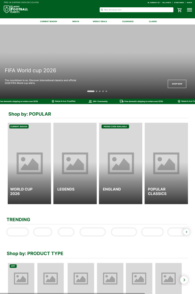
All the wireframes were created in Figma, as I carefully reconstructed the webpage layouts of both desktop and mobile platforms with subtle changes based on prior feedback. For example, the most reoccurring piece of feedback which I addressed before was that the landing page is “too organised”, and as of approximately a month ago they got rid of the FIFA world cup banner which was a very confusing choice. Because of this I have reimagined the landing page, brought back the world cup banner in order to keep people interested in the main event of the year and clean up by getting rid of any useless/less profitable tabs (more on redesigning in “Design Portfolio”). My next step would be to redesign the product listing page to attract more attention towards the campaign.