Classic football shirts originally started out as a very ambitious passion project, fuelled by the irritation that the owners felt when being unable to get their hands on an original 1990 West Germany shirt. Their goal is to make collecting classic kits and receiving information about them way more accessible. It was difficult to make the project take off, since the owners were still in college and took a huge gamble, deciding to buy out every stock of retro classic shirts that they could find and use their college flat as the warehouse and eventually launching the website in 2006. It was tough powering through the difficulties of being a very underground service, but the business kept growing through sheer dedication.
Target audience
Their target market is very versatile, ranging from passionate college students (just like how the owners were themselves when starting the business), to middle aged and even senior users filled with nostalgia, and anyone in between. This is accommodated by the wide selection of kits from 1970s to present day, as well as a very generous selection of sizes. Their goal of owning “at least one item for every recognised team, however obscure.” demonstrates their devotion to the art of collection and football as a whole, as well as their desire to not leave any football fan excluded. They also offer a multitude of shirts in women’s sizes, as well as having shirts from women’s teams such as the lionesses, broadening their target market even wider.
Visual analysis

The main and most recognisable colour is a saturated dark green, which only ever allows white details on top of it. This heavily resembles a football field, which is a very unique yet subtle correlation to the main theme of the business, and subconsciously communicates that to the user. Green is also very tame and trustworthy, socially representing friendliness and calmness for centuries, it communicates to the user that the brand is not just a stern profit-driven business, it is also a friend to all football fans.

The logo is very simple and recognisable. The shirt is the biggest giveaway of what the brand focuses on, and the fact that it has a person in it makes it much more personal, conveying it as a business focusing on their customers. The typography however is a mess, it has 3 different fonts that do not work together at all. Its strength is that the word “football” is the biggest and most bold, since football is the most vital part of this business. The other words are a huge weakness, “classic” is made up of only outlines, however the word is too small for people to notice that at first glance, and creates a distraction, this could of been fixed if instead of outlines, the word “classic” and “shirts” were the same type and font, with “football” still being the most visible on the hierarchy. The shape surrounding the logo helps it have a more simplified shape, as well as looking like a price tag suggesting that the store is e-commerce.
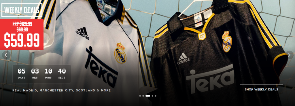
The advertised shirts on the landing page never have a person wearing them. It is unclear exactly why, but it could be they the shirts belong to specific players, and people know exactly how they look on those players and don’t want anyone else to advertise that player’s shirt, since it carries a piece of their history with them. It could also simply be that they do not want the models to distract from the product.
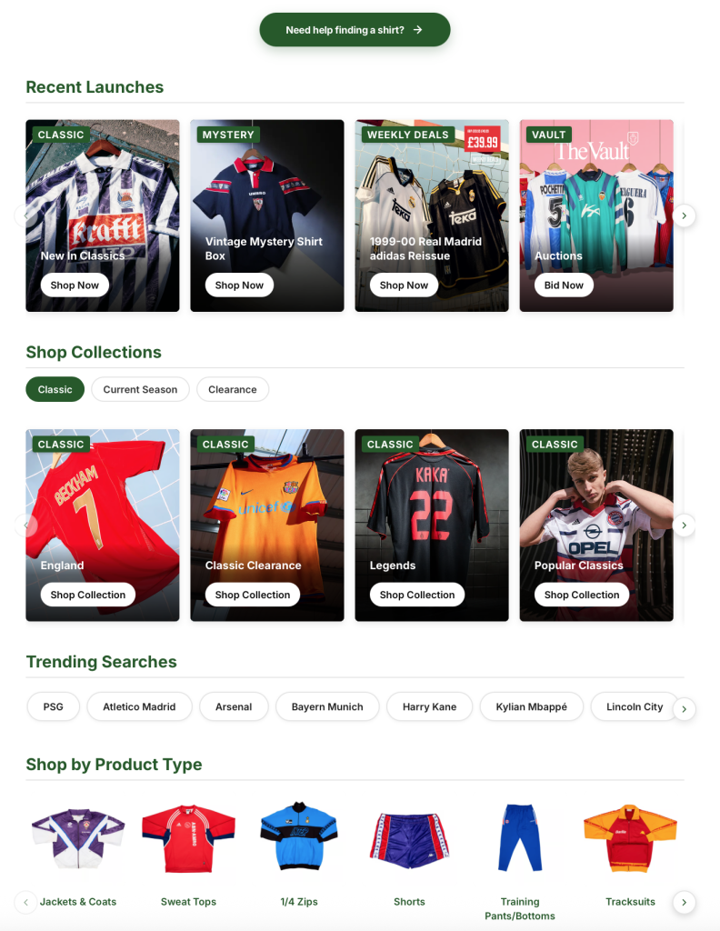
The website is very condensed, it overflows with information and categories to make it as easy as possible to find what you are looking for, however it ended up being very overwhelming and disorientating. This reflects the passion and knowledge that they want to share with their customers, but it can be very harsh to get started with a multitude of options, giving the user decision paralysis (being unable to choose due to being presented with too many options).
Marketing evolution
When business was at its lowest, with no social media access to quickly advertise new stock, the owners had to scramble for money in order to send in their request to have the business advertised in popular football magazines at the time. This was the catalyst that turned their business from an underground service to an official licensed business with multiple loyal returning customers. It was not long after that they rented out an office space in the city centre to use as their official base of operations. This also allowed them to launch a new clearance category, allowing fans to receive shirts at incredibly discounted prices which made it much more accessible and made the website pick up traction like never before.
In 2015, they were working with a multiple clubs and brands, and with the growth of social media, their customers have started to spread the word around via posts of them with their historical attire.
“Around this time we ran our first pop-up shop at an AC Milan legends match in China and fulfilled a childhood dream a year later on our 10th anniversary, sponsoring the World’s First Football Club Sheffield FC. It signalled in an era of evolution for the brand, starting with a new logo, an overhaul to the website, and eventually a new tag line – ‘The World’s Biggest Collection of Football Shirts’.”
Doug & Matt, “Classic Football Shirts.” Classic Football Shirts, 2017, www.classicfootballshirts.com/about-us. Accessed 9 Apr. 2026.
Their business has officially been recognised as the top seller of legitimate football shirts, now sponsoring many clubs such as Burnley and Parma. By 2023, they have had the privilege of meeting David Beckham, and guiding him through his entire football career in shirts. This moment was historical to them, having grown so far that they had the opportunity to face an English football legend, every step carefully strategized and taken towards letting the world know how much they love football.