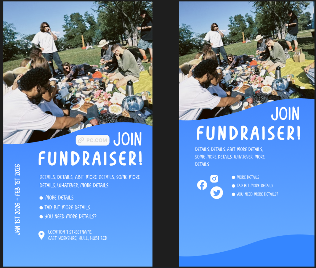
(L) Instagram
Unfortunately I have lost access to the original mock-ups that I was using for the low fidelity prototypes, however I still had the resources to recreate the Instagram and tiktok mock-ups in figma. Because of instagram stories forgiving safe space, I could use close to the full canvas. Just like in the website, I was very strict with the colours and typography used. Because of how much negative space I ended up with, I could afford to include extra information like the date on the side. I took advantage of the elements that instagram stories have to offer, and used the link feature to fill out more negative space and create a more appealing shape for the title whilst aligning the text in a more organised and satisfying manner. The link option being in this location is also very convenient because it’s easy to spot and due to the difference in appearance it is easy to recognise it as an interactive UI element and makes it easier for the user to be redirected to the event without having to manually search for the link themselves.
(R) Tiktok
Tiktok safe space is very unforgiving, so placing elements requires a lot more consideration. It still heavily resembles the low fidelity prototype, apart from the assets being replaced by higher quality ones. There is not a lot of extra elements that can be added since the low fidelity has already practically reached it’s limits with negative space. Instead, using the brand guidelines, I have better adjusted the elements to make them more suitable to the brand. I did not need to add any interactive elements since tiktok already provides those as a part of their UI on sponsorship and advertisement posts. In order to somehow try to make the post seem more interesting despite the limitations, I have included logos for other social medias which vary in shape and size. This both keeps the post slightly more interesting and stimulating whilst still remaining relevant, since it provides information to the user.
Uniform / merchandise
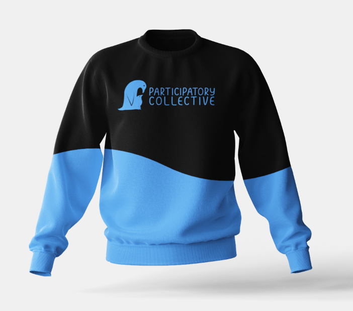
I have made 2 versions of the staff uniform. I switched from a jacket to a sweater because it seemed more suitable, it appears less aggressive and way less restrictive as well as less overwhelming due to its lack of finer details. The version on the right was created first, it is very minimalistic and looks more humble due to how the logo is not the centre of attention due to it’s small yet meaningful size and its placement away from the middle. However, when thinking practically, it is not a good idea to make the logo easy to miss, so the second design has been created in order to fix that problem. The design on the left has fixed this issue by a making it centred and bigger, in order to make it more accessible for people who can’t see from far away and in general makes the logo more prominent. The familiar wave is present at the bottom of the sweater. The colour contrast between the blue and black draws attention, and is more likely to be noticed in the crowd due to that.
Merchandise
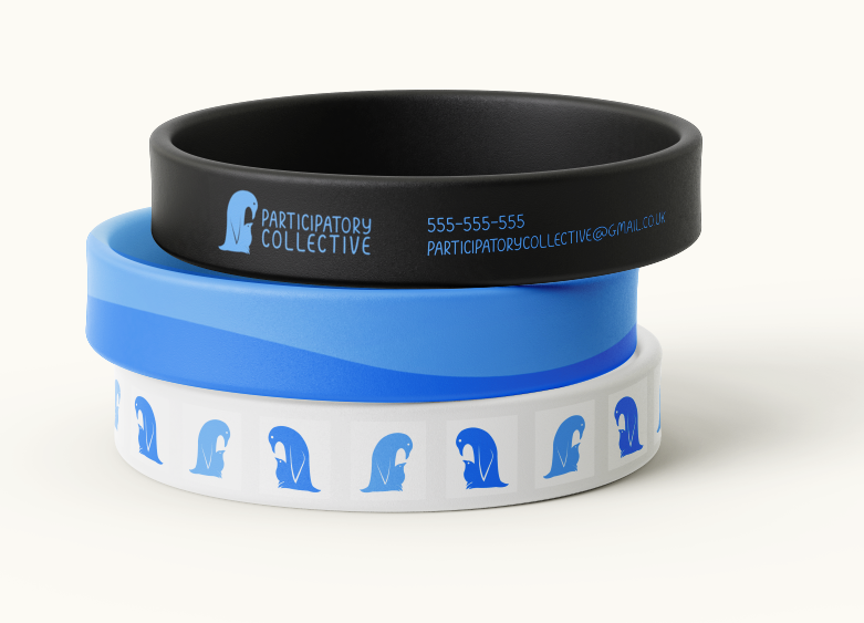
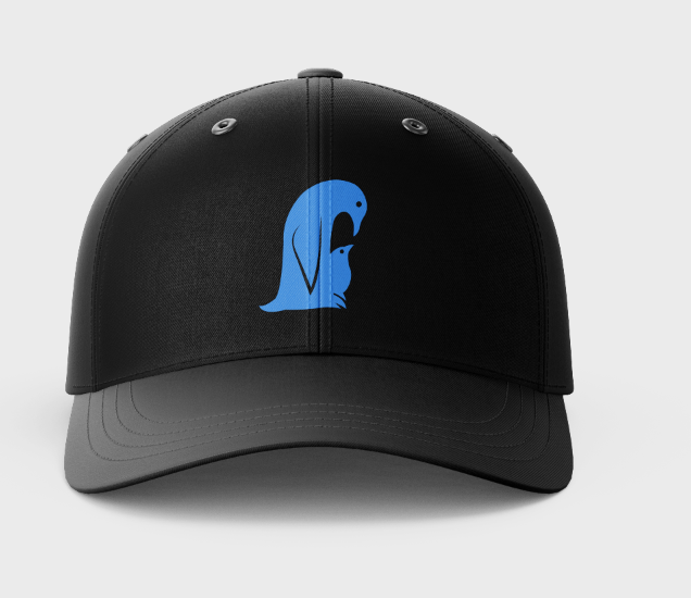
Small and easy to produce bits of merchandise can be used as a token for the user, a physical representation of their contribution towards making a change. The colour constancy makes these tokens seem more personalised, and that it is genuine gratitude from the collective which makes it way more people and community orientated. There is also a small but visible variety of colours and designs, giving the user a choice which is one of the most important values that the PC are aiming to instil, showing them that their opinions and personalised experiences matter. It is also a very good way to limit test the practicality of the branding guidelines and seeing how well the brand holds up when on different medias. Through the wristbands, I have made certain that every element still easily refers back to the Participatory Collective.