Brand guidelines
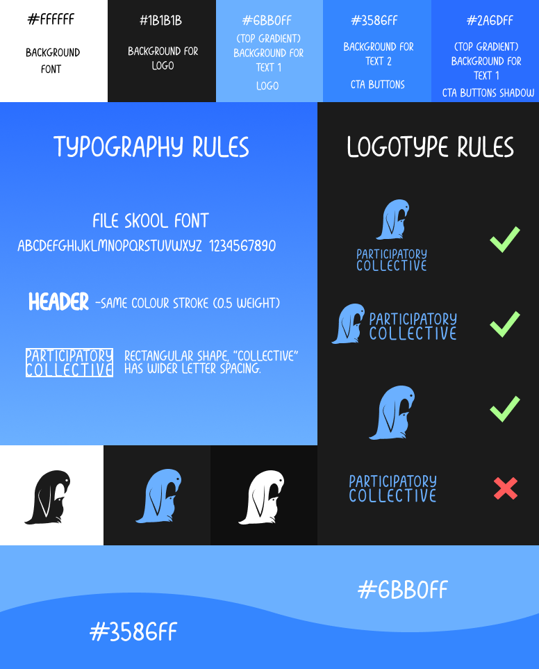
The colours I have decided would work best are blue and black. This gives the brand a very modern feeling, though due to the low saturation of the blue used in the logo it does not appear aggressive. The black was used to calm the eyes, since the specific code was #1b1b1b instead of #000000, the lower saturation helped create a more comfortable and familiar “dark mode” effect without creating a deeply saturated contrast between the blue and black which could hurt to get used to look at. The brand is overwhelmingly blue in order to create the association within the user between these specific shades and the participatory collective.
The most recognisable element of this brand is the blue wave, which is prominent throughout the entire website as well as being present on merchandise and social media. The simplicity makes it easier to remember and paired with its signature colour, it has become very easy to identify.
The logo is of 2 penguins, 1 taking care of another, this symbolises multiple things. Penguins are very social animals and can only survive the unforgiving cold in Antarctica as a group, This fits with the emphasis that the PC have on community. In the logo the penguin is helping the chick, whilst it can be mistaken for a brand of animal preservation or even a nursery, it symbolises care and puts even more emphasis on community, since taking care of the chicks is a group effort. The chicks (in this case, the people that seek help) are not infantilised, they are simply represented as inexperienced in surviving the harsh environments (an unaccommodating society) when they do not have the same capabilities as the other birds.
The logo is somewhat versatile depending on the context in which it is used. The text can be either below or on the right of the logo, and the logo can be used without the text present. However, the text without the logo cannot be used, it is nowhere near as memorable as the logo and seeing it without will not benefit anyone.
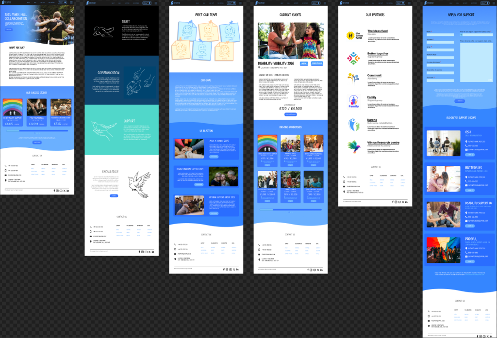
Desktop
To see the prototype in figma, click here
Mobile
To see the prototype in figma, click here.
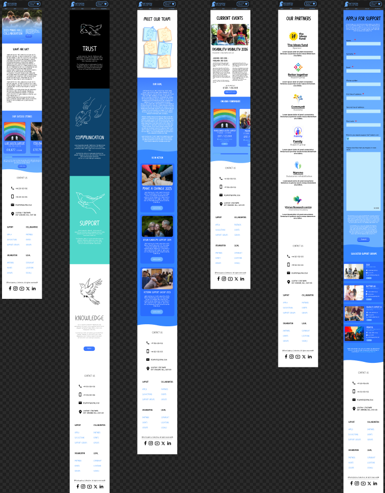
I expanded on the mid fidelity prototype by gradually replacing assets whilst looking at the inspiration images that we were given of the client’s preferences. Both the shapes used in the assets and the typography is very round to appear friendly and non confrontational, whilst still retaining a very organised layout to still appear professional. I have used free unlicensed images from Freepik (for logos for the partners page) and Unsplash (for photographs) in order to stay true to making sure this project remains fully ethical.
I made sure to make every page flow naturally in order to keep the user on the website for longer. This was primarily done with the shamelessly repeating inclusion of calls to action, which encourages the user to either read further, or contribute to the discussion themselves which is one of the main goals that the PC is trying to achieve. Every interactable UI element is large in size and possesses a unique shape and colour not found anywhere else on the website, for example the buttons and the scrollbar which are very rounded and are a blue colour that is not used on its own in any other case. Redirecting elements like the example fundraisers posses a dark border to help organise the image and writing into 1 single element as well as hinting to the user that it is interactable.
The website keeps consistent. Every colour and element mentioned in the brand guidelines is strictly used for their intended purposes alone, this helps with organisation and making sure that the user stays focused on the information they are receiving from the website rather than trying to comprehend what is going on. It also helps with assuring the user that they did not accidentally click a link that redirects them to a separate website.
The only time in which the file skool typeface was not used was when mentioning the partners and collaborators. This has shifted to tone to ensure that they are taken seriously and remain their own identifies.