The story on the website is suppose to complete 2 main objectives: Accurately portray the values of the Participatory Collective in action, and to make it linear and easy to comprehend whilst vaguely relating to a wide audience. This will be achieved through care emotional manipulation within the user focusing on colour, style, and composition.
Draft 1
This draft expands on my initial idea to base it off of the “nuggets” short. Though instead of spiralling deeper, the bird would be helped instead.
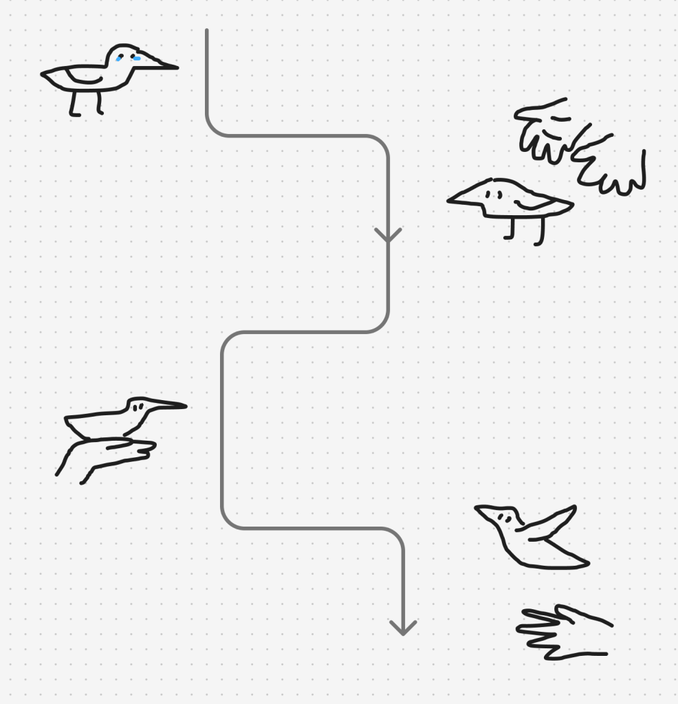
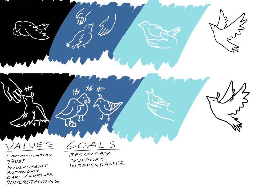
I have created 2 versions, one which shows a story of recovery and one which is focused on showcasing the values individually to convey the attitude the PC has towards its users.
The first one is simple, and very versatile. It is vague and easy to relate to whilst showcasing the process of recovery with support. However due to how vague it is, it might be difficult to showcase the values through it. The second is is more complicated and less vague, it has clear imagery which can speak more directly to the user, which I can utilise and
“Why use animation?” The inclusion of a subtle wiggle effect can actually completely change the perception of the art, as well as contribute to the story. From a UI perspective
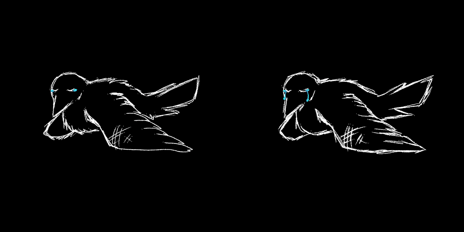
The first bird, the colours are very dull and dark to represent rock bottom and the art style is very rough, sketchy and “low effort” to represent loss of passion.
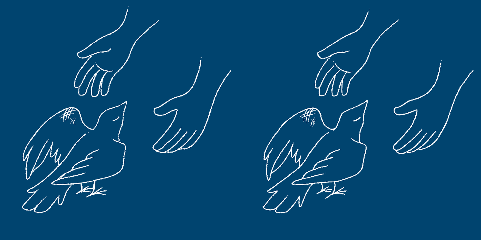
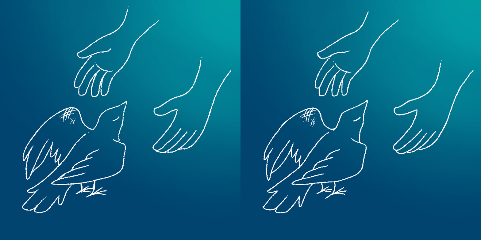
The melancholy blue makes sure that it is clear the conflict is still not resolved, yet is an upgrade from the prior black void. The lines became a bit cleaner and more composed, hinting at better emotional regulation when presented with support. I have made 2 different versions, 1 with a plain background and 1 with a slight gradient. The gradient helps to represent what exactly is going to bring light back to the bird (that being the support system that the PC provides), however I was not sure how I would be able to integrate it, so I made a solid colour version just in case.
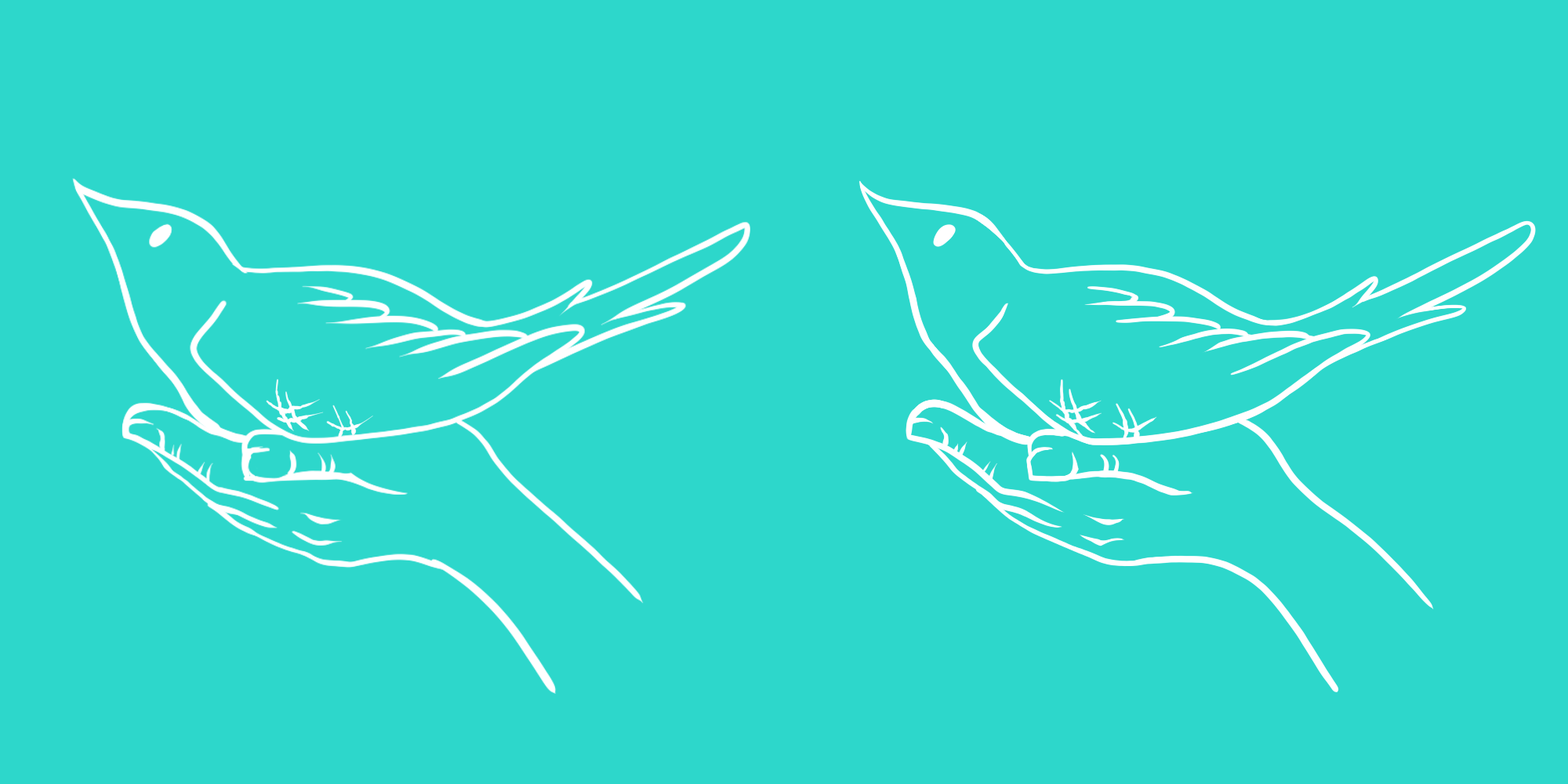
The colour became much brighter, the art style is now smooth and clean. The art itself is now more detailed, showing the transition from apathy and not caring about small details to rediscovering the beauty in the world. The Injury has become smaller, showing the lack of emphasis on it compared to how it was at the start.
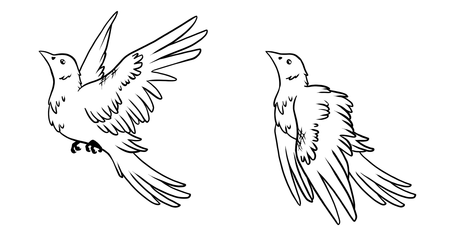
The final stage is bright and detailed. The overall shape is now much smoother and the animation (excluding the wings) is now very subtle to contrast the catatonic spasm like movements at the start when the subject was at its lowest.