The core of a brand identity is the visuals that you associate with the brand. Through careful use of colour, composition, tone and typography, I can manipulate exactly what emotion my logo invokes.
For the logo, I have decided on the key word being “flock”, heavily associated with companionship, teamwork, communication, and most importantly community, which is one of the key values of the Participatory Collective.
I have compiled a good selection of scamps of all different styles, each focusing on a different value in order to make a wider variety to choose from. This sheet shows my thought process and the evolution of ideas.
Logo
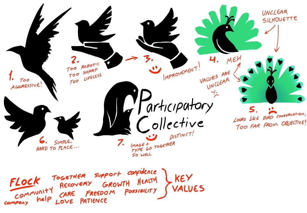
Out of those examples, I have picked the best suited ones based on the connotations and shape that I considered to be most suitable to represent the values and attitude of the Participatory collective. The next step is to make branding guidelines, or at least start considering some stricter colour schemes in order to make sure that the brand always represents exactly what the Participatory collective needs it to represent.
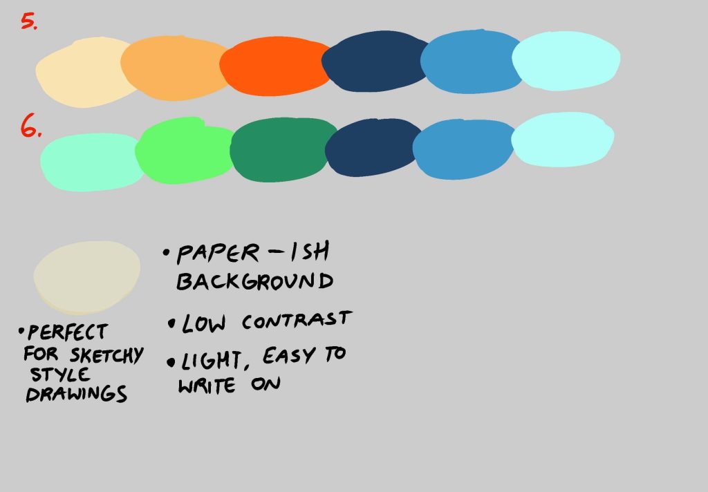
It was also time to expand on my idea of visual storytelling, on the theme of recovery and healing shown via colour. For this I need to carefully pick out colours to represent every stage of the process appropriately.
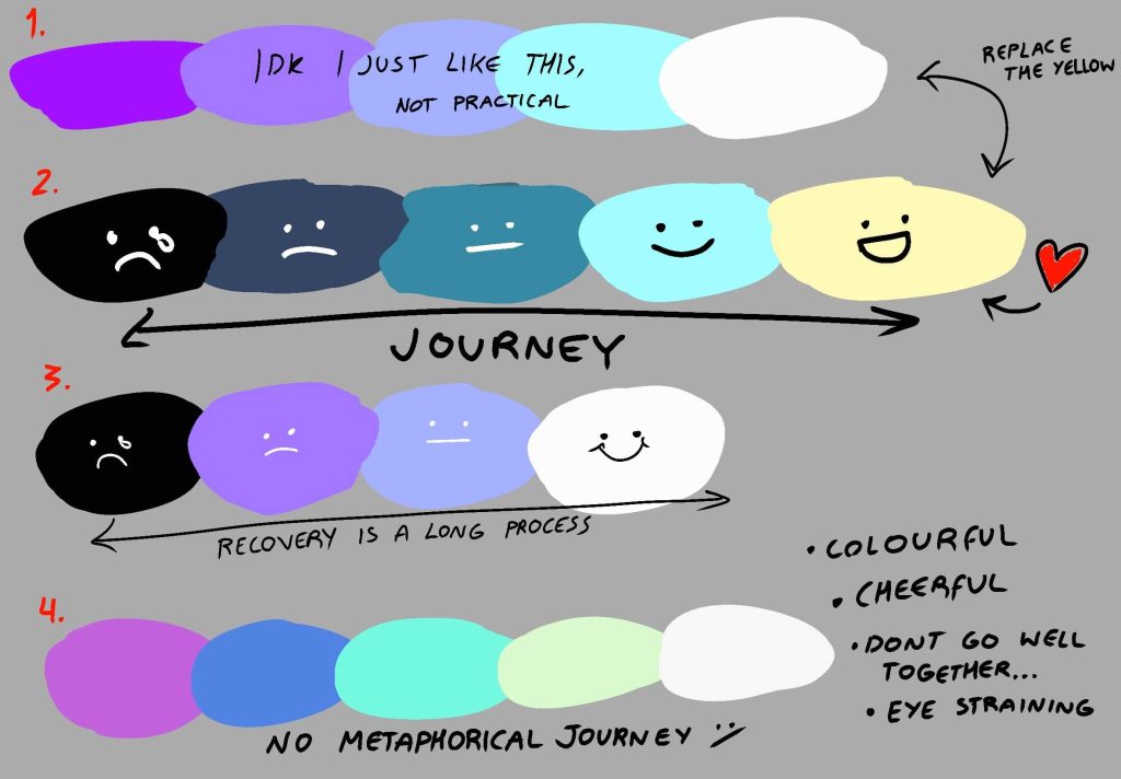
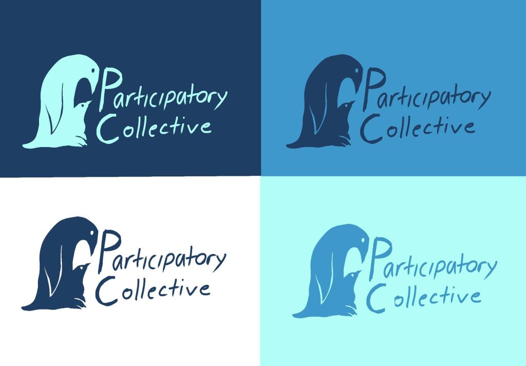
Example 1) The colours are muted and pleasant, however, due to the penguin imagery used it has accidentally created a more arctic and cold theme, which is the opposite of the feeling that I have tried to invoke. It has also derailed off the original topic and now looks more like it is focused on animal conservation.
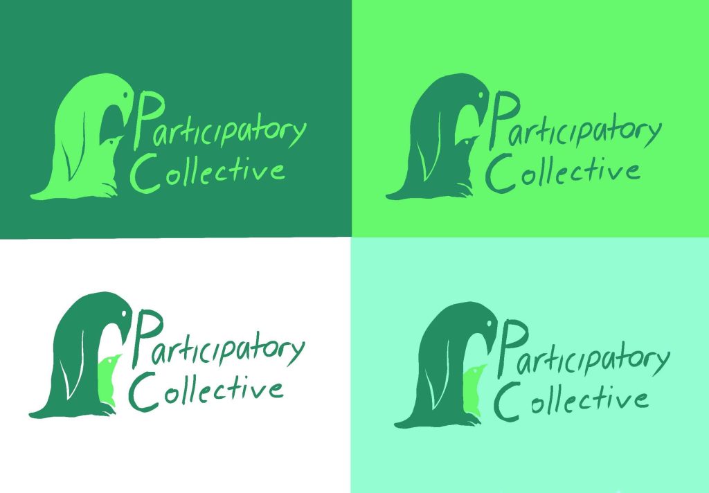
Example 2) The green colour is jolly and warm, however the connotations of eco-friendliness have made it look like the brand is focused on sustainability above all else.
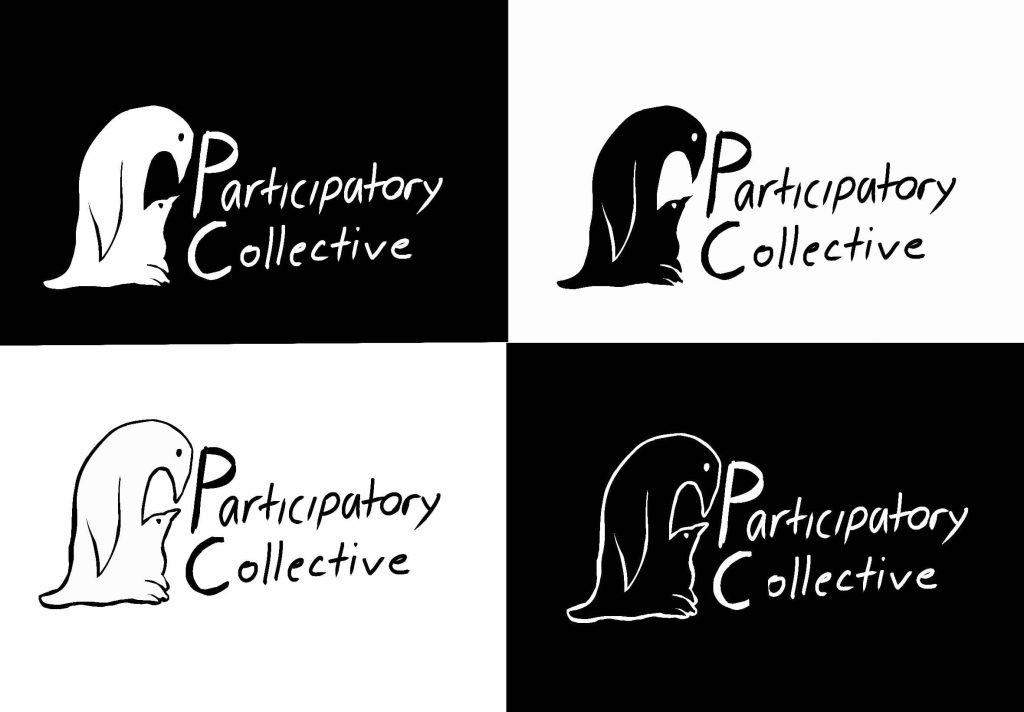
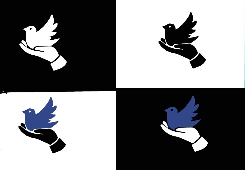
Example 3) The black and white look very modern, clean and professional, but too “corporate-like” to reflect the values and attitude of the collective.
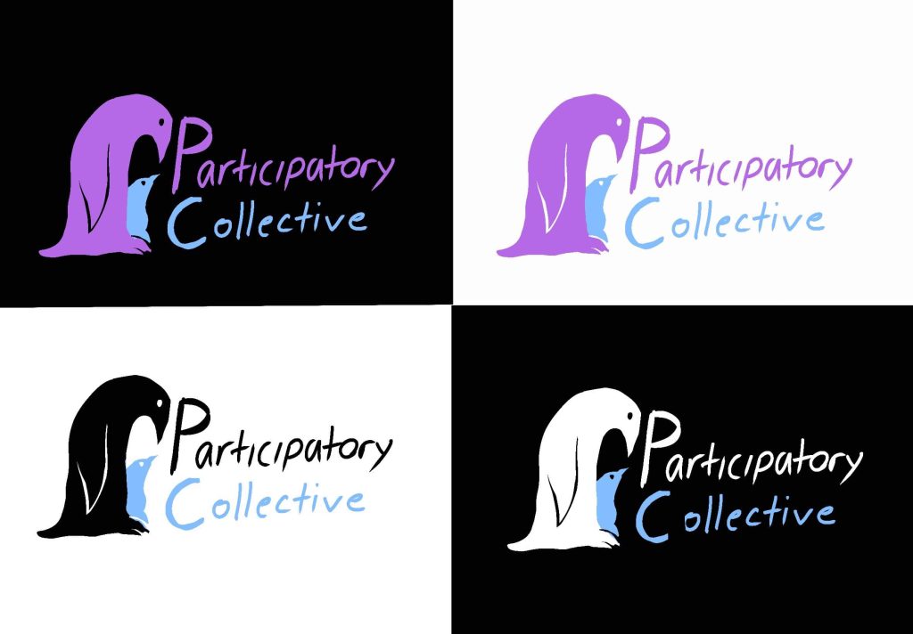
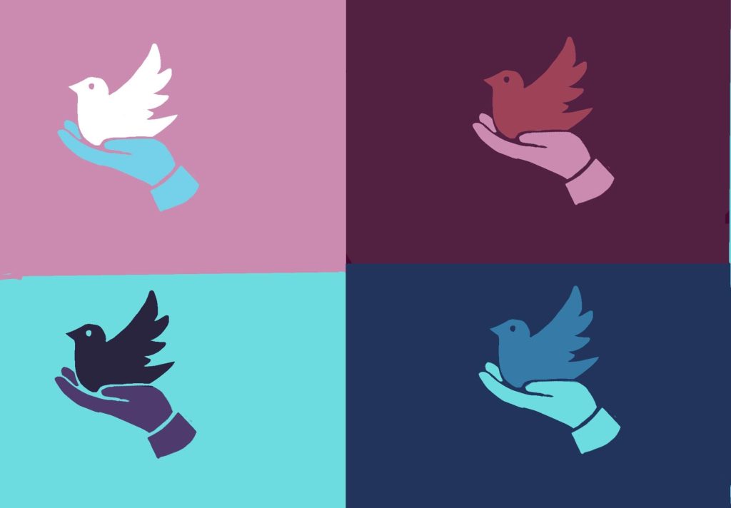
Example 4) Adding colour has helped bring emotion into the logo, by representing the penguin in a warm, comforting purple and the chick in the cold blue, it helped to convey the purpose of the collective, supporting those that need assistance.
Example 5) I decided to experiment with the other successful logo, just to see how it would look in different colour formats.
sad
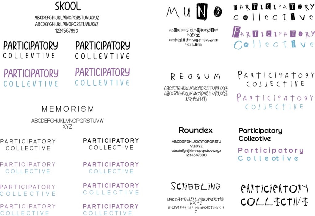
Typography
A typeface can drastically change the route in which the brand leans towards, and can represent as much emotion as the logo. I have chosen a few suitable typefaces for the vibe, and target audience of the participatory collective.
Some of the type faces like those on artboard 1 (left) are more suitable to be placed alongside the logo, making it complete whilst being easy to read, professional, and yet having soul and personality to not come off as cold and corporate-like.
Artboard 2 on the right instead takes a more artistic and expressive route, more focusing on possible usage outside of the logo, for example if used on a blog talking about someone’s personal experience. A drastic typeface change can be risky, but it can also have a big payoff, making it seem personalised to someone writing a recount of their experience.