Visual storytelling in websites aims to take the user on a journey with them, to make sure they have a deeper understanding of each other and to be able to provide necessary information to the user in an organised, chronological order.
The formula for visual storytelling is always the same, setup > structure > finale.
Designers use all visual tools to help them create a story, with careful considerations of all elements such as colour, tone, shadows, shape, size and composition. Unlike written storytelling, this form relies on invoking strong but comprehensible emotions in the user who will then be tempted to fall for the call for action to find out more.
News CGTN – Example analysis
The Danube: Life of a river is a visual informational story about the history, importance, and struggles of the Danube river. The story starts with the bird’s eye view of the area which the Danube river crosses, informing the user of what the topic of the website actually is for those unaware.
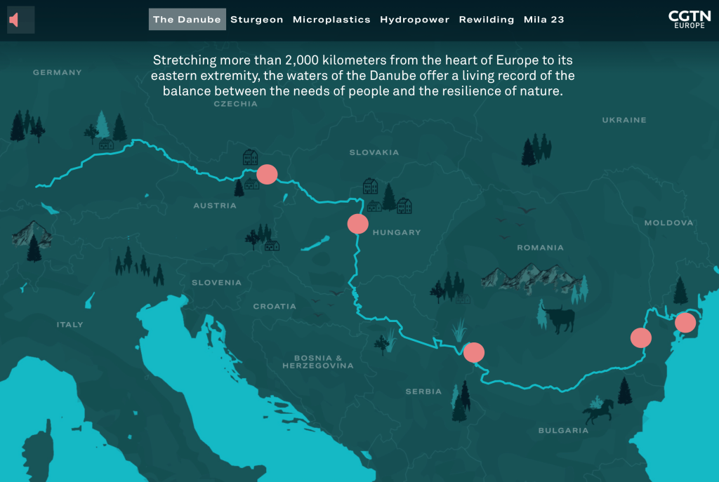
Scrolling down, the website zooms into the source of the river, delivering an important bit of information at every stop. The story starts at the source of the river, and ends at the mouth, just like the river itself. The website uses cold tones for the river, reflecting its freshness and coldness of the climate in the Balkans that it passes. Warm tones are strictly used as calls to action.
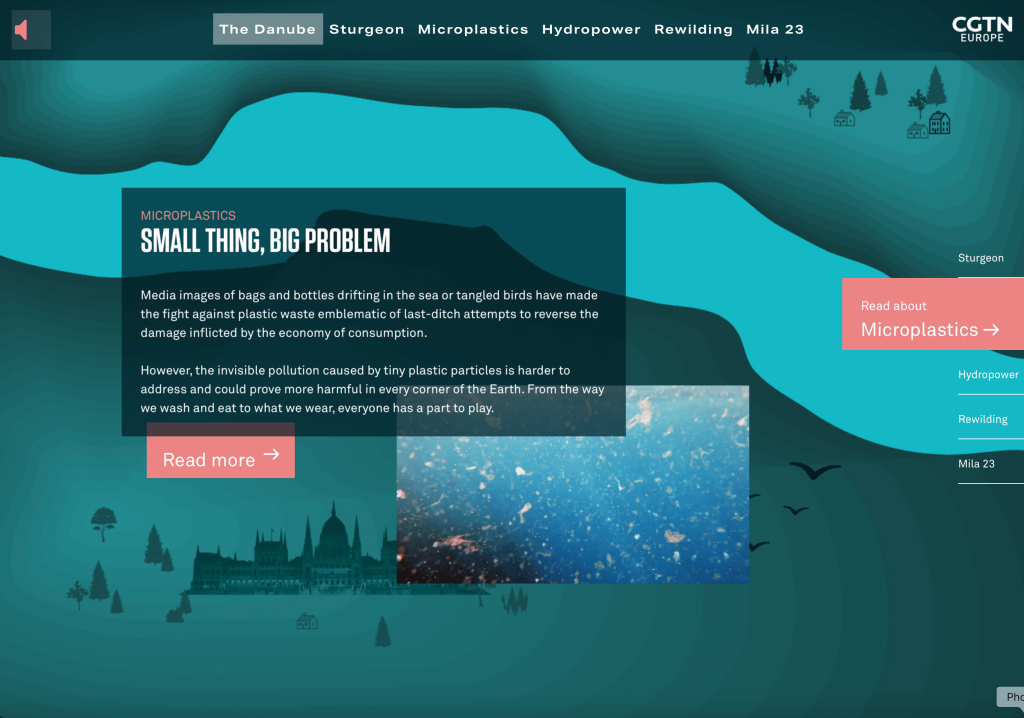
Scrolling all the way down changes the tone, there is now more light blue rather than dark blue, suggesting that there is now no land in the picture. The phrase “dive in deeper” confirms it, but it has already been confirmed in the user’s mind via the use of colour, tone and shape.
sad
Parallax within web design.
Parallax in web design refers to the smooth transitions present on some websites as you scroll or change page, and it can be a very powerful tool in visual storytelling. More simplified versions simply refer to a gradient change or a transition from 1 image to another. A more complex version involves multiple elements on the header image being pasted on different layers, and moving at different times as you scroll which creates a deeper 3d effect via use of angle and composition.
A complicated parallax header can be easily observed on the Firewatch official website.
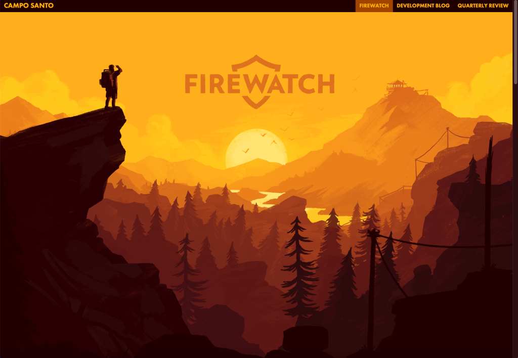
Through careful use of composition and colour, the top of the page gives us an overview of the area, however as you scroll, the closest elements to you (the mountains) stay in place whilst the further elements become more obscured the further you scroll.
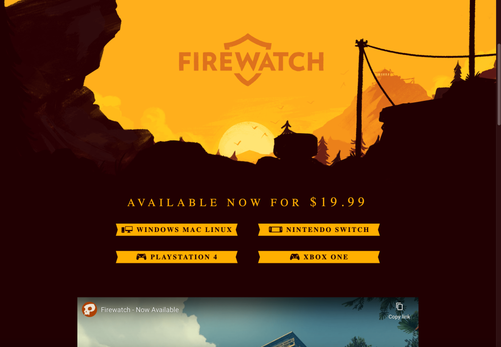
As you scroll, your angle is now way lower, showing to the user that they have now descended down the mountain with the realistic angle confirming it. Below the mountain, all you see is the dark brown of the mountain, suggesting that you are now at the very bottom of it and that makes it look grand compared to the user, they no longer have the Birds Eye view. However that is when you get screenshots and previews of the game, suggesting that all the events happen at the bottom of the mountain, where you as the user currently are.
sad
Planning
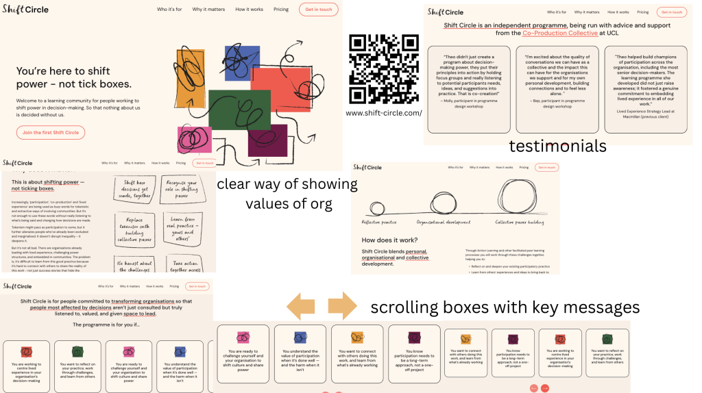
I have looked into examples provided by the Participatory collective that they are fond of for a variety of reasons. It is evident that they are focused on how well the websites show their values and represent themselves. They care a lot about functionality, but are also fans of the messy, squiggly art style used on these websites. It looks childish, but represents everyone since something so rough is easy to replicate and therefore shows that people of all levels can be a part of the community and add something of their own.
I think the ideal story for this website would be a path to recovery. It can be represented following a metaphorical object/entity since using a person will automatically make a struggle seem too personalised and less flexible, meaning only a few people could relate.
An idea similar to this a short animation called “Nuggets” by Filmbilder & Friends on YouTube. This short represents the start, impact and struggle of addiction represented by a simplistically drawn bird who finds itself quickly forming an addiction to an unspecified substance which is simply represented by a seemingly consumable yellow drop.
Opposite to the short animation, which dims the light as the bird falls deeper into addiction, I could use parallax to start the story off with a dimmer light and eventually work up to a bright radiant screen which will feature the values of the Participatory collective, and links to their support groups, suggesting that they are the saving grace in this story.
I could also change shape and style entirely throughout the website. This will not only show the recovery process of the subject. Switching from crude sharp shapes to more comprehensible and rounded ones to show the improvement in the mental state as well as changing style to make it seem like more than one person worked on the website to portray community and group effort.
REFERENCES
- Cgtn.com. (2024). Danube River. [online] Available at: https://news.cgtn.com/event/2019/danube-life-of-a-river/index.html#/.
- Filmbilder & Friends (2014). Nuggets. YouTube. Available at: https://www.youtube.com/watch?v=HUngLgGRJpo.
- Firewatch. (2016). Firewatch: Out now for Windows, Nintendo Switch, PlayStation 4, Mac, and Linux. [online] Available at: https://www.firewatchgame.com.