After looking through and considering all websites, I have chosen a select few which best fit what the Participatory Collective are looking for. I consider these websites to have the most fitting design elements that are most practical.
OSHI
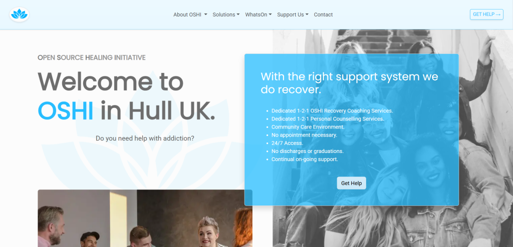
Example 1, the front page of OSHI, taken from https://www.oshi.org.uk/
Example 2, the front page of OSHI after scrolling down once, taken from https://www.oshi.org.uk/
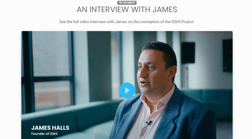
Example 4, the interview with the founder, taken from https://www.oshi.org.uk/about-oshi/
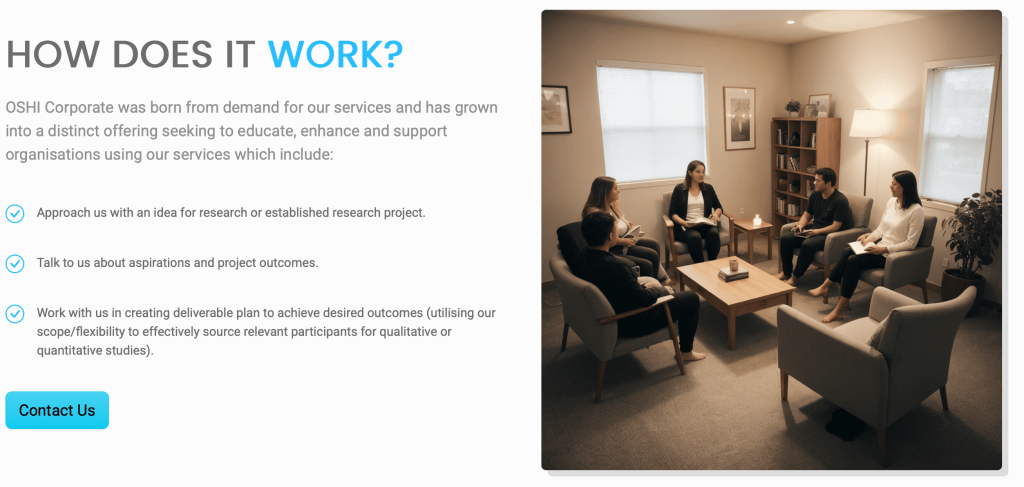
Example 5, OSHI research page with AI generated content, https://www.oshi.org.uk/research/
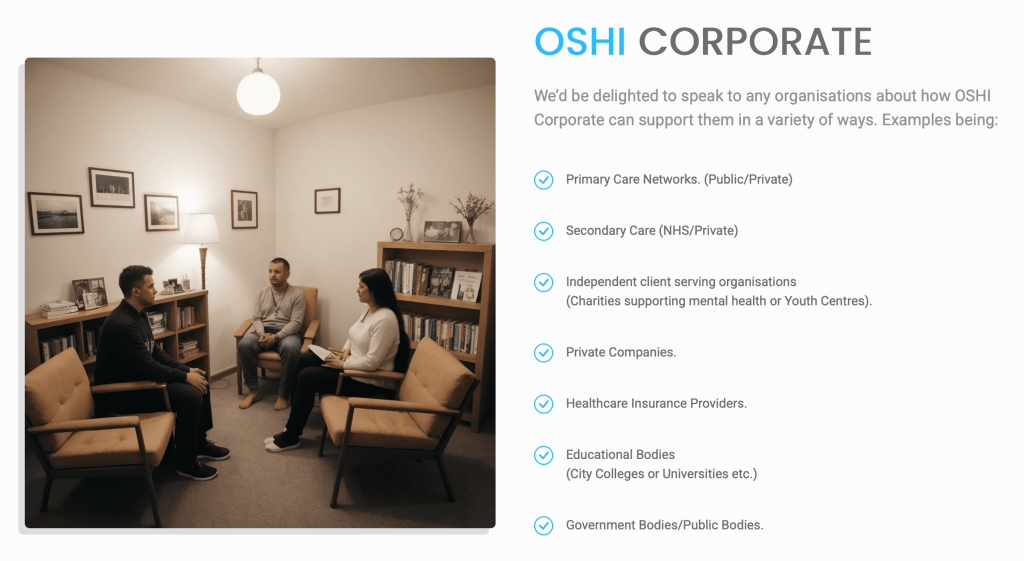
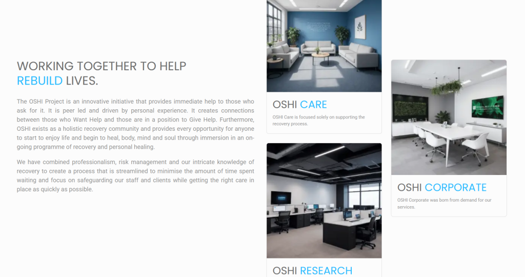
Example 6, OSHI corporate page with AI generated content https://www.oshi.org.uk/corporate/
Pros:
The colour pallet is strict and does not have any unnecessary colours. The prominent white colour is modern and clean, whilst the light blue is friendly, calm, and welcoming. Together the colour combination looks very professional and medical. The only time they break the mold and use different colours is regarding to their call to action. They make the buttons more deep-fried and the text black to make it easier to read on a more high contrast background, this helps the user differentiate which elements are interactable.
The shapes seem sharp and rectangular at first, giving it a very modern and serious feeling, however upon closer inspection you can see that the edges are rounded, making the seemingly confrontational elements seem more friendly and inviting, making it a perfect metaphor for seeking help.
The layout of the website is not overwhelming, it prioritised practicality but did not neglect aesthetics. The way they organised their posts is both modern, strict and yet unique. Instead of using the normal grid layout they changed sides and levels, reminding the users that they are all human just like them, struggling with the same issues just like them, not another heartless copy paste corporation.
The atmosphere has already been shaped to be welcoming and calm through the use of colour. It is also very open with its users, featuring an interview with the founder in which he is simply referred to by his first name. Downplaying his importance and sharing his own struggles and goals before anything else really shows the users that this isn’t a heartless company, but a collective that look out for each other and have the best interest of their clients in mind.
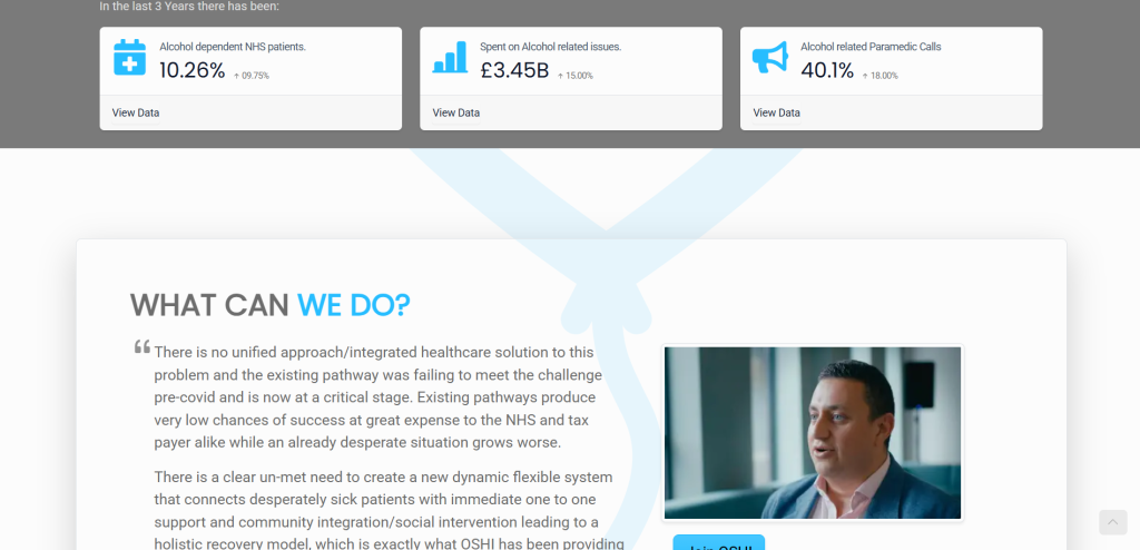
Their use of statistics also puts into perspective just how big of a problem this is whilst educating people and destroying any remains of ignorance, this demonstrates how dedicated they are to solving this crisis, and how seriously they take the concerns of their clients and users through their thorough research.
Cons:
Their use of AI generated imagery is unethical due to it being non sustainable and infringing on people’s rights because it uses real people’s faces. It also makes it look lazy, robotic and unrealistic since the photos do not depict OSHI’s real legitimate support techniques.
Butterflies
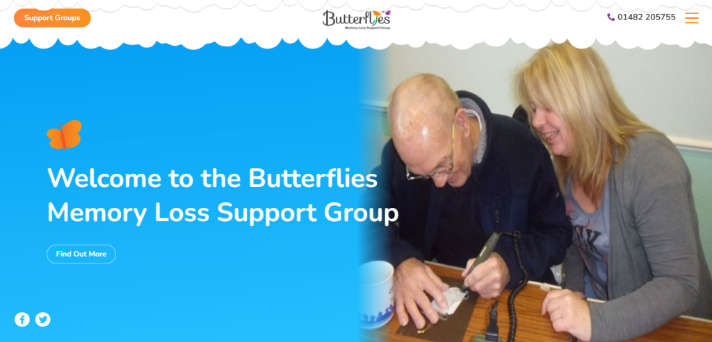
Example 1, Butterflies front page, taken from: https://www.butterflies.org.uk/
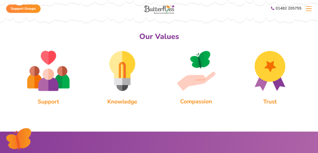
Example 2 Butterflies values, taken from: https://www.butterflies.org.uk/
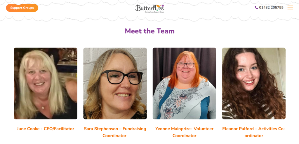
Example 3 Butterflies meet the team, taken from: https://www.butterflies.org.uk/about
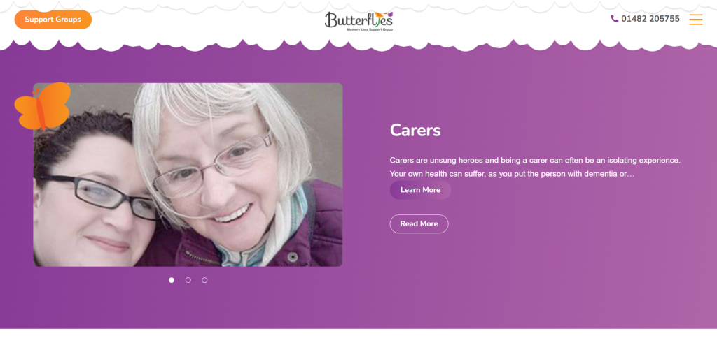
Example 4, Butterflies call to action, taken from: https://www.butterflies.org.uk/
Pros:
Consistent colour pallet, very safe use of white colour and the calming old fashioned low contrast purple perfectly works with their target audience and their needs. Every colour stands out a lot, very effective for people whose sight is limited. This extends to their calls to action, instead of adding more colours into the equation, they recycle colours and combine them in a new way to bring attention to the UI elements.
From buttons to banner to logo to art style, the website uses very soft rounded shapes. This makes the website appear very non-aggressive and establishes a consistent caring, informal and safe atmosphere which helps relax the user upon discovering the website. The visuals and shapes look very childlike and the website uses easy to understand language, this helps patients who suffer from dementia and/or Alzheimer’s to be able to comprehend the language and make an informed decision of if they want to contact them.
The layout is very disciplined, it uses grids and does not attempt to do anything risky or unique due to them keeping their target demographic in mind. The UI elements such as buttons, logo, contacts and burger menu are all very easy to find which helps patients who are struggling but do not have a relative nor carer to help them navigate the website.
The “meet the team” helps put the name to face, all workers are smiling and not posed professionally, it helps to understand that they are a community that care for people not for monetary gain of any sort. This helps relax the user, since it means they don’t have to struggle making a first impression upon meeting the team in person.
Cons
They used some low resolution photos on their front page, and it can possibly harm the first impression the user gets from the website by showcasing the bad quality. Making it look unprofessional.
Community knowledge matters
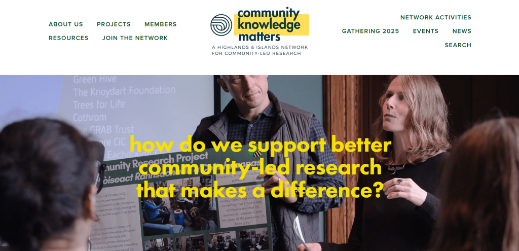
Example 1, front page, taken from: https://www.communityknowledgematters.com/
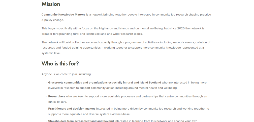
Example 2, their mission summarised, taken from: https://www.communityknowledgematters.com/
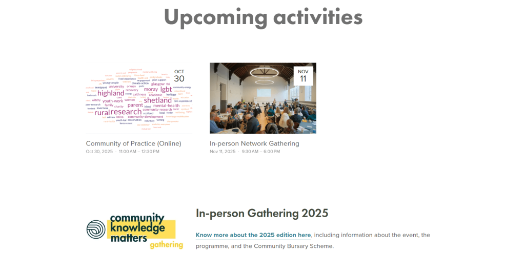
Example 3, News and upcoming events, taken from: https://www.communityknowledgematters.com/
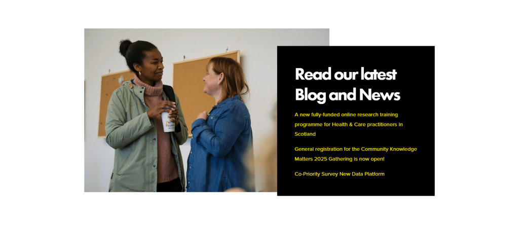
Example 4, Blog call to action, taken from: https://www.communityknowledgematters.com/
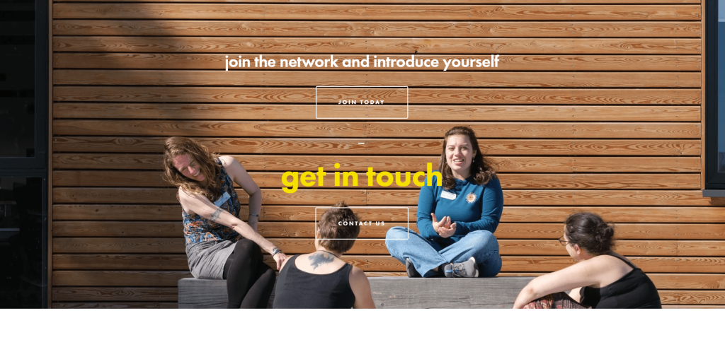
Example 5, Contact and join, taken from: https://www.communityknowledgematters.com/
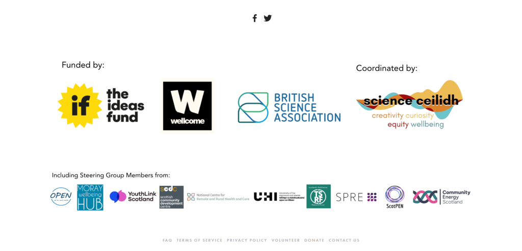
Example 6, Sponsors and partnerships, taken from https://www.communityknowledgematters.com/
Pros
They stay true to their colour pallet, but a bit too strongly because of this some of their calls to action can be easily missed such as in example 5. However the colours they used work very well together and make each other stand out. The desaturated yellow is also very pleasant, carrying connotations of a sunny day and joy. The buttons at the top however completely disregard the scheme, and are instead a deep dark green. Whilst it looks out of place, it does help to convince users that these are interactable elements.
The shapes are primarily sharp, however their hostility is nulled by the pleasant colours. Instead, it looks more professional, slick, and modern.
The layout is very centred throughout, however it is very repetitive and doesn’t necessarily work, instead you can see how hard they tried to make everything centred and it instead looks more forced rather than naturally fitting.
Cons
Call to action is unclear. In example 4, it took me longer to figure out where I needed to click in order to read their blog (I tried clicking the black bit, but the actual button is the photo, this can easily catch casual users out). In example 5, The contact buttons are difficult to see due to the photo background that they used, users can easily skip it.
Their dedication to making every portion of the website centred has caused it to look very repetitive and not very professional, some elements would of worked better if arranged differently.
REFERENCES
- Csbsju.edu. (2024). Research Guides: Artificial Intelligence and Images: AI Image Ethical & Legal Issues. [online] Available at: https://guides.csbsju.edu/c.php?g=1297123&p=10165087.
- Chen, A.X. (2025). A.I. Is on the Rise, and So Is the Environmental Impact of the Data Centers That Drive It. [online] Smithsonian Magazine. Available at: https://www.smithsonianmag.com/science-nature/with-ai-on-the-rise-what-will-be-the-environmental-impacts-of-data-centers-180987379/.
- Oshi.org.uk. (2024). OSHI – Open Source Healing Initiative in HULL UK. [online] Available at: https://www.oshi.org.uk [Accessed 21 Oct. 2025].
- Butterflies. (2023). Butterflies – Memory Loss Support Group. [online] Available at: https://www.butterflies.org.uk [Accessed 29 Oct. 2025].
- Matters, C.K. (2019). Community Knowledge Matters. [online] Community Knowledge Matters. Available at: https://www.communityknowledgematters.com.