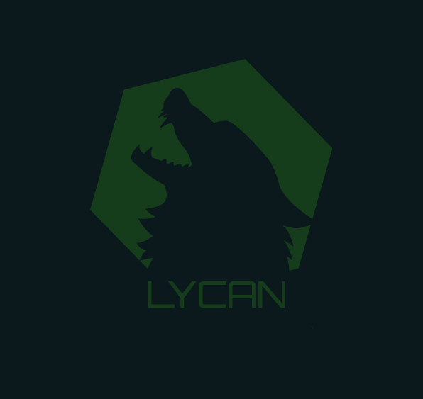
After creating a wide variety of scamps to choose from, I have decided on the current logo. I chose a wolf for a variety of reasons; there are almost no sports brands which have wolves as a logo, meaning there is much less competition for brand recognisability. Wolves also perfectly represent the elements I want to convey, they are pack animals who care deeply for one another, wild and untameable, and since they are canines they have been used to represent loyalty and protection very commonly. Because of this I came up with the tagline “Love it? Protect it” which not only instils discipline by making it sound like a command but also conveys that the brand strives for self improvement of others to give them strength for love rather than strength to cause harm.
The idea of using a wolf was also loosely based on the “legend of the iron wolf“, A legend of how the capital city in Lithuania was founded. In summary, the Grand duke Gediminas has dreamt of a giant wolf made of iron, howling louder than 100 wolves combined. After asking a priest to interpret this dream, he was told the wolf represents a castle, and so the duke has built a castle on the same hill on which the wolf stood and another nearby, and those castles he has named “Vilnius”.
In this story the wolf is a prophet, a force that non-verbally pushes you in the right direction. This is a perfect metaphor that I want this brand to have, to push people to self improvement and use their new earned skills and knowledge to continue the legacy and make the world a safer place for everyone.
The name “Lycan” came from the word lycanthropy which was used to describe the condition of becoming a werewolf. I deemed this fitting since it would help better associate the animal and all of its positive traits with the users, to help them feel more confident and “part of the pack”.
dfgdfgad
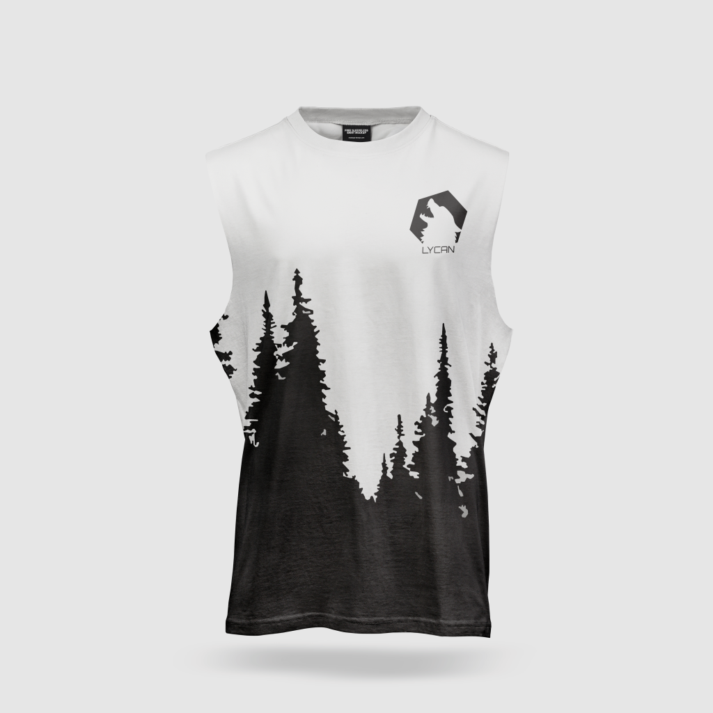
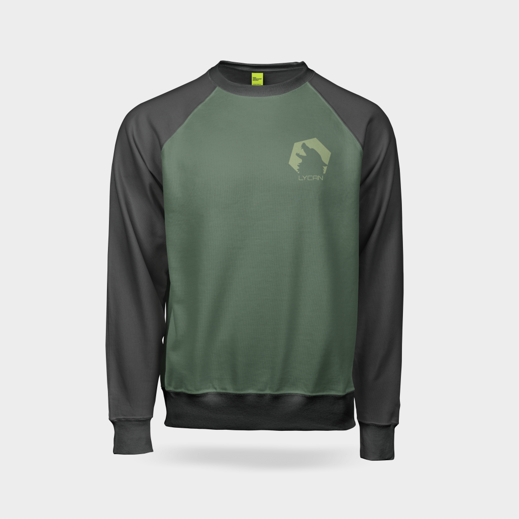
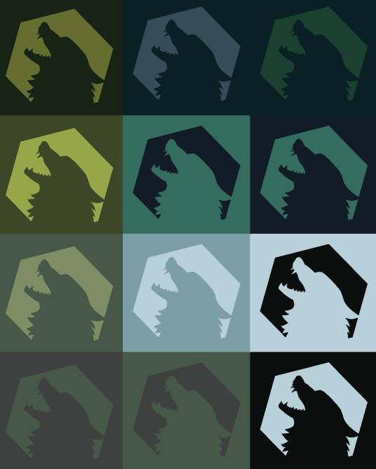
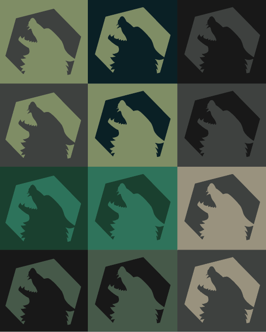
I primarily stuck to using natural colours, in order to help match the vibe and atmosphere that I have created in the brand matrix. However it was relatively tough to combine them in a way which looks good in multiple formats, especially on clothing and advertisements. I stuck to browns and greens for the majority of the experimentation due to their nature-like looks, plus black and white since its incredibly adaptable and modern.
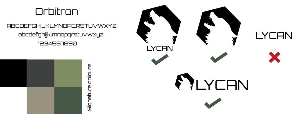
I chose the Orbitron typeface because of how modern and serious it looks. Its sans serif which makes it sound less formal and easier to read. The thin weight of the font looks athletic and lightweight, and very simplistic making it fit very well with the simple outer shape of the logo.
sadsaffsasdfagdsagda
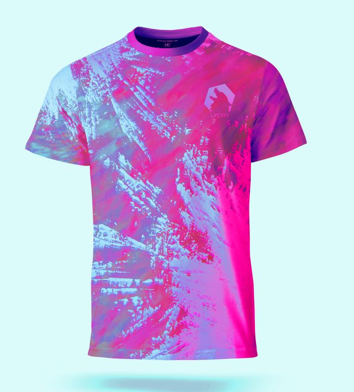
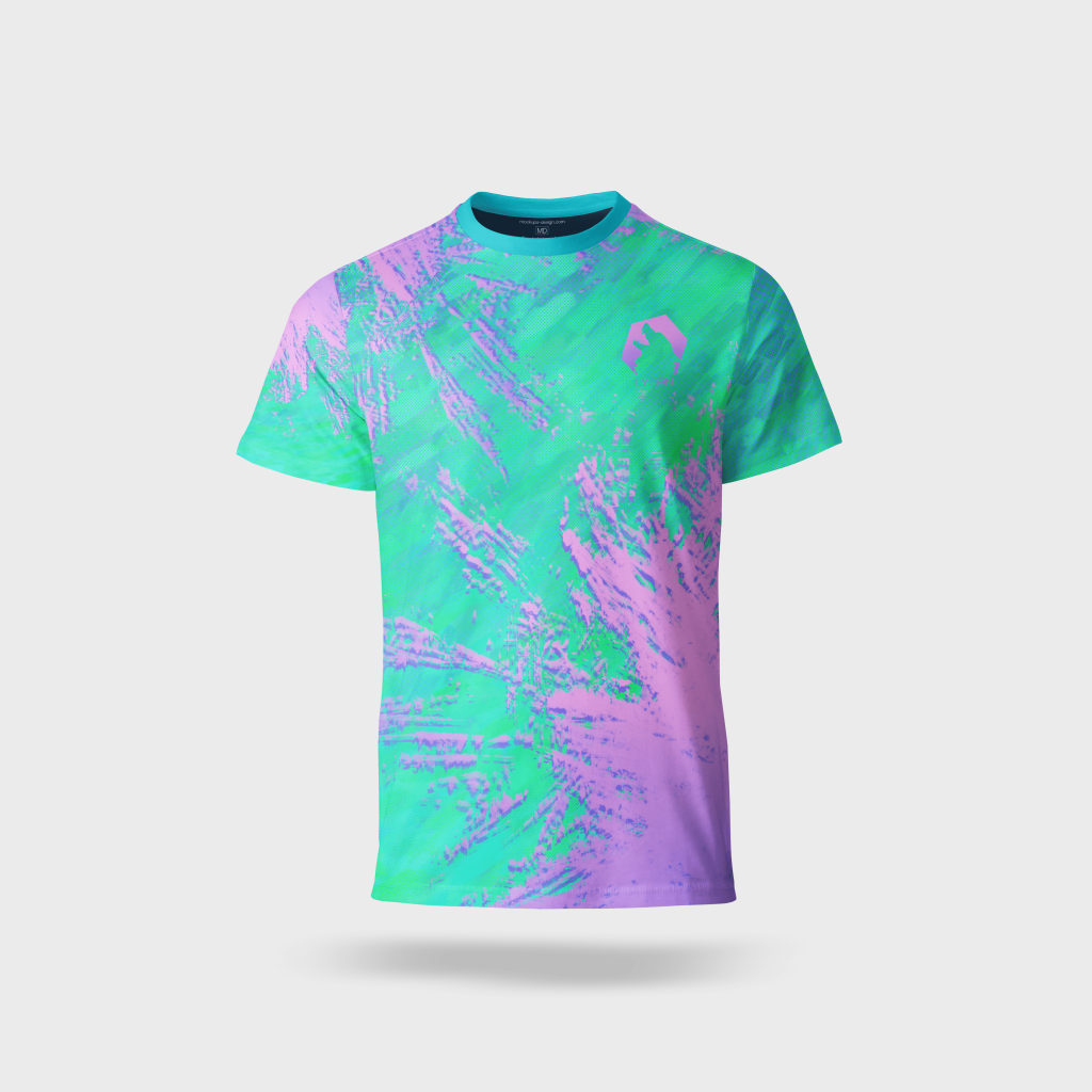
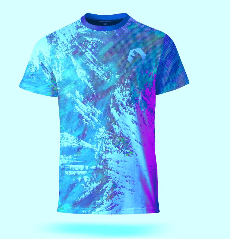
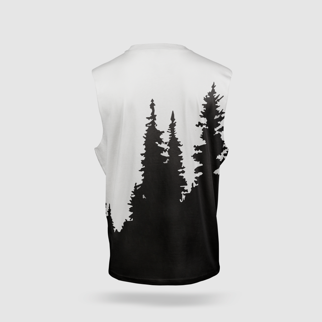
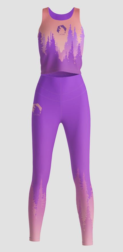
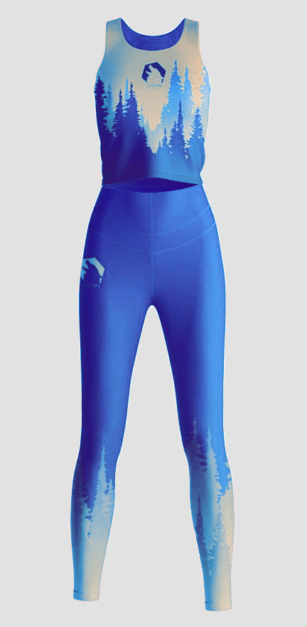
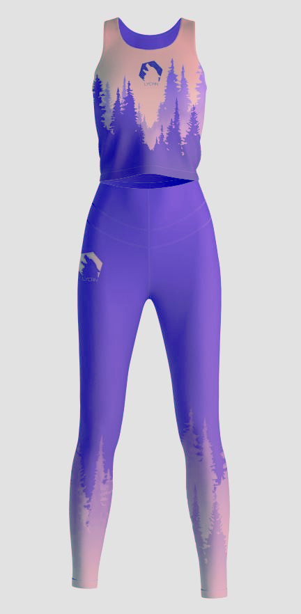
Mock up clothing
From the brand matrix and the logo, the brand appears to be very masculine leaning, but that is not the intended effect. To enforce that, there is a wide variety of clothing for women (which would be very helpful to complete the needs of one of my user personas) and children.
I made a lot of men’s and unisex clothing options, ranging from dull, natural colours and black and whites to eye-bleeding and loud colours to suit both introverts and extroverts.