Early moodboards
dadsaadda
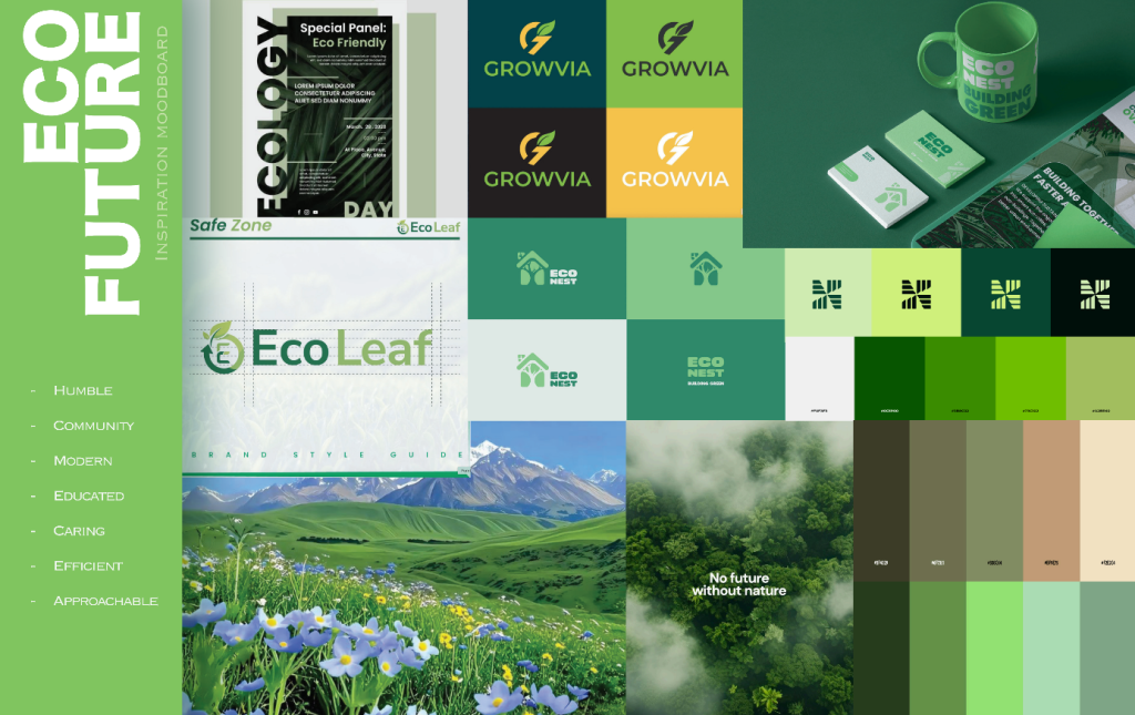
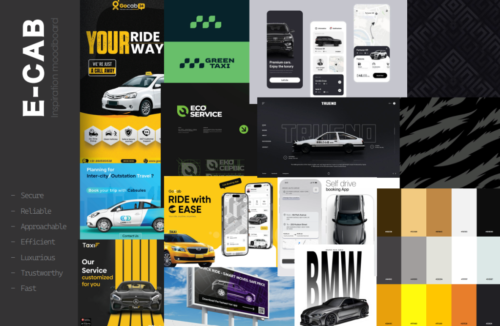
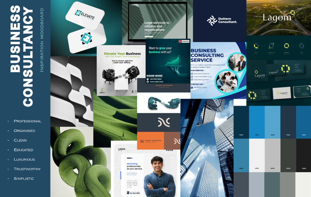
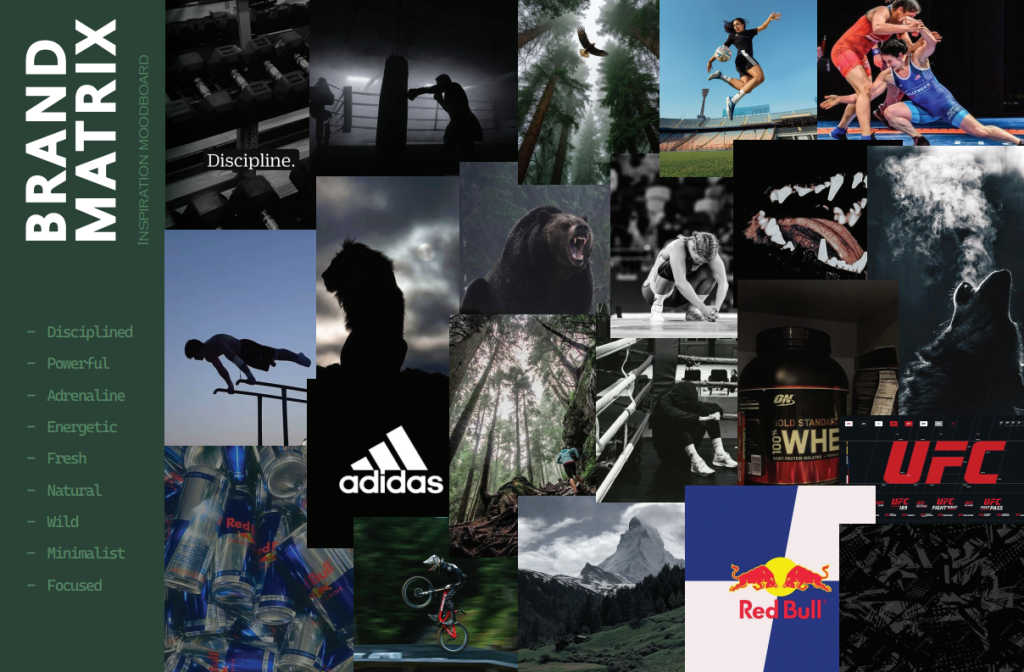
Before developing my own direction, I have vaguely compiled a moodboard for each topic. This was highly beneficial my creative process since it has given me a multitude of different pathways I could take. During the creation of moodboards, I have decided to go with the eco-future direction, this is because the visuals I included in the moodboard had a lot of appeal for me and I felt like it would be the most fun and versatile one to do. Noting down the main elements of these brands has also helped me create a mental formula for the upcoming brand development.
Problem space
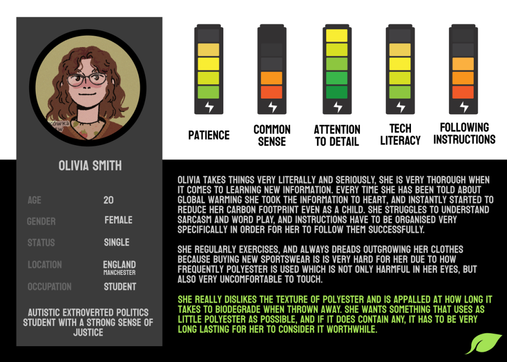
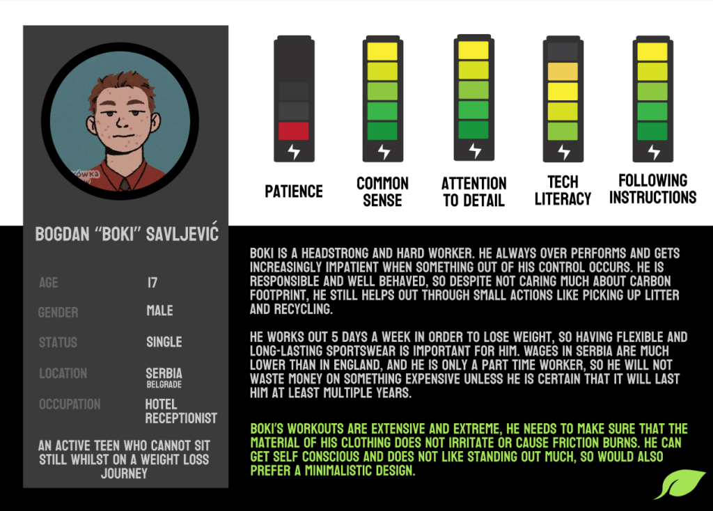
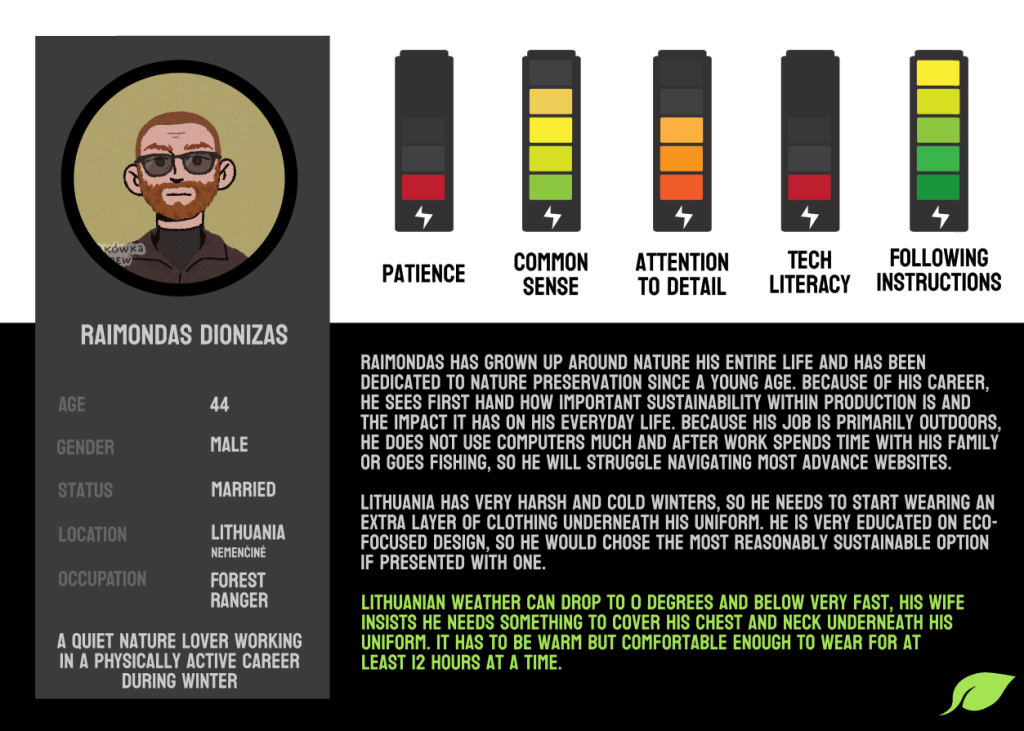
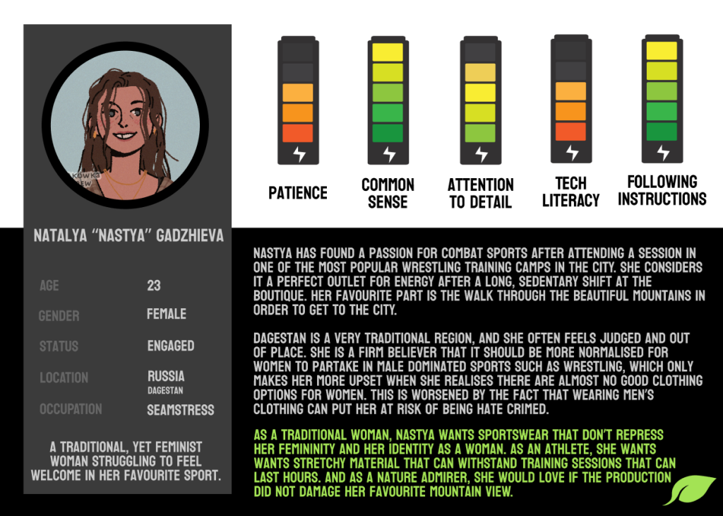
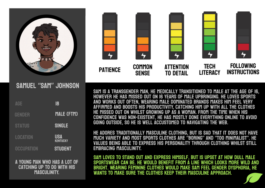
The icons for the user personas have been created on picrew, template made by Mischa Mokowka
Before creating the brand itself, I need to come up with a purpose for it. I have decided to create an e-commerce website focused on selling sustainable sportswear. By asking around and taking inspiration from people’s situations that I found online, I made 5 user personas with unique requests and limitations in order to create a very adaptable and accessible product.
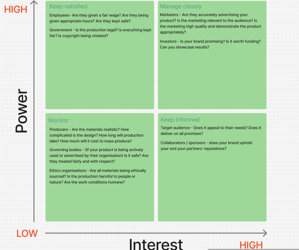
Customers are not the only people who my brand should appeal to however. There are multiple stakeholders who I have to keep track of who would all benefit from completely different parts of the brand. There are certain things that may not interest the casual consumer such as the relationship between the brand and its sponsors or employee conditions for example. Knowing how to appease everyone will help the success of my brand.
dadsaadda
Creating a brand
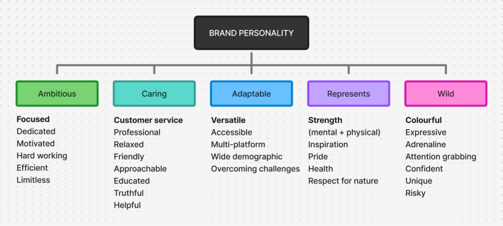
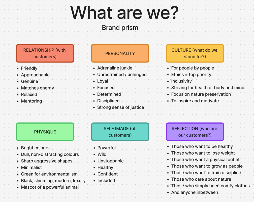
After figuring out the purpose of the brand, I went back to my moodboards and elaborated on elements which I (and my potential target audience) will want to see in my brand. It helped me narrow down the direction in which I am going. Visualising via a brand matrix has been helping me a lot during this project since I would always refer back to it whilst creating scamps and would always get back on track if I was swaying too far away from the original idea.
The most important parts of this brand are ethics, health of body and mind, nature preservation, and discipline. Throughout my work I will need to focus on showcasing the emphasis on these 3 values to my users. This brand focuses on self improvement, community, and despite such an aggressive exterior, it focuses on love, appreciation and value of everyone and everything around you. For this reason it is important for me to make the brand very accommodating for a wide range of users and convey that if anything involves causing harm (physically, socially, financially, environmentally), then it is not getting done.
dadsaadda
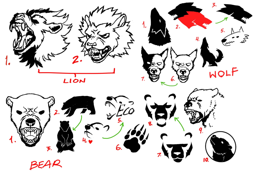
Logo scamps
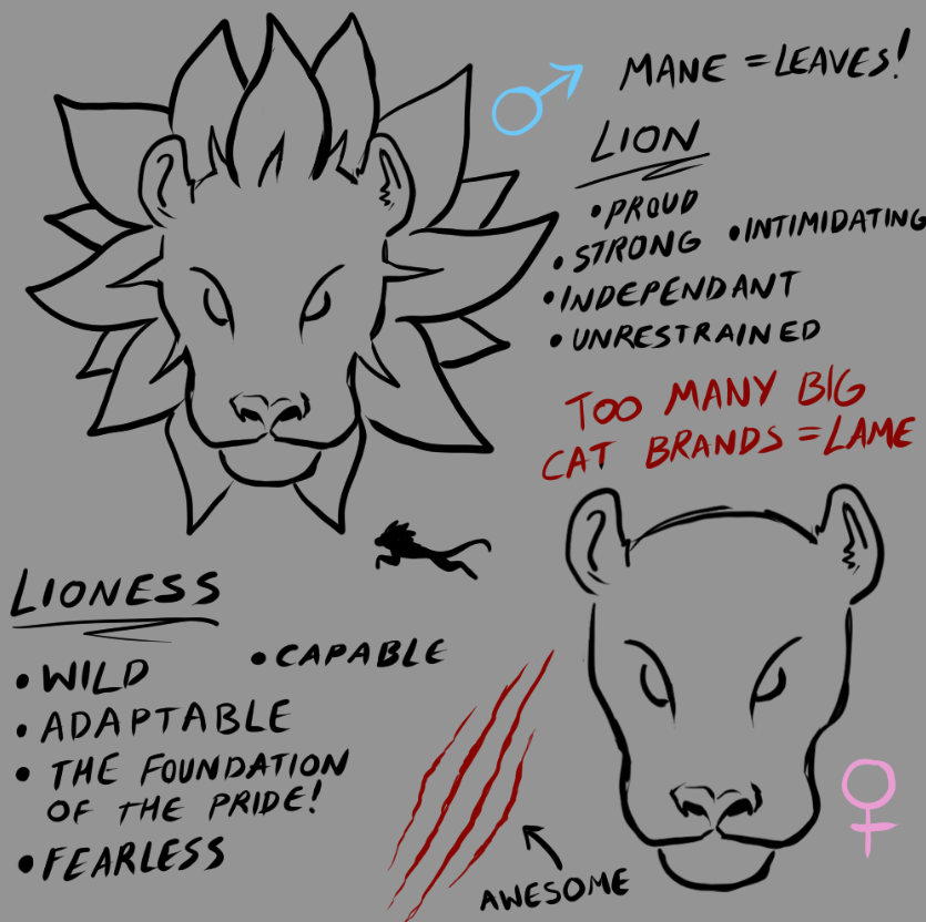
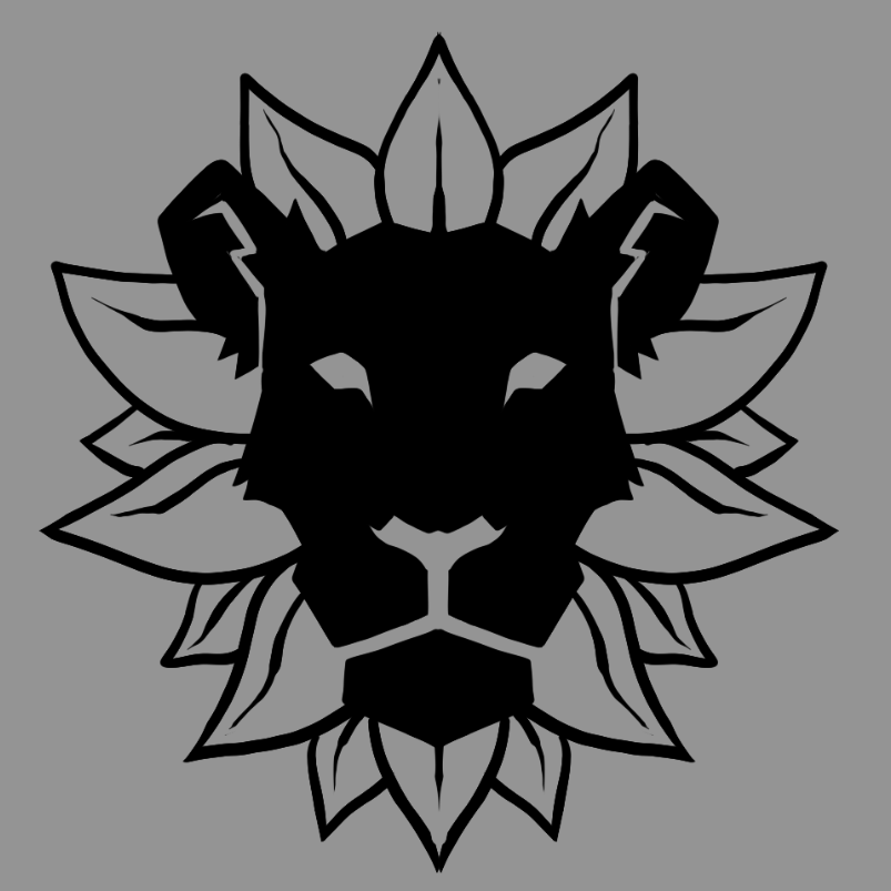
After extensive mindmapping, I felt confident to start visualising my brand. All of my scamps have been based on animals that I have included in my brand matrix due to them perfectly representing the main elements that I want in my brand, strength, wilderness, health, confidence and aggression. My first idea was to make the logo be a lion, from my observations, big cats are commonly represented in sports brands due to to elements I have previously described such as Puma, Slazenger and Jaguar. This means that using a big cat would put me on the right path, however it also means a ton of competition and extra hard work to make it stand out amongst the rest.
Because of this, despite originally being dead-set on using a lion, I have started to include the possibility of other animals and developed those scamps until I have found the best fitting one.