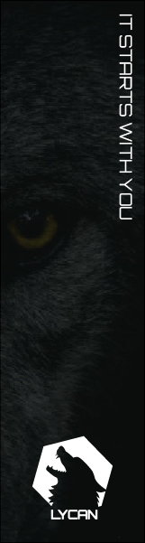
Since the brand itself is very simplistic, I realised the most effective advertisement plan would be to also make very simple and direct posters. A black and white colour pallet is very easy to spot due to its high contrast, it makes it very easy to have the logo stand out. It acts as a wakeup call for the user, making them realise that their progress is not in the brand’s hands, but in their own.
wdqafsadfdas
sadfsafsafsda
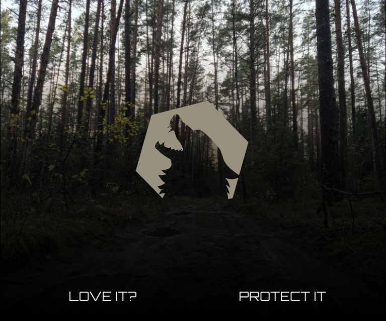
The second banner still takes a very direct approach. By showing the forest (picture taken by me in Lithuania) it entices the user, hypnotises them with its beauty, followed by the familiar “Love it? protect it” tagline which now speaks directly to the user, asking if they enjoy the view and consider it worth protecting. This would be highly efficient in a fundraiser campaign or any sort of collaboration with the intent to directly contribute to nature preservation.
adfadfsasedfasd
wdqafsadfdas
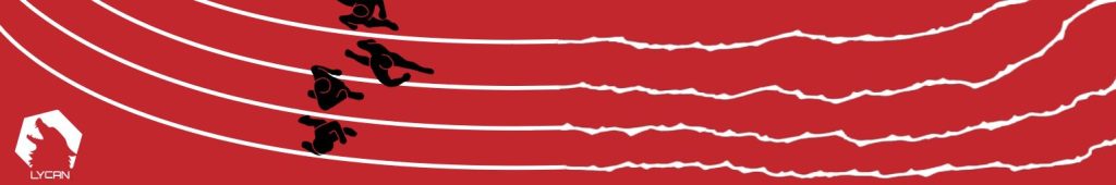
This banner shows 4 runners on a track, which gradually turns from straight lines to serrated claw marks. It represents becoming wild and free, from perfectly organised straight lines to wonky, disorientating and untamed ones. It is also meant to be interpreted as “all tracks lead to Lycan”, showing the brand’s confidence in their ability and marketing.