Home page
Website available at https://www.figma.com/design/5pzaQWrcLVQc13unUuNLu6/Companion-app-MUTANT-HAVEN-IPAD-PORTED?node-id=0-1&t=4UkI6PZvxZYnrM0D-1
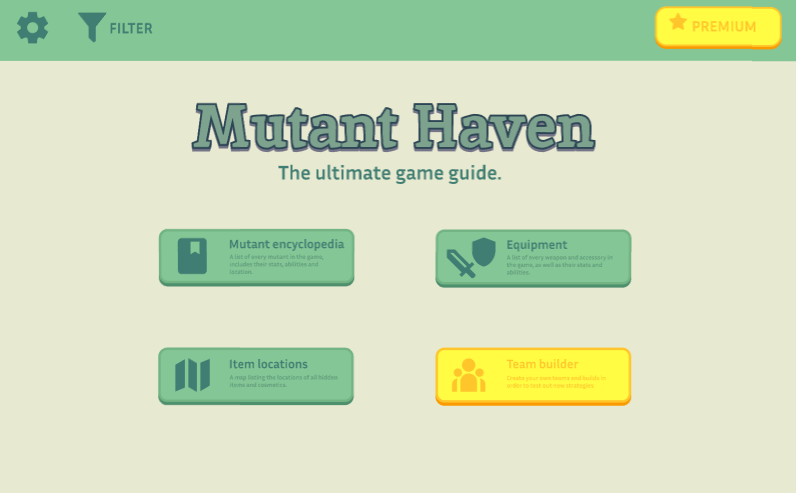
Due to the larger canvas space on the tablet interface, I had to rearrange the options in order to make them appear to take up more space in order to avoid making it seem empty.
Settings
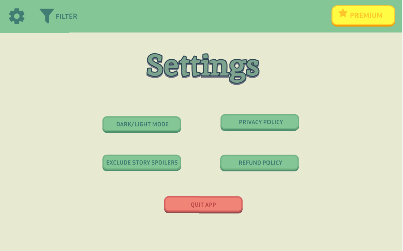
Due to the little amount of settings options provided, it was difficult to make them take up more negative space on the canvas so instead I had to rearrange them in a manner which gives the illusion of taking up more space, like putting the important setting, the “quit app” setting in the middle, which not only takes up more space but also highlights its importance.
Premium
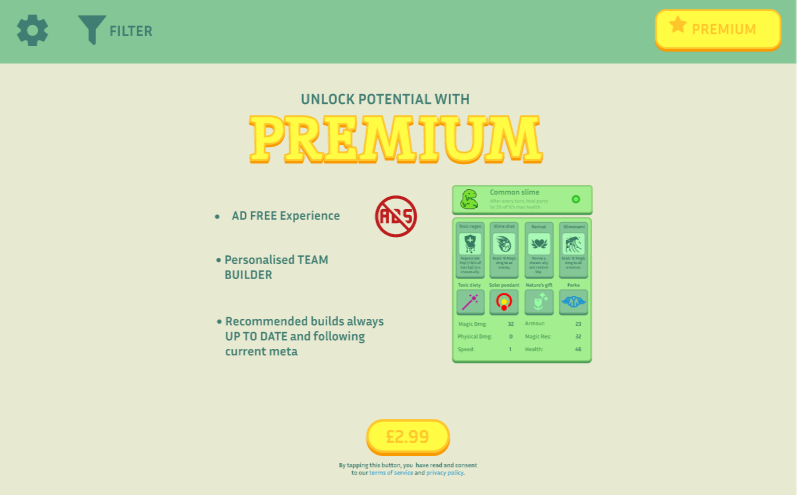
Premium was near impossible to port due to how strategic the structure was on the mobile interface. I have instead yet again spread it out further in order to give it the illusion of there being more assets on the page.
Option 1 – Mutant encyclopaedia
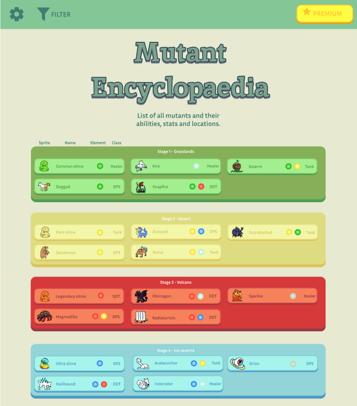
Due to there being only a few mutants per area, I have decided to condense it. This resulted in more mutants being shown on the page without the user even beginning to scroll which makes it highly convenient for them if they are looking for information on mutants from early areas. This also makes it much easier to identify the order of game progression.
Option 1 – Mutant information
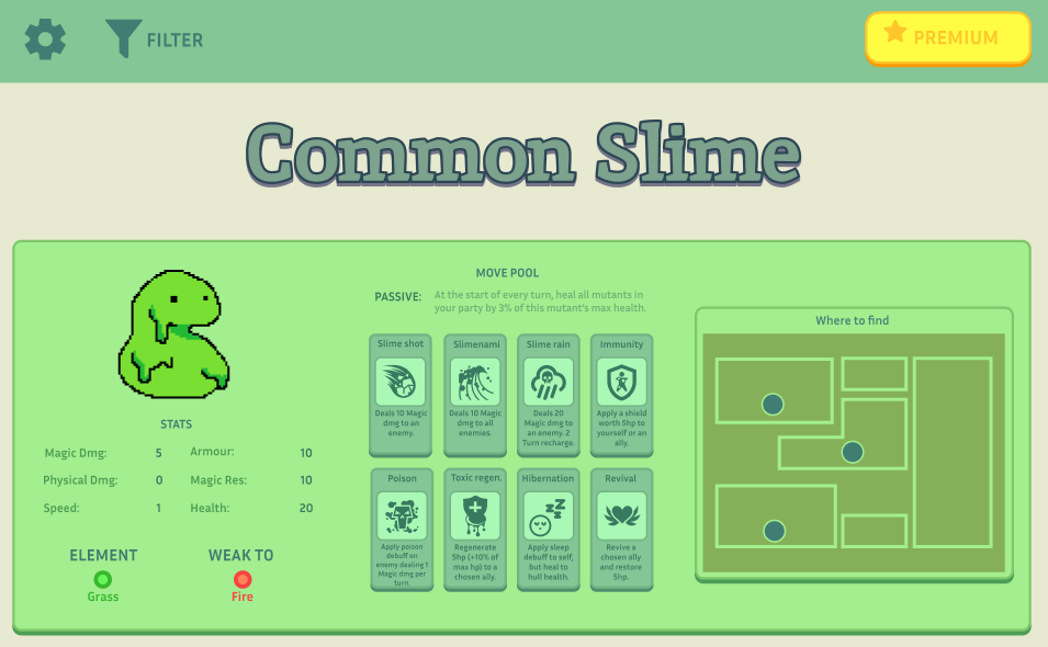
Instead of being vertically sided like in the mobile interface, I realised it would be more space efficient and convenient for the user (ensuring they don’t have to scroll as much and information is not hidden from them) if I was to simply make it more horizontally leaning. This has proven to be highly effective since it only requires you scroll a miniscule amount before all information is presented.
Option 2 – Items
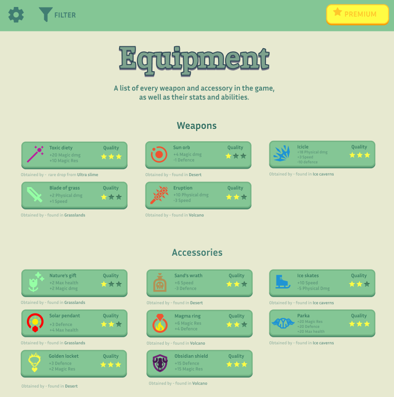
Similar to the encyclopaedia, I have condensed the list of items to be horizontal instead of vertical. Making it easier for the users to see the entire page whilst filling out the empty space with necessary assets.
Option 3 – Item locations
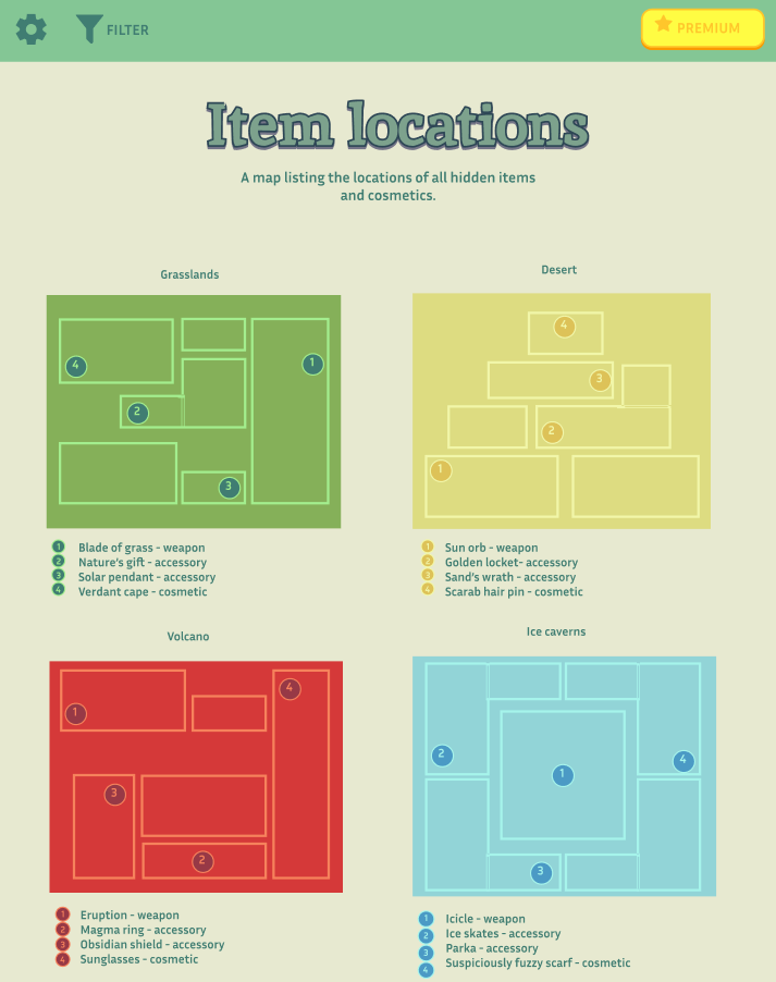
The maps are placed horizontally and still maintain their progression order, the UI has been slightly enlarged so it becomes easier to see the smaller details on the bigger screen.
Option 4 – Team builder
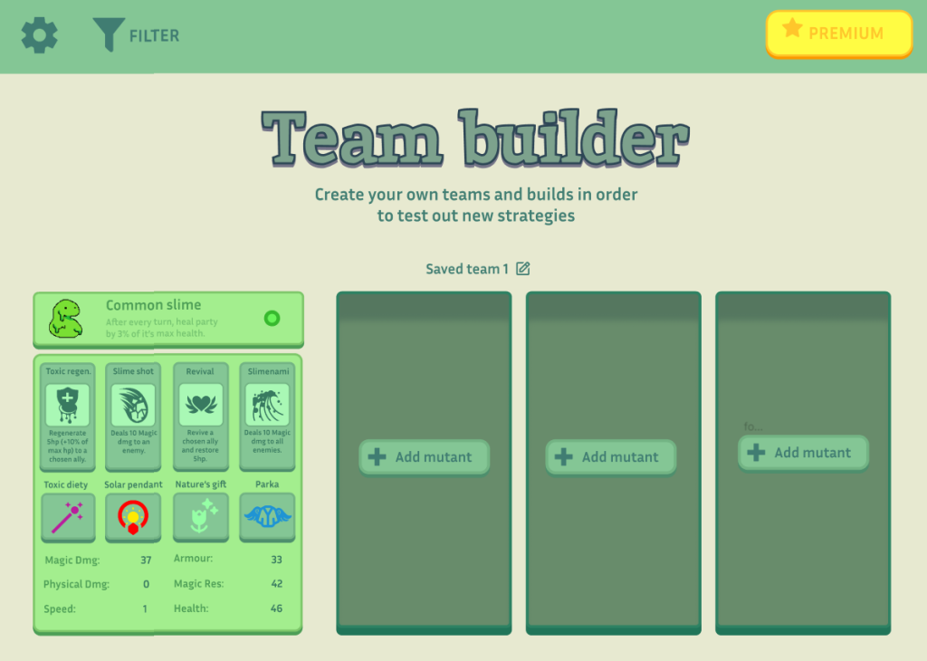
The team builder remains the least changed. However I have added the a new asset. The box behind the button fills space whilst also visualising for the viewer how much space it will approximately take.