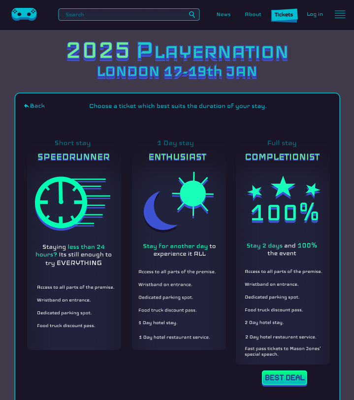
Best option is highlighted, and every option has its own visual cue.
Every important option has a notable change in colour to bring attention to it and make them easier for the user to find.
Every UI element and asset placed on the canvas has been carefully considered, with each component serving a specific function. Nothing is added unnecessarily, each visual and interactive element has been designed and positioned with purpose. This intentionality is driven by an understanding of user behaviour and psychological associations commonly used in digital design. Rather than simply aiming for aesthetics, every decision in the layout contributes to functionality and enhances the overall user experience. The arrangement of the interface elements is not random; it’s rooted in cognitive patterns and user expectations developed from prior interaction with websites and apps.
For instance, the placement of the main logo in the top left corner of the screen is deliberate. This location is widely recognized as a psychological “safe space” for users. It’s where users instinctively look for brand identity and, more importantly, for navigational reassurance. Having the logo in this spot functions as a “return home” button. Users know they can click it to return to the homepage or a previous screen, offering them a sense of control and security. This common design pattern has been deeply ingrained in users through years of browsing and using interfaces across the web, so placing the logo there leverages those habits to create a smoother, more familiar experience.
Navigation elements that help users achieve their core goals on the site are made more visually prominent to guide attention. One clear example of this is the “Tickets” button. It stands out significantly from surrounding elements due to both its larger size and its distinct colour contrast against the background. This contrast isn’t just visually pleasant, it’s a purposeful technique used to attract the eye and signal importance. The size differential also creates a visual hierarchy, telling the user that the action of buying tickets is crucial to the experience the site is offering. This kind of prioritization through visual weight ensures users are naturally drawn to the most important interactive assets.
The ticket purchase page itself demonstrates a responsive design approach that balances flexibility with visual consistency. While it adapts effectively to different screen sizes (ensuring usability for both desktop and mobile) it also retains the project’s signature aesthetic by staying within a tight, cohesive colour palette. Even as the layout adjusts for smaller screens, the visual identity remains intact. That limited palette creates a unified look while reducing cognitive load for users, helping them focus on the content and options in front of them rather than being distracted by too many colours or elements.
Furthermore, the ticket options themselves are presented in a clean and accessible format. Each choice is clearly separated and easy to compare, making sure that there is little confusion. Among these, the best-value option is intentionally highlighted using subtle visual cues (slightly increased size, colour contrast, or a bold outline) to gently nudge users toward it. These cues are not intrusive, but they do guide the user’s decision making process by signalling what’s recommended, all while allowing them to make an informed choice based on their needs and goals.