In order to ensure that my website is always easily accessible, I have made a version compatible with mobile devices. This would also make it possible for the users to present the website at the festival as a proof of purchase of tickets if they were to accidentally delete or lose the email that provided them with the confirmation.
To enhance the overall user experience and improve accessibility, the primary navigation options were relocated to the top section of the screen. This change was made with the intention of increasing visibility and ensuring that users can locate the most important features quickly and intuitively. By moving these core elements to the top, the design becomes more user-friendly, especially for individuals accessing the site for the first time or using smaller screens. It aligns with common design standards seen across many modern digital interfaces, which tend to place key features in highly visible areas to reduce the time and effort users spend searching for them.
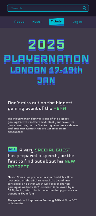
Additionally, the text alignment on the page was modified to be centered rather than left-aligned. This stylistic change was driven by both visual and functional reasons. Centering the text allowed it to better reflect the content hierarchy, visually indicating its importance in a way that stands out without being intrusive. Moreover, this layout adjustment helped to create a more balanced and aesthetically pleasing appearance across different screen sizes. The tighter spacing and centered formatting also made the design more adaptable to mobile platforms, where screen real estate is limited and clarity is essential.
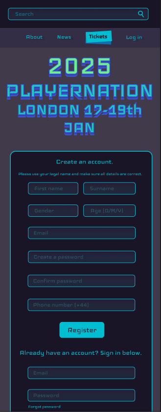
When it comes to the login feature, only minimal changes were made. The primary alteration involved resizing the login button and its surrounding elements to better suit mobile usage. This ensured that the button remains easily tappable and visually consistent across devices without disrupting the overall layout. The functionality and appearance of the login process were largely preserved, as it was already effective and familiar to users. The small adjustment was made purely to maintain usability on a variety of screen sizes.
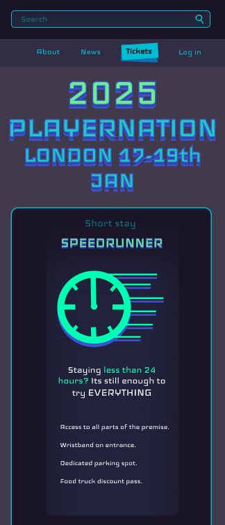
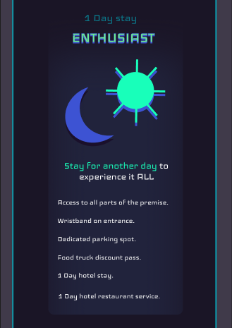
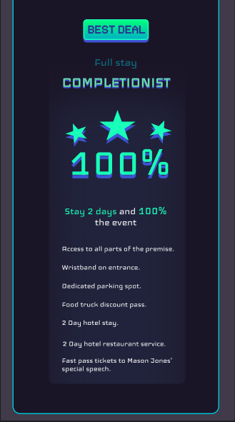
Significant improvements were also made to the tickets page. One of the most notable changes was the reorganization of ticket options. Previously, ticket choices were displayed side-by-side in a horizontal layout, which posed challenges on mobile devices due to limited screen width. To address this, the ticket options were restructured to be presented in a vertical stack, one above the other. This vertical layout allows for easier scrolling and viewing on phones and tablets, ensuring that users can clearly see all available ticket tiers without needing to zoom or adjust their screen. The order of presentation, from least expensive to most expensive, was intentionally maintained. This sequential flow is designed to first present users with the most affordable option, capturing their interest before gradually introducing them to more premium choices. This subtle psychological technique encourages users to consider the higher-value options after first evaluating the basic offerings.