Cover design 1
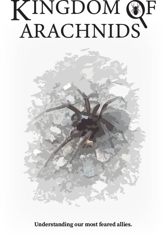
- Serif font in order to make the book seem more formal and serious which helps to recognise it as being focused on conveying information.
- The edited photo looks like an illustration and blurs a lot of fine details and looks like a polygonal part piece, which helps alleviate the uneasiness of readers with arachnophobia.
- The white background helps the photograph to blend in and look natural on the cover.
- The masthead was altered in order to bring attention towards it, the K was scaled bigger in order to make it be higher on the hierarchy in order to not compete with the A below it.
- The O in the masthead was remade in order to look like a magnifying glass over a spider in order to signify that the book looks into finer details as well as to give it an identifying visual which could easily be cropped into a logo if necessary.
- Might not interest the younger target audience due to lack of vibrant colours.
Cover design 2
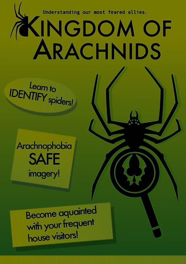
- Looks more like a magazine rather than a book, helps to attract the younger target audience.
- Important words are highlighted in order to bring attention to them when looking at the cover, reassures the readers that the book takes their concerns seriously and clearly conveys about what it has to offer and the attitude it has towards spiders.
- The main cover image (spider being identified with a magnifying glass) is simple and recognisable, which helps it be a stand alone logo when necessary.
- The green colour is based on the bug type from Pokemon, this reference to popular children’s and teens’ media helps to create a visual association between the cover and insects/arachnids before they even read the masthead.

Image taken from bulbapedia at https://bulbapedia.bulbagarden.net/wiki/Bug_(type)#/media/File:BugIC_RSE.png
#/media/File:BugIC_RSE.png)
- The masthead is evenly placed in the middle at the top of the cover in order to take up the majority of the space and make the cover look more evenly weighted especially since the image and cover lines below it have also created an even weight.
- In order to stand out, the masthead has been altered by making the K and the A bigger, as well as making the K have spider imagery attached in order to lessen the amount of negative space at the top as well as giving it more brand recognition, since if it was used on a different volume of this series it could be easily connected due to this iconic detail.
Cover design 3
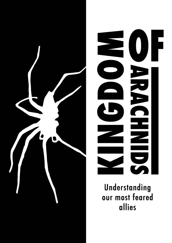
- The masthead was meant to distantly resemble the 2008-2018 Animal Planet logo due to its horizontal M and how stylistically varied a lot of letters are. This inspired me to experiment with the positioning of each word until I have decided on this version which has equal weight and most importantly is still legible.
Image taken from https://1000logos.net/animal-planet-logo/
- The masthead has been positioned slightly higher than the middle of the page in order to make room for the tagline underneath, this decision has helped the page look more equal and centred, since it allowed the writing to align with the main image on the left.
- The harsh contrast of black and white allows the cover to stand out even without the use of vibrant colours.
- Due to a lack of colour, it might not interest the younger audience much, however due to the more informal looking typeface it can appear slightly less serious and still intrigue them.
- The main image is just a silhouette of a spider, which conveys what the book is about whilst accommodating arachnophobic readers by not subjecting them to realistic imagery which would have deterred them from picking up the book.
Cover 3 adjusted
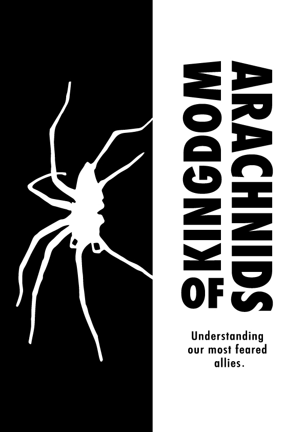
- Whilst it was the most practical and successful cover design, it had flaws, for example the masthead was very poorly designed and did not follow the importance hierarchy. I fixed it by scaling down the word “of” since its size emphasised its importance when in reality it was the least important word in the title. I have instead repositioned it below “kingdom” so that the reading order is not compromised, and scaled up the word “arachnids” since it is the most important word in the title.
- The stylistic choice of this masthead looks more modern than the references that inspired me, however in order to keep the formal tone that I tried to achieve I properly punctuated the tagline.
References.
- Bug (type) (2024) Bulbapedia. Available at: https://bulbapedia.bulbagarden.net/wiki/Bug_(type)#/media/File:BugIC_RSE.png (Accessed: 13 December 2024).
- Animal Planet Logo (2024) 1000 Logos The Famous logos and Popular company logos in the World Animal Planet Logo Comments. Available at: https://1000logos.net/animal-planet-logo/ (Accessed: 13 December 2024).