Audience and purpose – My target demographics are adults and late teens, which I will need to demonstrate through visuals and colour. I have assessed the logos based on how viable they would be in my project as well as overall how effective they would be in their respective context.
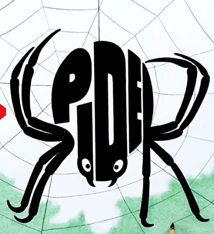
Bad typographical logo example.

- Weight imbalance between logo and background.
- The text making up the spider are not written on the same level which makes it very difficult to focus on.
- The sudden typeface change (due to the legs being a part of the spelling) makes it difficult to read, especially the first pair of legs that are bent vey naturally which makes it harder to see that it is making an “S”.
- The target demographic is blurred, the typeface, proportions and face of the spider make it very childlike, however the spelling utilising the spider’s legs Is difficult to read, especially for young audiences.
- The spider has 2 eyes instead of the usual 8, whilst it does not particularly ruin the design it makes the spider look very uncanny and awkward, solidifying the fact that the logo is made for a young target demographic.
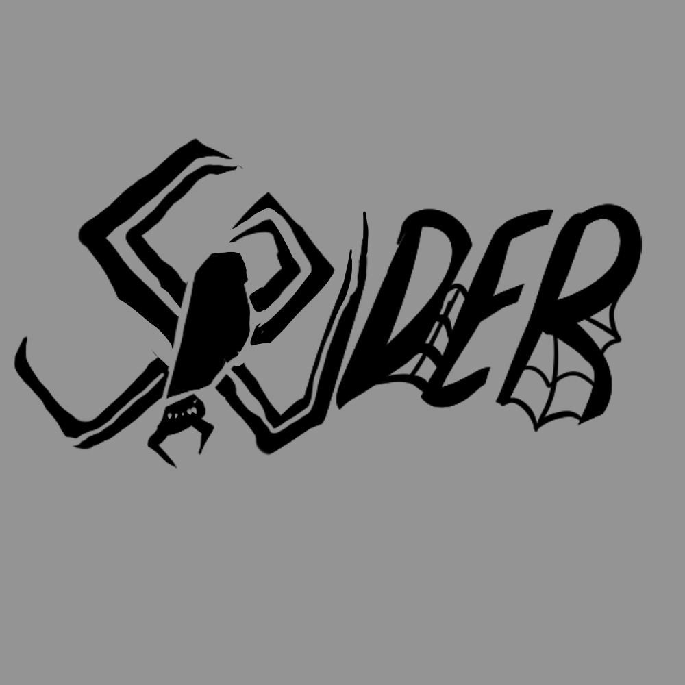
Fixed typographical logo.

- Keeping in mind the young target audience of the first logo, I was less strict with realism and have also attempted to bend the spider in a way which will be able to merge it with the type. However I soon realised that I would not be able to expand the spider enough to create the entire word with it, so I made it convey the first 3 letters.
- The logo remains difficult to read, however with the entire word levelled evenly it is much easier to put together.
- In order to prevent the rest of the word looking plain, I have decorated it with cobwebs in order to make the weight be equal on both sides.
- I have kept it slightly less cartoon stylised by giving the spider the appropriate amount of eyes, for my own educational magazine it would be important to use anatomically correct details.
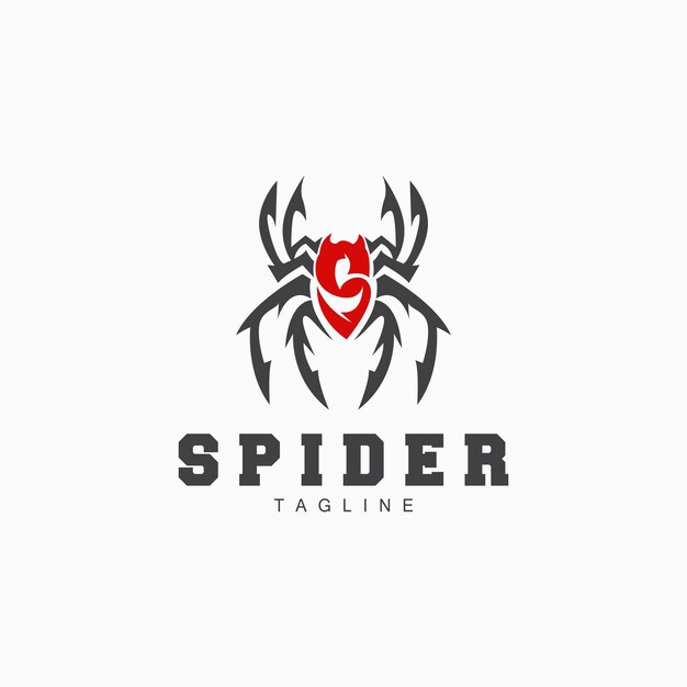
Better typographical logo.

- The colour separation makes it easy to recognise both the spider imagery and the letter “S”.
- The sharp angles and thick bold lines give off ferocity and confidence, could be a sports logo.
- The front legs of the spider look as if they are creating a crown, making the logo seem like it is for “winners” which would fit perfectly with a sport theme.
- The letter S was given 2 “horns” which are easy to see due to the colour difference between the letter and the legs of the spider and create fangs.
- The thickness of the legs forces them to be further apart, making the shape of the logo awkwardly wide.
- Has a lot of needless detail, however this helps justify the decision to give fangs to the spider because if the logo was smooth the fangs would be unnatural.
References.
- (No date a) Spider images – free download on Freepik. Available at: https://www.freepik.com/free-photos-vectors/spider (Accessed: 28 October 2024).
- (No date a) YouTube. Available at: https://www.youtube.com/watch?v=P%E2%80%93OP8hgUAw (Accessed: 28 October 2024). (Original video has been deleted.)