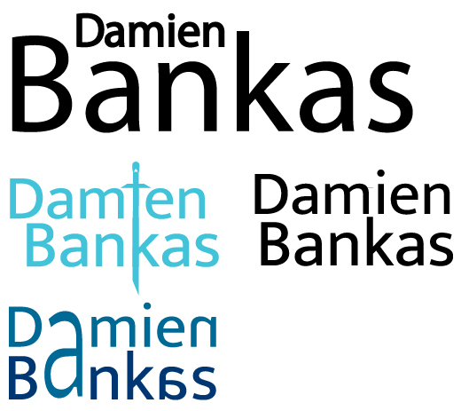
The original attempt was highly focused on learning how to scale and getting more familiar with the software’s capabilities. You can see the lack of confidence at first due to how little the changes are, however it did confront me with a problem of my name not looking visually pleasing when arranged on top and below which forced me to find a solution by looking deeper into the composition. I consider the hierarchy to be a mess, due to how much I had to scale down my forename it does not stand out much and is practically irrelevant in the logo despite being placed above the surname. However I have also considered that most successful individuals are typically recognised by their surnames, so the size of the surname technically also helps to establish a better and more recognisable brand identity.
I have attempted to look further outside of the block of text and experiment with alignment and composition in order to create new imagery. Using this method, I have developed my logo into featuring a sword which still follows the consistent weight and style of the typeface which ensures that it works alongside the text and adds to it rather than creating an entirely separate image. I chose to use a light blue in order to weaken the contrast between the text and the background to provide a softer and more pleasant look to the logo which both represents my calm demeanour and prevents the sword imagery from appearing hostile.
The final attempt was more brave with altering the typeface. By looking out further at the full image, I got the idea to align both of the As, however it created the issue of having too much weight on one side, so to fix that I reflected some of the other letters on the right which is a tribute to me having dyslexia which makes the logo more personal to me as an individual. I did consider the possibility of people struggling to read the logo however, so I changed the colour to a dark and easy to read blue to lessen the contrast of black on white, and I used 2 shades in order to better separate the words after I essentially merged them with the first A.
References.
- https://www.freepik.com/premium-vector/spider-logo-insect-animal-vector-minimalist-design-symbol-illustration-silhouette_48509554.htm
- https://www.google.com/url?sa=i&url=https%3A%2F%2Fwww.youtube.com%2Fwatch%3Fv%3DP–OP8hgUAw&psig=AOvVaw1JbJWvmkMKIJbJSZfBQ0_S&ust=1729155001931000&source=images&cd=vfe&opi=89978449&ved=0CBcQjhxqFwoTCICShcPCkokDFQAAAAAdAAAAABAR