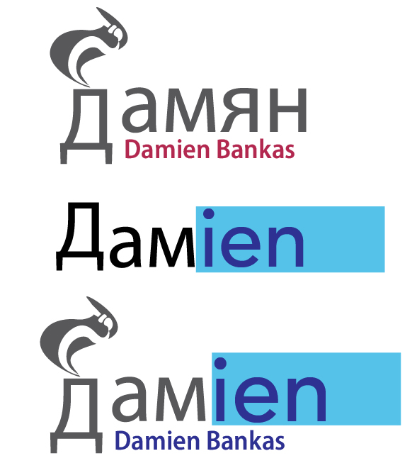
An undeniably big part of my character is my nationality, so in my logo, my name is spelt in Russian. This changed the entire course of the design due to my association of the new visuals with my past experiences and events that made me who I am, most prominently that the Russian letter D reminded me of the factory that I used to work in. However I knew that just including my past work does not convey much to the viewer apart from my experience and like of handling hands-on physical work, I personalised it better by adding a paint brush and a brush stroke inside the smoke to also convey my creativity and my love of art. I have moved down the D due to how much weight imbalance there was in the logo due to how high the D and the illustration were compared to the rest of the logo, which left me with some empty space underneath in which I wrote my name in English to accommodate English speakers and make sure they can still unmistakably connect me to the logo.
The second attempt was more focused on dyslexia and has an abrupt transition from Russian to English which perfectly summarises my move to this country. What caused me slight issues was attempting to find the same type and size that was used for the Russian part that did not continue onto the English part. Using ruler guidelines, I have successfully aligned the 2 portions together and matched the weight of both in order to connect it into 1 word. I have decided to extend the length of the blue strip in order to make it symbolise an overlay ruler which is a common tool used to help people with dyslexia and light sensitivity, it also helped the “ien” part not feel trapped when being covered by a small box.
Finally I tried to experiment and merge the 2 logos together, that resulted in a highly personalised logo with many references to my life and experiences. The logo looks very busy and since it focuses on a variety of different subjects at once, it becomes very overwhelming. However, merging the 2 logos has solved the issue of the weight imbalance. The thick filled blue rectangle has created a good distraction from the overly tall D and makes them look more even in comparison.
Bad logo example.

- Suppose to be an hourglass mixed with a spider, looks like neither spider nor hourglass.
- Tells me nothing about the brand or purpose of the company.
- Separates spiders into 3 parts, but arachnids are only suppose to have 2.
- Spider legs awkwardly disproportionate, makes it more difficult to recognise the creature.
- Needlessly detailed in the middle, the details serve no purpose.
- Too much weight imbalance.
- The thickness of the lines make the logo less serious and professional.